


What Is Responsive Web Design (RWD)? How It Works, Why It Matters
Responsive web design has become the standard way to build modern websites because people now browse on many different screen sizes throughout the day. A site that works well only on desktop is no longer enough. Businesses, publishers, and product teams need websites that stay readable, usable, and consistent across phones, tablets, laptops, and larger screens. This guide explains what responsive web design means, how RWD works, why it matters, and how it differs from adaptive and mobile-first design.
Further reading:
What Is Responsive Web Design?
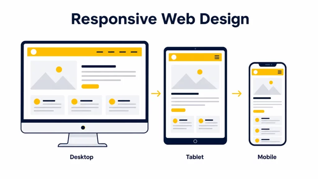
Responsive web design, often shortened to RWD, is an approach to building websites that adapt their layout, content, and interactions to different screen sizes and device capabilities. Instead of creating separate desktop and mobile websites, responsive design uses one flexible codebase that reflows across phones, tablets, laptops, and large monitors.
A Short History of Responsive Web Design
Responsive web design did not begin as a single invention. It grew out of the web’s shift away from fixed-width desktop layouts.
In the early web, many sites were built around rigid pixel widths because designers were working with a far narrower range of screen sizes. As more devices began accessing the web, those rigid layouts broke down. Early “fluid” layouts used percentages, but they often kept the same structure across all screens, which still created poor reading and navigation experiences on smaller devices.
The turning point came in 2010 when Ethan Marcotte coined the term “responsive web design” and described a model built on three foundations: fluid grids, flexible images, and media queries. That framework gave teams a practical way to build one RWD system that could respond to screen changes instead of serving disconnected versions of the same site.
That core model still matters. What changed is the surface area of the job. In 2026, responsive design also includes fluid typography, responsive images, reduced-motion handling, component-level responsiveness through container queries, and more deliberate mobile ergonomics.
How Does Responsive Web Design Work?
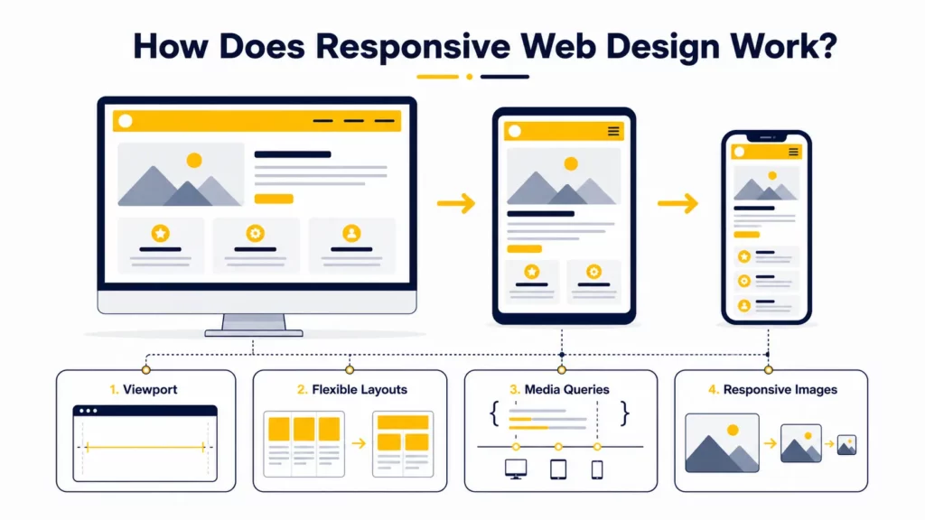
Responsive web design works by combining flexible layout rules with conditional styling. In practical terms, RWD works because the browser reads the page, measures the available viewport or container space, and applies CSS that changes the presentation accordingly.
At a basic level, four core elements make responsive web design work:
- the viewport tells the browser how to size the page
- flexible layouts let content reflow
- media queries adjust styles when conditions change
- responsive media and typography prevent overflow and usability issues
The Viewport Sets the Foundation
The viewport tells the browser how wide the layout should be on mobile devices. Without a viewport meta tag, mobile browsers may render the page at a desktop-like virtual width and then shrink it to fit the screen. That usually leads to tiny text and awkward zooming, which both MDN and web.dev explicitly warn about.
The standard tag looks like this:
<meta name="viewport" content="width=device-width, initial-scale=1">This line tells the browser to match the layout width to the device width and use a normal initial zoom level. It is one of the smallest but most important pieces of responsive setup.
Flexible Layouts Let Content Reflow
Responsive layouts use relative or fluid sizing instead of relying entirely on fixed pixel widths. That often means percentages, fr units in CSS Grid, flexible spacing, and layout systems such as Flexbox and Grid.
For example, a product gallery might show:
- 4 columns on desktop
- 2 columns on tablet
- 1 column on mobile
The point is not to preserve the same visual arrangement everywhere. The point is to preserve usability and hierarchy while letting the structure adapt.
Media Queries Adapt the Layout
Media queries apply CSS rules only when certain conditions are true, such as screen width, orientation, hover capability, or user preferences like reduced motion.
A basic example:
@media (max-width: 768px) { .feature-grid { grid-template-columns: 1fr; }}That rule tells the browser to use a single-column grid on narrower screens.
In practice, the best breakpoints are content-based, not device-name based. A layout should change when the content starts to feel cramped or broken, not because a designer wants one rule for “iPad” and another for “Android phone.”
Flexible Images and Media Prevent Overflow
Images are often the heaviest part of a page, so responsive design has to address both layout and asset delivery.
At the CSS level, images should not overflow their containers:
img { max-width: 100%; height: auto;}At the HTML level, modern responsive design often uses srcset and sizes so the browser can choose a more appropriate image file for the current device and layout width. MDN’s responsive images guide is still one of the clearest references on how this selection works in practice.
<img src="hero-1200.jpg" srcset="hero-480.jpg 480w, hero-960.jpg 960w, hero-1200.jpg 1200w" sizes="(max-width: 768px) 100vw, 50vw" alt="Responsive website layout shown across devices">This matters because hiding oversized desktop assets with CSS does not necessarily stop them from downloading. A site can look responsive while still being unnecessarily heavy on mobile.
Responsive Typography Protects Readability
Responsive text should scale without becoming tiny on phones or oversized on wide screens. One common modern pattern uses clamp() to define a minimum, preferred, and maximum size:
h1 { font-size: clamp(2rem, 4vw, 3.5rem);}This helps typography scale more smoothly than rigid breakpoint jumps. It also gives designers more control over readability across many screen widths. MDN’s clamp() reference also notes the accessibility value of bounding text sizes instead of letting them scale endlessly.
If you want to explore the practical rules behind these techniques in more detail, you can continue with our article on Basic Principles of Responsive Web Design.
Core Elements of Responsive Web Design
The table below summarizes the parts that most responsive websites rely on.
| Element | What it does | Why it matters |
|---|---|---|
| Flexible grids | Reflow layout across available space | Prevents broken, rigid layouts |
| Media queries | Adjust styles based on conditions | Keeps the interface usable on different devices |
| Responsive images | Scale and load efficiently | Improves mobile speed and visual quality |
| Responsive typography | Keeps text readable at all sizes | Supports comprehension and accessibility |
| Touch-friendly navigation | Adapts controls for fingers, not cursors | Reduces friction on mobile |
| Performance optimization | Controls payload and rendering cost | Prevents slow mobile experiences |
| Accessibility support | Respects user needs and preferences | Improves usability for more people |
Why Is Responsive Web Design Important?
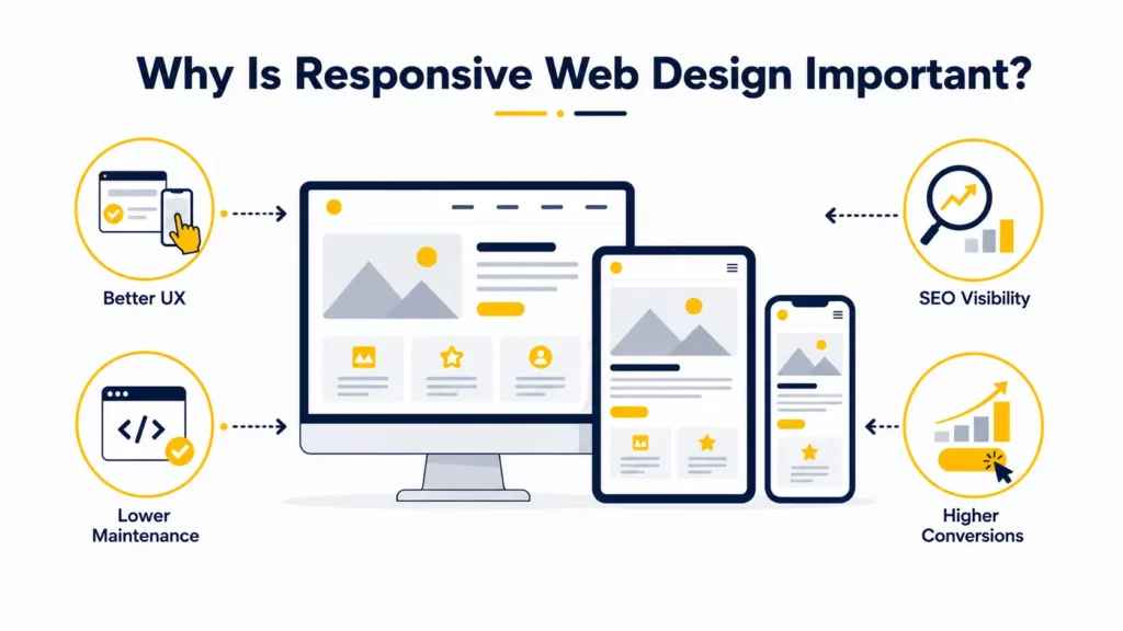
Responsive web design matters because users do not browse in one context anymore. They switch between phones, tablets, laptops, external monitors, and sometimes foldable devices. A website that works only on one screen shape is no longer acceptable for most businesses, which is exactly why RWD became the default expectation.
Better UX on Every Screen
A responsive website is easier to read, navigate, and interact with. People should not have to pinch-zoom, fight tiny tap targets, or guess where important actions moved on mobile.
Good responsive UX usually means:
- clear hierarchy on small screens
- readable text and spacing
- navigation that remains usable with touch
- forms that are easier to complete on mobile
- media that supports the experience instead of slowing it down
Stronger SEO and Visibility
Responsive design also matters for search visibility. Google Search Central uses mobile-first indexing, which means Google primarily evaluates the mobile version of a site’s content for indexing and ranking. Google also recommends responsive design as the easiest mobile configuration to implement and maintain.
That does not mean “make the site responsive and rankings will jump.” It means weak mobile usability can create friction for both users and search systems. If the mobile version is incomplete, hard to use, or materially weaker than desktop, the page becomes less competitive.
Lower Long-Term Development Overhead
A single responsive system is usually easier to maintain than separate desktop and mobile sites. Teams do not need to duplicate templates, split analytics logic, or manage content parity between multiple versions.
That reduces:
- maintenance complexity
- QA overhead
- SEO inconsistency risk
- content synchronization issues
Higher Conversion Potential
Responsive design can improve conversion potential because it reduces friction in high-intent flows such as:
- pricing exploration
- contact forms
- demo requests
- ecommerce checkouts
- bookings and reservations
A mobile user may have less patience and less screen space, but not less intent. Responsive design helps teams preserve the path to action.
Responsive Web Design vs Adaptive Web Design
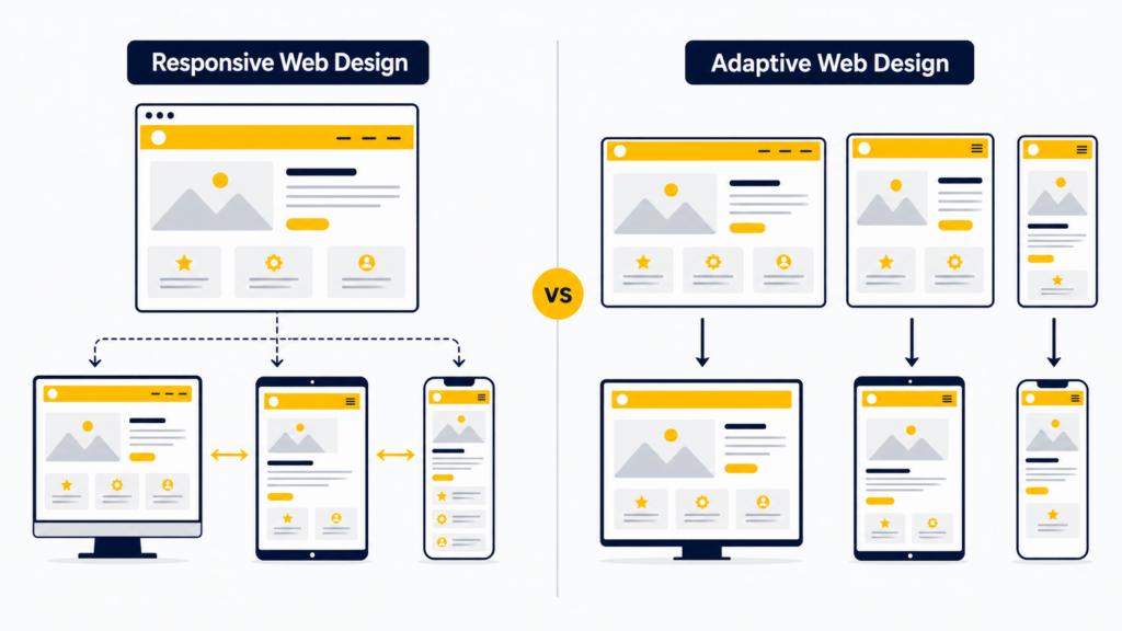
Responsive and adaptive design are related, but they are not the same.
Responsive design uses fluid layouts that continuously adapt between screen sizes. Adaptive design typically uses several predefined layouts designed for specific screen ranges. In other words, responsive is more fluid, while adaptive is more discrete.
| Factor | Responsive | Adaptive |
|---|---|---|
| Layout model | Fluid and flexible | Fixed layouts for specific ranges |
| Flexibility | High | Moderate |
| Maintenance | Easier with one system | More complex across multiple versions |
| Best for | Most modern websites | Specialized, tightly controlled experiences |
Responsive design is usually the better default choice because it handles the long tail of screen sizes more gracefully. Adaptive design can still make sense in constrained product environments, but it often costs more to maintain well.
You’ll love these too: Best Progressive Web Apps Examples (PWAs)
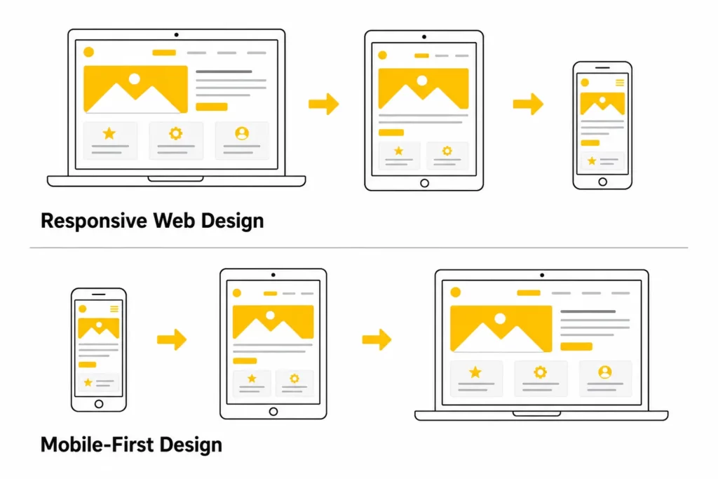
Responsive Web Design vs Mobile-First Design
These terms are often mixed together, but they describe different things.
Responsive web design is the outcome: a site that adapts across devices. Mobile-first design is the strategy: designing for the smallest screen first, then enhancing the experience as more space becomes available. In other words, RWD describes the behavior of the site, while mobile-first describes the workflow used to design it.
Mobile-first design is often the best way to produce a strong responsive result because it forces teams to prioritize:
- the most important content
- the most important actions
- the most important navigation paths
If a page works well on mobile first, it is easier to scale it up thoughtfully. If a page starts as a dense desktop layout and then gets compressed later, the mobile experience often feels compromised.
Common Responsive Web Design Mistakes
Responsive design can fail even when the layout technically “fits the screen.” Some of the most common mistakes include:
- Designing desktop first and shrinking everything later: This often creates cramped mobile layouts, weak hierarchy, and too many competing elements above the fold. The better approach is to prioritize content for smaller screens from the start.
- Using device-specific breakpoints instead of content-based breakpoints: Hard-coding breakpoints around specific devices ages badly. Better breakpoints appear when the content starts to feel crowded, awkward, or difficult to read.
- Hiding important content on mobile without a clear reason: Responsive design should reorganize content before it removes it. Users usually expect the same essential information on mobile as they do on desktop.
- Serving heavy assets and hiding them with CSS: A page can still feel slow on mobile if large desktop assets continue downloading in the background. Responsive performance is about delivery strategy, not just layout.
- Ignoring touch ergonomics: Small icons, crowded buttons, and edge-hugging controls make mobile interaction frustrating. Touch interfaces need enough space for real fingers, not just precise cursor behavior.
- Relying only on browser device emulators: DevTools are useful, but they do not replace real-device testing. A layout can look correct in emulation and still fail in real-world use.
- Forgetting accessibility preferences: Motion-heavy or contrast-poor interfaces can become harder to use on smaller screens. Responsive design should also respect settings such as reduced motion and dark mode where appropriate.
Explore more:
Responsive Web Design Best Practices
If you want a responsive website that stays strong in real use, these are the best practices that still matter.
Some of the most important responsive web design best practices include:
- Start with mobile constraints and content priorities: Mobile-first thinking forces clarity. It helps teams decide what matters most before extra space makes weak decisions look acceptable.
- Use fluid layouts and relative units: Use CSS Grid, Flexbox, percentages, fr, rem, and other relative sizing patterns where they make sense. Rigid pixel-based layout systems usually age poorly across device ranges.
- Set breakpoints when the layout breaks: Choose breakpoints by observing where content becomes awkward, not by copying a generic device list.
- Make tap targets comfortable: Buttons, links, toggles, and small controls need enough hit area and spacing for touch interaction. This is both a UX issue and an accessibility issue, especially as touch target expectations in WCAG 2.2 have become more explicit.
- Keep navigation simple: Mobile navigation should reduce friction, not bury important paths. If the user has one likely task, surface it quickly.
- Optimize images, fonts, and payload size: Responsive sites should load efficiently as well as reflow cleanly. Prioritize modern image formats where appropriate, srcset and sizes, lazy loading for below-the-fold media, efficient font loading, and a realistic mobile performance budget.
- Test on real devices: Check real devices, real form inputs, and real network conditions. The goal is not to pass a screenshot test. The goal is to deliver a usable experience.
A good next read is: Top Animated Website Templates Providers
Real-World Examples of Responsive Web Design
Strong responsive websites usually reveal the same recurring patterns:
- content hierarchy changes between desktop and mobile
- navigation becomes simpler, not just smaller
- layouts reflow cleanly instead of collapsing awkwardly
- images and video adapt without dominating the experience
- CTAs remain obvious on smaller screens
For example:
- Airbnb uses progressive disclosure to reduce information overload on mobile while preserving key booking details.
- Shopify simplifies menu hierarchy so mobile visitors can still reach important paths quickly.
- Dribbble shifts from dense desktop grids to cleaner single-column mobile browsing.
- SWISS Air prioritizes the booking path on mobile instead of preserving every secondary action above the fold.
For a deeper breakdown, explore our responsive web design examples.
Advanced Responsive Design in 2026
The fundamentals of responsive design have not changed, but the implementation surface is wider now. These topics are increasingly relevant for modern teams.
Container Queries Make Components More Reusable
Traditional responsive design is mostly viewport-driven. That works well for page-level layout, but it is less precise for reusable components that can appear in very different column widths.
Container queries let a component respond to the size of its parent container instead of only the viewport. That means a card can adapt differently in a narrow sidebar and a wide content grid without depending on global breakpoint overrides. If your team works with reusable components, MDN’s container queries documentation is a good practical reference.
In practice, this is useful for:
- card components
- dashboards
- design systems
- modular landing pages
- shared UI libraries
Responsive Design Now Includes User Preferences
Modern responsive design also responds to user settings, not only screen size. For example:
- prefers-reduced-motion helps reduce unnecessary motion for users who are sensitive to animation
- prefers-color-scheme can support light and dark themes more thoughtfully
- pointer and hover queries can help adapt interactions for touch-first environments
That does not replace core accessibility work, but it makes the experience more context-aware. For motion-sensitive users, W3C’s technique for prefers-reduced-motion is a useful baseline for deciding what should be simplified.
Foldables and Unusual Screens Matter More Than Before
Most teams still optimize for phones, tablets, and desktops first. That is still the right priority. But more advanced interfaces increasingly need to consider unusual screen shapes, dual-pane patterns, and foldable devices.
This does not mean every site needs custom foldable layouts today. It means responsive design should be treated as an evolving system, not a one-time mobile retrofit.
When Should You Use Responsive Web Design?
For most modern websites, responsive design should be the default starting point.
It is especially important for:
- business websites
- SaaS marketing sites
- ecommerce stores
- blogs and content hubs
- product documentation
- portfolio sites
- booking or lead-generation flows
You might choose a more specialized architecture in unusual product contexts, but for the majority of web projects, responsive design is the most maintainable and future-friendly baseline.
Find out more in:
- Web Design Tools for Different Types of Web Design Software
- Steps of the Web Design Process
- Top 10 Web Design Companies in Vietnam
FAQs About Responsive Web Design
Is responsive web design still relevant in 2026?
Yes. RWD is still the default expectation for modern websites. The concept has expanded, but the core need remains the same: one experience that adapts well across devices and contexts.
How is responsive web design different from adaptive design?
Responsive design uses fluid layouts that adapt continuously. Adaptive design usually switches between several predefined layouts built for specific ranges.
Is mobile-first the same as responsive design?
No. Mobile-first is a design strategy. Responsive design is the final adaptive behavior of the site across devices.
Do I need separate mobile and desktop websites?
In most cases, no. A well-built responsive website is easier to maintain and less likely to create content or SEO inconsistencies than separate desktop and mobile sites.
How many breakpoints should a responsive website have?
There is no universal number. Use as many breakpoints as the content needs and no more. The right breakpoint appears when the layout starts to feel cramped, unclear, or broken.
Does responsive design help SEO?
Responsive design supports SEO indirectly by helping teams maintain content parity, mobile usability, and a cleaner mobile experience. It is not a ranking shortcut, but poor mobile UX can absolutely hold a page back.
What are the main components of responsive web design?
The main components are flexible layouts, media queries, responsive images, responsive typography, touch-friendly interaction, and performance-aware implementation.
Conclusion
Responsive web design, or RWD, is the practice of building one website that adapts to different screens, interaction models, and device constraints without breaking the user experience. At its best, it combines flexible layout systems, responsive media, readable typography, touch-friendly interaction, and performance discipline.
That is why responsive design still matters in 2026. It improves usability, supports search visibility, reduces long-term maintenance complexity, and helps businesses serve real users across real devices.
If your site already looks “mobile-friendly” but still feels awkward on smaller screens, the issue is usually not whether it is responsive. The issue is whether the responsive system is thoughtful enough. Start by auditing hierarchy, breakpoints, forms, media weight, and navigation behavior on real devices.
If you need help planning, redesigning, or building a responsive website that works reliably across devices, the team at Designveloper can help turn those requirements into a scalable product experience.
Also published on

Share post on


Related Articles

LangChain Vs LangGraph Vs Langflow Vs LangSmith: Which Is Better?
LangChain Vs LangGraph Vs Langflow Vs LangSmith: Which Is Better? Published July 01, 2026
11 Best Web Development Languages for Front-End and Back-End
11 Best Web Development Languages for Front-End and Back-End Published June 16, 2026
Responsive Web Design Principles: 10 Best Practices for Better UX
Responsive Web Design Principles: 10 Best Practices for Better UX Published June 03, 2026


