


Have you ever wondered how visitors can find information they need on your website? It’s all thanks to web navigation. If you want to create a badass website, navigation is certainly one of the most important aspects you should consider first. Here, in this article, we’ll elaborate on common pitfalls, best practices, and web navigation examples you need to focus on. Now, let’s get started!
Understand Web Navigation
Web navigation is the system that allows users to move around a website. It guides visitors from one page to another.
When you look at the top of our website, for example, you’ll see how our website’s navigation works. We navigate our potential clients through separate sections, including Services, Projects, Company, and Contact Us. This helps visitors find the information they need quickly, whether our past work or knowledge bases.
Good web navigation is simple and intuitive. It makes the user experience smooth and enjoyable. If visitors can’t find what they’re looking for, they may leave the website. That’s why web navigation is crucial. It keeps users engaged and helps them stay on the site longer. Well-designed navigation can also improve search engine ranking. When search engines can easily crawl a site, it benefits SEO.
5 Types of Web Navigation & Examples
Web navigation comes into five key categories. They include:
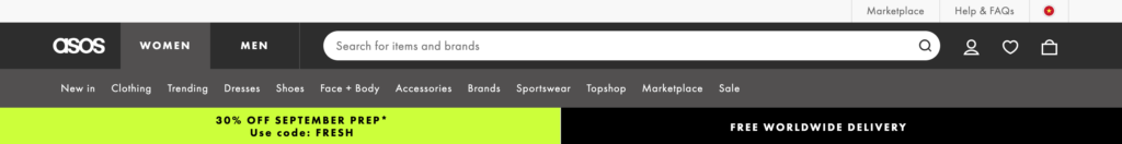
Horizontal Navigation Bar
This is a common type of web navigation. It’s usually placed at the top of the website. The links are arranged in a single row. This type of navigation is simple and easy to use. Visitors can see all the main sections of the site at a glance. It works well for websites with a few main categories. Many websites, from blogs to eCommerce, use horizontal navigation bars.
Here’s a typical web navigation example of this type:
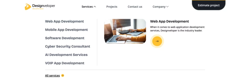
Dropdown Navigation Menu
A dropdown navigation menu expands when a user hovers or clicks on a menu item. This type of navigation is useful for websites with many categories. It allows your site to stay clean and organized. Dropdown menus provide a clear hierarchy of content. Visitors can see subcategories without cluttering the main navigation bar. They’re popular on eCommerce and large websites with multiple sections.
Below is a typical example of this web navigation type:
Hamburger Navigation Menu
This is a compact navigation style. It’s represented by three horizontal lines, resembling a hamburger. When users click on the icon, a menu slides out or drops down. This type of navigation is often used on mobile websites. It saves space and keeps the design minimal. It’s also becoming more common on desktop sites. However, visitors must know to click the icon to see the menu. This could be a drawback if the design isn’t intuitive.
Let’s take a look at an excellent example of this type:
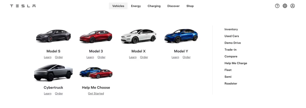
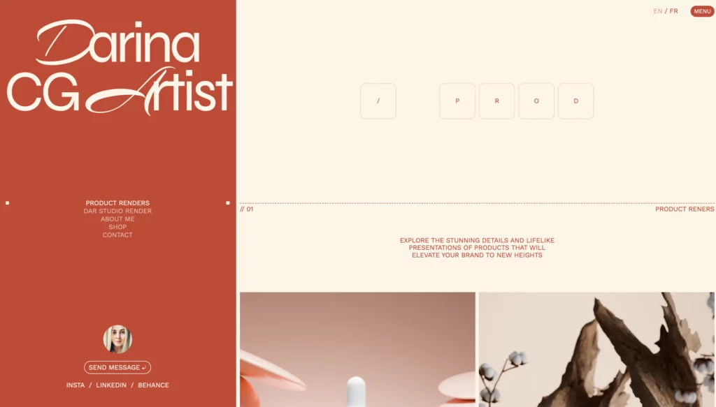
Vertical Sidebar Navigation Menu
This type of web navigation runs along the side of the page. It provides a clear list of links to different sections of the site. A vertical sidebar navigation menu are useful for content-heavy websites. It allows visitors to see all the options without scrolling back to the top. Normally, you can find vertical menus in blogs, forums, and sites with lots of categories. They can also stay fixed as users scroll. This offers easy access to navigation at all times.
Let’s see how Darina used the vertical menu in her portfolio website:
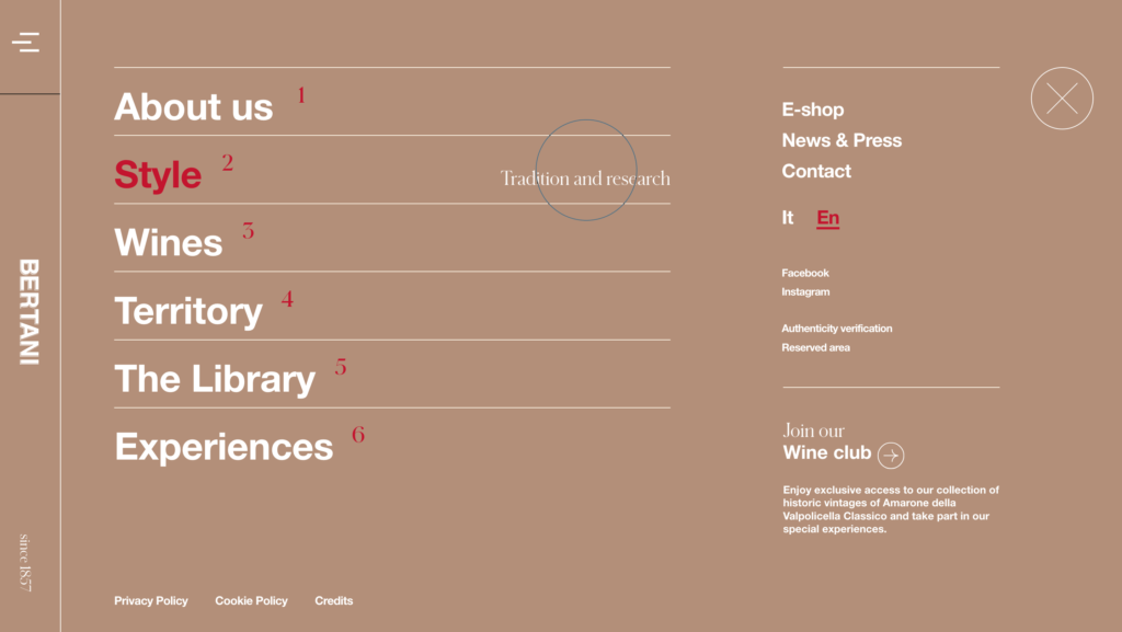
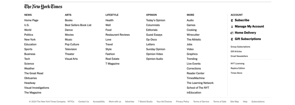
Footer Navigation Menu
This navigation menu is placed at the bottom of the website. It often contains links to less prominent pages. In other words, it’s a good place for links that users may need but not require immediate access to. These links might include privacy policies, terms of service, and contact pages. For this reason, footer navigation helps keep the top navigation bar clean and uncluttered. Further, many websites use footer menus as
The New York Times is a typical example for this navigation type. Apart from its top menu, it also provides a footer menu as a secondary navigation tool. It offers a final chance to guide users before they leave the site.
How to Choose the Best Website Navigation: Designveloper’s Insights
Web navigation proves useful for your website. However, choosing the wrong website navigation makes your websites fail. Especially when the global market for website design is forecast to expand at a CAGR of 8.7% from 2024 to 2031, the demand for appealing yet suitable web navigation is increasing accordingly. So, how can you evaluate and choose the most suitable website navigation for your website project? Here’s what we at Designveloper often do:
First, we set clear goals for a website, including:
- Target Audience: Consider the user’s persona, such as their personality, age, gender, etc., and build a persona that matches the website.
- Complexity of Features: Evaluate the complexity of the features included in the website.
- Key Features: Identify the standout features that we want to highlight to users.
- User Experience (UX): Ensure a consistent user experience across all sections of the website.
Based on these factors, we can determine the direction for development and expansion, along with specific UI decisions, particularly related to navigation to fit the project.
Below are several important factors to choose a navigation bar:
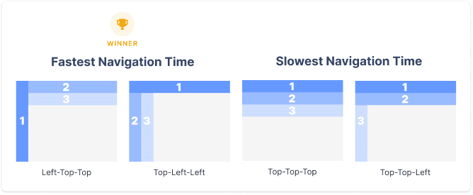
- Navigation Time: Research states that users are most familiar with and navigate fastest when the navigation bar is located on the left side of the screen.
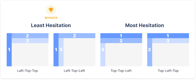
- User Hesitation: Users tend to hesitate when there is more than one navigation bar on the screen. So it’s important to establish a clear hierarchy between different navigation bars when selecting the appropriate layout.
- Mouse Movement Time: Placing navigation bars close to each other is a good option to reduce mouse movement time between content.
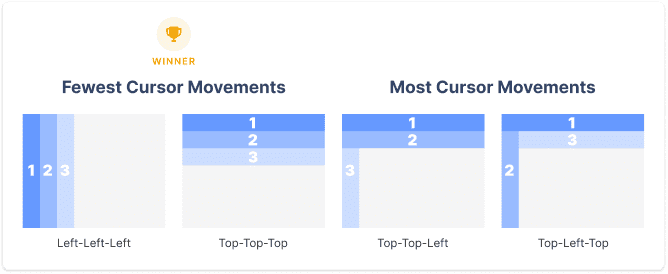
- Error Rate: A clear hierarchy between navigation bars can help users minimize errors when making selections.

5 Best Practices for Web Navigation
Tons of websites out there have navigation that is poorly designed. For example, their navigation menus have too many options. This overwhelms visitors, making them confused and unsure of where to go next. This can lead to frustration and cause visitors to leave the website. Therefore, to step your game up a little bit, here, we’ve pulled together some tips for the perfect web navigation. Give it a shot. Why not?
Recommended reading: 7 Key Elements of a modern Successful Website
1. Make It Prominent & Clear
Your navigation should stand out. Users need to find it easily without searching the page. Use a design that is clear and noticeable. Make sure the links are easy to read and not hidden in the background. Place the navigation bar where users expect to see it, usually at the top or left of the page. A prominent and clear navigation helps users move through your site without confusion.
2. Keep Web Navigation Consistent
Consistency is key in web navigation. If you change the layout or style from page to page, users may feel lost. Keep the navigation bar in the same place on every page. Use the same colors, fonts, and design elements. Consistent navigation builds trust with your users. They will feel more confident exploring your site when they know where everything is.
3. Keep It Concise
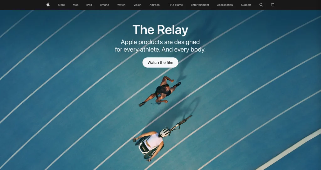
Less is more when it comes to navigation. Too many options can overwhelm users. Keep the menu short and to the point. Focus on the most important sections of your site. If you have more content, use drop-downs or submenus to organize it. A concise navigation makes it easier for users to find what they need quickly. Apple’s web navigation is a good example for simplicity.
Recommended reading: How to Increase Web Conversion Rate?
4. Be Descriptive
Your navigation links should tell users exactly what to expect. Avoid vague labels like “Services” or “Products.” Instead, use specific terms that describe the content. For example, if you offer different services, list them out under the main category. Descriptive navigation helps users make decisions faster. They know what to click on without guessing.
5. Optimize for Mobile
Mobile optimization is crucial. More users are browsing websites on their phones. If your navigation doesn’t work well on mobile, you could lose visitors. Use responsive design to make sure your navigation adapts to different screen sizes. Consider using a hamburger menu to save space. Make sure links are easy to tap, and the menu is simple to access. Optimizing for mobile ensures that all users have a good experience, no matter what device they use.
Conclusion
Imagine what will happen if you walk for hours in the forest without a compass or a map. It feels daunting, doesn’t it? The same can be said for a website without navigation. In this article, we elaborated on different types of web navigation with incredible examples. We also guided you to choose the most suitable navigation option and use the best practices to help visitors navigate well in your website.
We hope this blog post has inspired you to create more interesting navigation in your future projects.
And now, it’s your turn! Do you have any tips on designing the perfect site navigation? It would be great to get your input. Feel free to share in the comments below! Don’t forget to subscribe to our blog to receive the latest information about web navigation!
Also published on

Share post on


Related Articles

6 Proven Ways Chicago Brands Can Build Loyalty That Lasts
6 Proven Ways Chicago Brands Can Build Loyalty That Lasts Published July 02, 2025
How to Organize Design Files That Help to Save Time?
How to Organize Design Files That Help to Save Time? Published June 27, 2025
10 Questions to Ask a Web Designer Before Signing Contracts
10 Questions to Ask a Web Designer Before Signing Contracts Published April 26, 2025Read more topics

AI Development
AI Development

Automation Technologies & Solutions
Automation Technologies & Solutions

Back-End Development
Back-End Development

Best Companies
Best Companies

Blockchain Technology and Applications
Blockchain Technology and Applications

Business Analyst Role & Skills
Business Analyst Role & Skills

Chatbot Development
Chatbot Development

Cloud Technology Revolution
Cloud Technology Revolution

CMS Platforms Development
CMS Platforms Development

Cyber Security
Cyber Security


