


Helvetica Neue Font: Download and Improve UI of Your Mobile Apps
The use of mobile has increased to a great extent compared to desktop, and today designers need to be mindful of enhancing the UI of mobile apps. With an adequate user experience, you can get an impulsive boost in the traffic for which you build a site or an app. This sudden surge in mobile usage is the ease it gives people. Whether you have to search for any product online or want to see the price of your mandatory item, open the mobile and inspect the details. New to this field and don’t know how to operate it? You only need a bit of guidance on how to use Helvetica Neue font to improve the UI of your mobile apps.
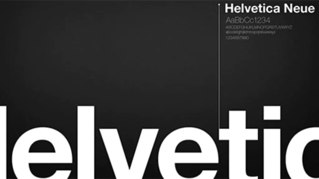
What is Helvetica Neue Font?
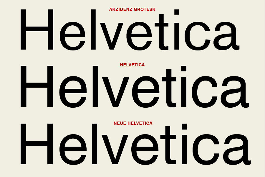
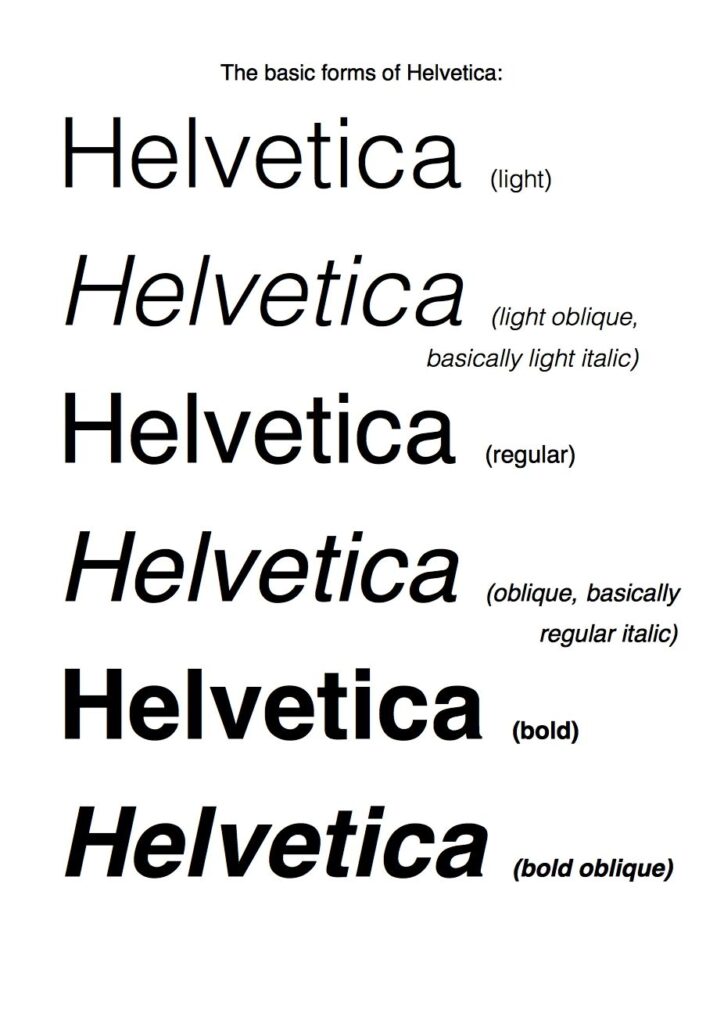
Helvetica Neue is a sans-serif typeface designed by Max Miedinger and Eduard Hoffmann in 1983. It is a reworking of the original Helvetica typeface, with a more uniform set of heights and widths and improved legibility. Helvetica Neue was also expanded to contain many additional weights and styles, such as condensed and extended.
Helvetica Neue is one of the most popular and widely used typefaces in the world. It is known for its clean, modern design and its excellent legibility. Helvetica Neue is used in a wide variety of applications, including signage, branding, advertising, and publishing.
Here are some examples of where Helvetica Neue is used:
- The logos of many major brands, such as American Express, Apple, BMW, and Lufthansa
- The signage for many airports, train stations, and other public spaces
- The text in many books, magazines, and newspapers
- The subtitles on many movies and TV shows
Helvetica Neue is a versatile and timeless typeface that is sure to be a good choice for a wide variety of design projects.
Please note that Helvetica Neue is a licensed font, so you will need to purchase a license to use it in your work.
How to Download the Helvetica Neue Font for Free
If you’re looking to download the Helvetica Neue Font for free to improve your mobile app’s UI, there are a few things you should know. First and foremost, Helvetica Neue is a licensed font, which means it’s not freely available for download due to copyright laws. Using a licensed font without proper authorization can lead to legal issues.
However, there are legitimate ways to access the Helvetica Neue Font. One of the most common methods is through font subscription services like Adobe Fonts, which is included with an Adobe Creative Cloud subscription. These services provide access to a vast library of fonts, including Helvetica Neue, for use in your projects.
Alternatively, you might consider using a free alternative to Helvetica Neue. Fonts like Roboto, Open Sans, and Arial are free to use and share similar characteristics with Helvetica Neue. They can be a great choice for improving your mobile app’s UI while avoiding potential legal issues.
Download URLs
While the Helvetica Neue Font is a licensed font and not freely available for download, there are legitimate ways to access it:
Additionally, you can download the Helvetica Neue directly here.
Importance of Typography in Mobile Apps
You have read thousands of articles on the importance of typography and fonts, so one can readily assume why people keep emphasizing them. The main element of mobile designs is the font size. If the size is up to the mark, the user interface will be more promising, and if the reader faces a challenging time apprehending the content, you will face the significance.
The only way you can cover this problem is by using the correct font that matches your design and is convenient for the readers to acknowledge the content. Moreover, your content appears differently on each screen, so this point is important to look up to. The one suitable font as per the situation is Helvetica Neue font which is a free resource you can download for your projects. It is the re-working of the original Helvetica font, where the designer did many modifications to make it a whole package; that’s why it took more fame.
A few changes that people saw in this version were improved readability score, enhanced number spacing, addition of punctuation marks, etc. We also have different versions of this font, making it more workable.
FURTHER READING: |
1. Top 7 Essential UI Design Principles for Newbies |
2. 3 Essential UI Mistakes That You Should Avoid |
3. What Is UI? The Overview for Beginners |
Using Helvetica Neue Font for Mobile Apps
If you are about to employ this font in mobile apps for the first time and don’t know the right way, the tips I will share will be worthwhile. It will enrich the user experience, and you will make a successful mobile app that everyone will idolize.
1. Be simple with the Text
You do not need to go over the board regarding the text. Using fancy or decorative fonts for text will ruin everything. Helvetica Neue is an uncomplicated font with a conceivable letter set, so you can go with it. The top priority of every designer is to keep the text as simple as attainable so that the reader doesn’t need to spend extra time understanding what you have penned. It is the number 1 rule for enhancing the user experience of your mobile app.
FURTHER READING: |
1. UX Design Process: What You Need To Know? |
2. What Does a UX Designer Do to Make the Best Product? |
3. UX Design Careers: What You Need to Focus On? |
2. Headlines Should be Prominent
The text must be superficial but when we talk about headlines or any promotional lines, using bold fonts is viable. Helvetica Neue is a large family of fonts, so you can easily find a bold font in this extended family. Use it so the reader presently understands the entire context without reading the content. You can also mix some bold fonts of the Helvetica Neue family for headings and titles.
3. Accessible to all devices
It doesn’t matter on what device the reader will read your content, the font you are using should be accessible to everyone. In this case, Helvetica Neue is the top choice because it supports different applications so everyone will get access to read your content. Moreover, all mobile app designers widely use this font for good reasons. It is also said that you won’t face any issues while reading this font on mobile screens and it is the most needed point.
4. Easily Customizable
There is nothing better than being capable of customizing the font for the mobile design so that it works with all the conditions. One such font is Helvetica. When you use a font that is different and unlike, it does make a contrast and makes your design stand out. That’s why Helvetica is eminent for this objective because it lets you customize the font according to your directives.
Why Is Helvetica Neue Font the Best?
As a designer, it must be understandable for you that choosing fonts for mobiles is way more challenging than selecting them for desktops. Helvetica Neue is one of the few fonts that fully satisfy clients and give them the gratification they have been discerning for. Let’s check out some key points that tell you why this font is the best pick.
1. Improved Version of Helvetica
We all know the leading cause behind having this font was to cover all the points that were missing in the initial Helvetica font.
The designer thought to work on his own design and it is how he came up with this fantastic option that fulfilled all the void. Not only for desktops, but it also became an unmatchable option for mobile applications as well, which is why designers now commonly employ it so that the user gets the best experience.
2. Visible in Low Light
Helvetica Neue is a simple font which is why the visuals are quite unusual. You can clearly inspect this font in low light without any tribulation.
It has also been used as a system font because Google wanted to give the best experience to people who use OS X and IOS. In the start, IOS used Helvetica but later switched to this version when it was released because of its improved performance.
3. Unified Widths and Heights
If the font’s width is unified then the characters won’t take enough horizontal space and the same is the case with height.
In Helvetica Neue, the characters don’t take extra space in the design and this is the beauty of this typeface. This point is essential to be noted in mobile applications because there the font height and width should be checked appropriately.
4. A Professional Font
On whatever design you are working on, you should never take professionalism lightly because this is what attracts the reader the most.
If the design or font used in it is professional, it will automatically become worth praising. Helvetica is an extremely professional font which makes it worth being used in all the big places and platforms. In the past, many big names were attached to this font which made it more projecting.
5. Large Font Family
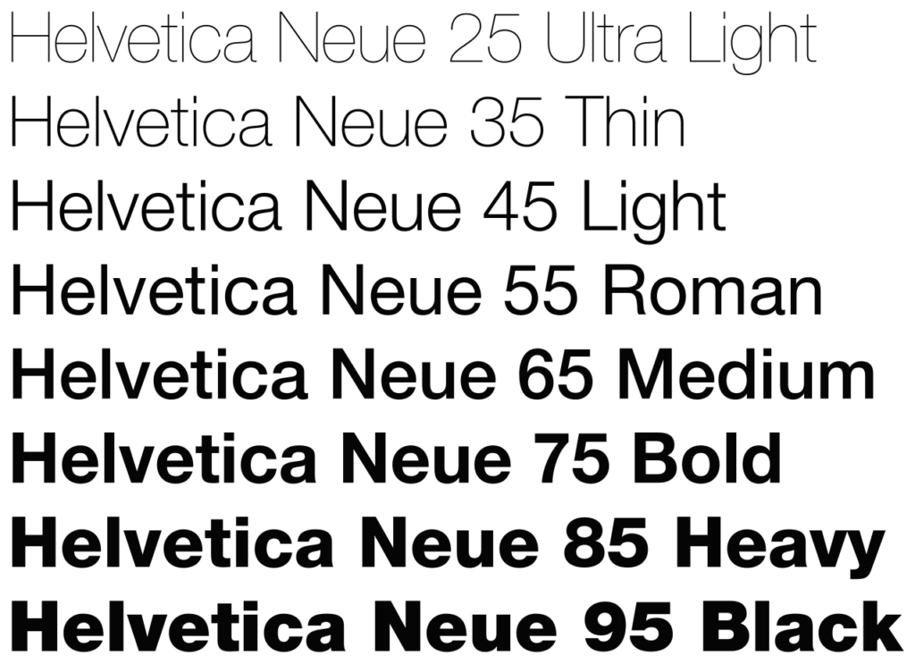
When you have a big font family, it becomes easy for the designer to pick their required option because they definitely get what they have been penetrating for to make their design fantastic. To make your mobile apps realistic, readable, and visually impressive, you can find the fonts according to them. It has almost 51 fonts, including 3 widths and 9 weights.
6 Possible Challenges with Using the Helvetica Neue Font
While the Helvetica Neue Font is a popular choice for mobile app UI due to its clean and modern aesthetics, it’s not without its challenges. This section will delve into the potential issues that may arise when using the Helvetica Neue Font in your mobile app design. From legibility concerns at small sizes to compatibility issues across different systems, understanding these challenges can help you make more informed design decisions and ultimately improve the UI of your mobile apps.
Legibility at Small Sizes
One of the challenges when using the Helvetica Neue Font in mobile app UI is its legibility at small sizes. When the font size is reduced, the thin strokes of Helvetica Neue can become nearly invisible, making the text difficult to read. This is especially true for light versions of the font.
Moreover, the uniformity of Helvetica Neue, while a strength in many design contexts, can lead to a lack of visual distinction between characters at small sizes. This can cause users to confuse similar-looking characters, such as capital ‘I’ and lowercase ‘l’, or the number ‘1’ and lowercase ‘l’.
Therefore, when using Helvetica Neue Font in your mobile app, it’s important to test the legibility across different devices and screen resolutions. Consider increasing the font weight or size in smaller displays to ensure that your text remains clear and easy to read.
Boldness Overpowering Design
Another challenge with using the Helvetica Neue Font in mobile app UI is the potential for the font’s boldness to overpower the design. When used in its bolder weights, Helvetica Neue has a strong presence that can dominate the visual hierarchy. This can distract from other important elements on the screen and disrupt the balance of the design.
For instance, if Helvetica Neue is used in a bold weight for body text, it can draw attention away from the headings or call-to-action buttons. This can confuse users about where to focus or what action to take next.
Compatibility Issues
Compatibility issues are another challenge when using the Helvetica Neue Font in your mobile app UI. Not all devices and operating systems have this font pre-installed. This means that if the Helvetica Neue Font is not available on a user’s device, the system will substitute a default font. This can lead to inconsistencies in your app’s appearance across different devices.
For example, Android devices do not come with the Helvetica Neue Font pre-installed. So, if your mobile app UI uses this font, it may appear differently to users on Android devices compared to those on iOS devices. This inconsistency can impact the user experience and the overall aesthetic of your app.
Light Backgrounds
Light backgrounds present difficulties when using the Helvetica Neue Font in your mobile app UI. The thin strokes of Helvetica Neue, especially in its lighter weights, can blend into light backgrounds, reducing contrast and making the text harder to read.
This is particularly true for mobile apps, where users may be viewing the screen in bright daylight conditions. In such situations, the lack of contrast between the text and the background can significantly impact the legibility of the text.
Vertical Alignment Issues
Vertical alignment issues can arise when using the Helvetica Neue Font in your mobile app UI. This font has been reported to have inconsistencies in the vertical positioning of some characters. This can lead to uneven text lines, disrupting the visual flow and potentially affecting readability.
For example, characters like ‘g’, ‘p’, ‘q’, ‘j’, ‘y’, and others that have descenders (parts of the letter that extend below the baseline) may not align perfectly with characters that don’t have descenders. This can make the text appear jagged and less polished.
Micro-Type Challenges
Micro-type challenges are the final aspect to consider when using the Helvetica Neue Font in your mobile app UI. This font, like many others, can present difficulties when used at very small sizes, such as on smartwatches or in compact areas of a mobile app.
At these tiny sizes, the distinct characteristics of Helvetica Neue can become less discernible, leading to a loss of the font’s identity. The legibility can also be compromised, making it harder for users to read the text.
Moreover, the spacing between characters (known as kerning) can become problematic at small sizes. If the kerning is not adjusted properly, the text can appear cramped or uneven.
Advice: How to Navigate the Challenges
Navigating the challenges of using the Helvetica Neue Font in your mobile app UI involves a combination of design best practices and careful testing. Here are some strategies:
- Legibility at Small Sizes: Increase the font size or weight for better visibility on small displays. Test your design on multiple devices to ensure legibility across different screen sizes and resolutions.
- Boldness Overpowering Design: Balance the use of bold weights with lighter ones to maintain visual hierarchy. Use bold weights sparingly for emphasis, and avoid using them for large blocks of text.
- Compatibility Issues: Include the Helvetica Neue Font files in your app’s resources, or consider using a similar, more universally compatible font. Test your app on different devices and operating systems to ensure consistent display.
- Light Backgrounds: Increase the contrast between the text and the background for better visibility. This could involve using a darker or bolder weight of the font, or adding a subtle shadow or outline to the text.
- Vertical Alignment Issues: Adjust line heights and letter spacing to improve alignment. Consider using a different font weight or size if alignment issues persist.
- Micro-Type Challenges: Adjust kerning and tracking settings to improve legibility at small sizes. Consider using a different font for micro-type, such as on smartwatches or compact areas of your app.
Remember, the key to successful typography in UI design is to prioritize readability and user experience. By understanding and navigating these challenges, you can effectively use the Helvetica Neue Font to enhance your mobile app UI.
Conclusion
Mobile app development is trending now. If you want your online business to do better, you’ve gotta think about improving the UI of the mobile apps. Every designer has once used Helvetica in their designs, so it wouldn’t be a surprise if they are still picking it for different applications. The reason for launching Helvetica Neue was all the fame that it got. After Helvetica Neue, many other variations were seen, and today, it has become an extended family of some fantastic fonts that are unstoppable and not going to disappear soon.
The most acceptable thing about this font is that it is distinct, due to which the engagement it has got in all these years is unreal. After Helvetica, the Helvetica Neue family ruled in typography, and despite the emergence of numerous fonts and as well as the challenges of using Helvetica Neue, it is still leading. While designing the mobile app, user satisfaction and contentment are important, so never avoid them; otherwise, you won’t succeed.
Also published on

Share post on


Related Articles

6 Proven Ways Chicago Brands Can Build Loyalty That Lasts
6 Proven Ways Chicago Brands Can Build Loyalty That Lasts Published July 02, 2025
How to Organize Design Files That Help to Save Time?
How to Organize Design Files That Help to Save Time? Published June 27, 2025
10 Questions to Ask a Web Designer Before Signing Contracts
10 Questions to Ask a Web Designer Before Signing Contracts Published April 26, 2025