


Responsive Web Design Examples: 25 Real Websites
Responsive web design examples are most useful when they show more than a layout shrinking from desktop to mobile. The best examples reveal how real websites adapt hierarchy, navigation, media, and conversion paths across different screens. This guide combines 25 responsive web design examples, so you can move from inspiration to implementation.
If you need a quick primer first, read our guide on what is responsive web design. If you want the implementation side in more depth, read our article on basic principles of responsive web design.
What Makes a Good Responsive Website?
A good responsive website does not simply fit the screen. It stays readable, usable, and goal-oriented as the layout changes. On a phone, that usually means clearer hierarchy, easier touch interaction, lighter visual density, and fewer competing actions above the fold. On a larger screen, it often means taking advantage of extra space without overwhelming the user.
The strongest responsive websites also balance UX, performance, and business goals. A page can look polished on multiple devices and still fail if forms become frustrating, navigation becomes harder to use, or media slows down the experience. Google Search Central also notes that Google primarily uses the mobile version of content for indexing through mobile-first indexing, which is one reason responsive design matters for visibility as well as usability (Google Search Central).
Explore more:
25 Real-World Responsive Web Design Examples
The responsive web design examples below show how different brands adapt layout, hierarchy, media, and interaction across screens without losing usability.
1. SWISS Air
On desktop, SWISS Air gives the flight search interface the most visual weight while still keeping secondary travel options nearby. On mobile, the layout shifts into a cleaner single-column flow that pushes flight search to the center of the experience.
This works because the mobile version reflects focused user intent. Most visitors on smaller screens want to complete one immediate task, so the design removes distractions and demonstrates a strong example of mobile-first task prioritization for transactional websites.
The below image shows two versions of the SWISS Air site:
Desktop
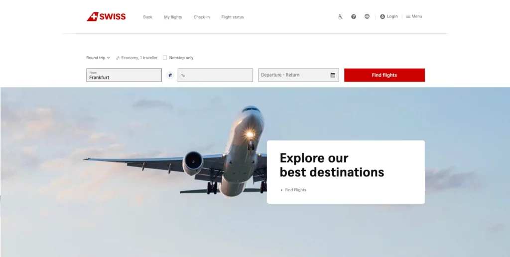
Mobile
Find out more in:
- Web Design Tools for Different Types of Web Design Software
- Steps of the Web Design Process
- Top 10 Web Design Companies in Vietnam
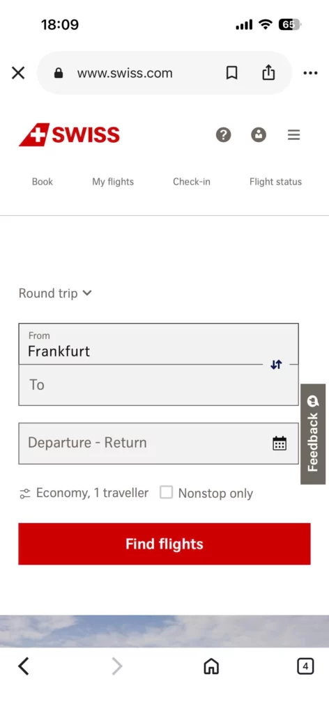
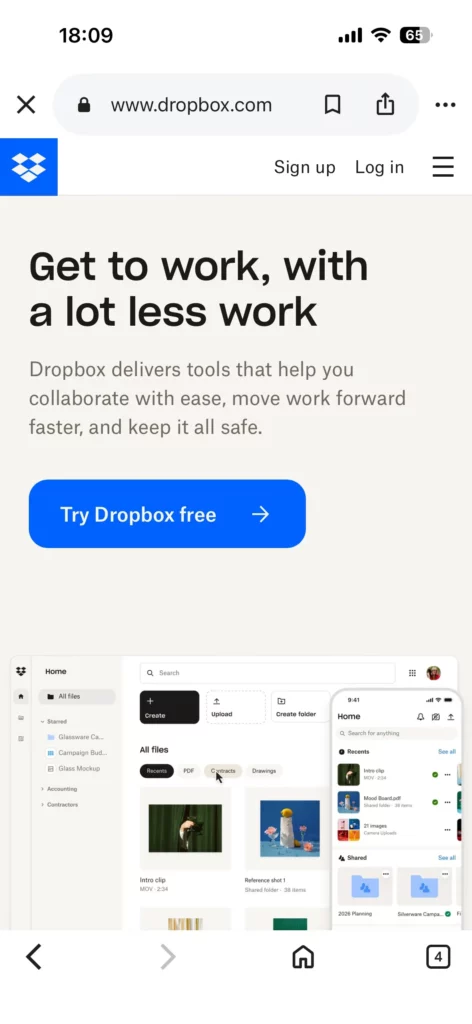
2. Dropbox
Dropbox changes its CTA language across devices, shifting the action based on likely mobile versus desktop intent. The visual structure stays familiar, but the messaging becomes more context-aware.
That is effective because users on different devices may be ready for different decisions even on the same landing page. Dropbox shows that a responsive CTA strategy can include message changes, not just layout changes.
The below image shows two versions of the Dropbox site:
Desktop
Mobile
A good next read is: Top Animated Website Templates Providers
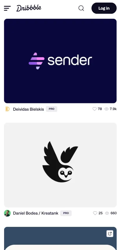
3. Dribbble
Dribbble moves from a multi-column grid on larger screens to a single-column vertical layout on mobile. Instead of squeezing cards into a narrow space, the site gives each project more room to breathe on smaller screens.
That decision works because it matches how people browse inspiration on phones. Vertical scrolling feels natural, each project remains legible, and the layout demonstrates that a responsive grid should reorganize around scanning behavior and tap accuracy.
The below image shows two versions of the Dribbble site:
Desktop
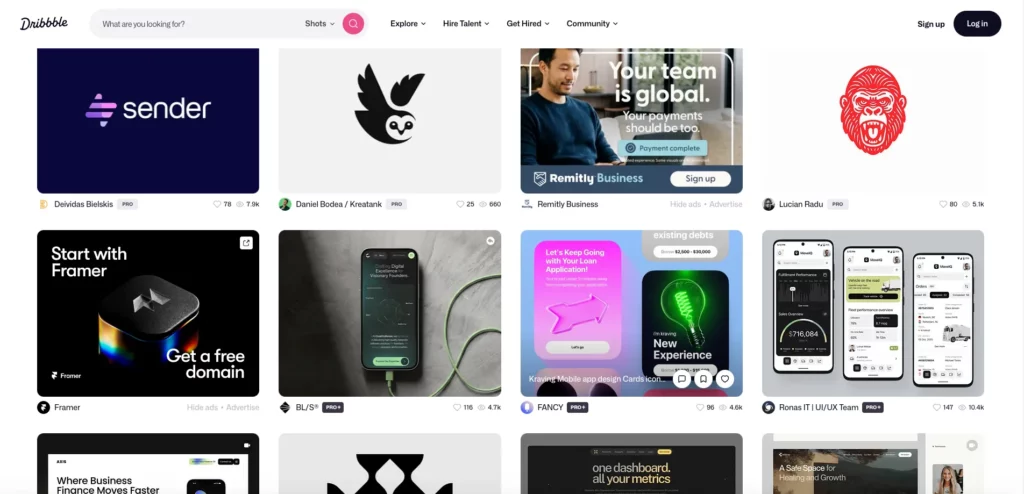
Mobile
You’ll love these too: Best Progressive Web Apps Examples (PWAs)
4. Etsy
Etsy keeps search highly visible across devices while adapting surrounding navigation and product discovery elements to smaller screens. The layout changes, but the main action stays obvious and easy to reach.
That approach works because search drives discovery for many ecommerce visitors. By protecting search prominence, Etsy reduces friction and shows why search-first navigation should remain clear at every breakpoint.
The below image shows two versions of the Etsy site:
Desktop
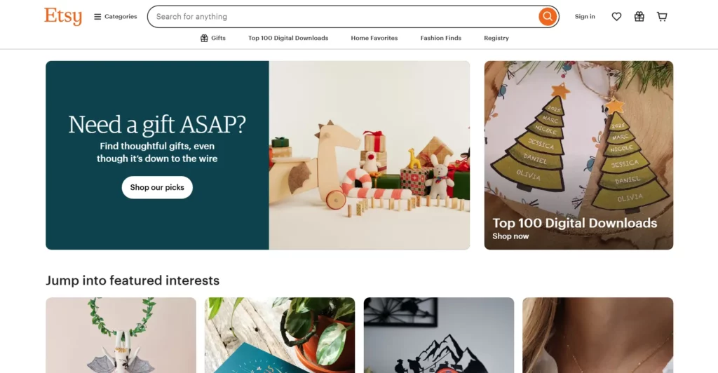
Mobile

See also:
5. Forefathers Group
Forefathers Group makes typography and navigation more direct on mobile, with fewer distractions around the core message. The smaller layout feels intentional rather than reduced.
This works because strong mobile UX often comes from better rhythm, clearer hierarchy, and a simpler reading path. The example shows that responsive typography depends on spacing, emphasis, and pacing, not only font size.
The below image shows two versions of the Forefathers Group site:
Desktop
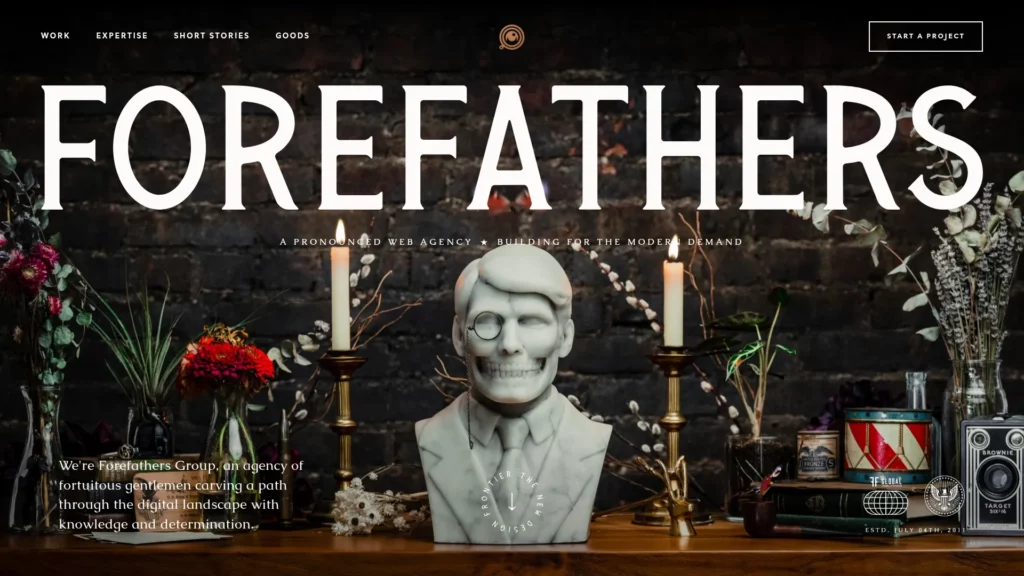
Mobile

6. Cuberto
Cuberto keeps its animation-heavy presentation visually expressive on smaller screens, but the motion and layout are controlled so they do not overwhelm the interface. The site still feels branded and energetic on mobile.
This works because the design protects personality without letting motion interfere with usability. It is a clear example of how animation should scale with device constraints instead of behaving the same way everywhere.
The below image shows two versions of the Cuberto site:
Desktop
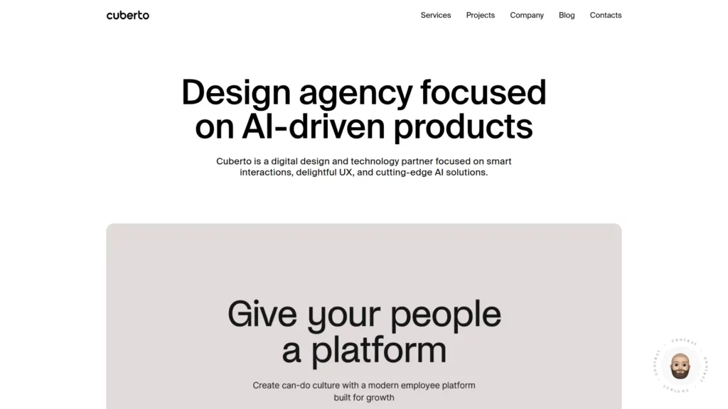
Mobile

Explore more: Key UI/UX Paradigms Redefining User Experience
7. Magic Leap
Magic Leap changes media behavior based on device context, including how autoplay and immersive visuals are handled. The responsive shift is not only about layout, but also about how the media behaves on different screens.
That is effective because video and motion should not perform identically across all devices and connection types. The example shows why media-rich experiences need responsive playback behavior, not just responsive dimensions.
The below image shows two versions of the Magic Leap site:
Desktop

Mobile

8. Wired
Wired condenses its editorial grid and supporting visual elements into a cleaner, more linear reading experience on smaller screens. The mobile layout feels less dense even though the brand still keeps its strong publishing identity.
This is effective because readability stays protected without making the site feel generic. Wired shows that content-heavy websites should simplify layout density on mobile before they sacrifice clarity.
The below image shows two versions of the Wired site:
Desktop
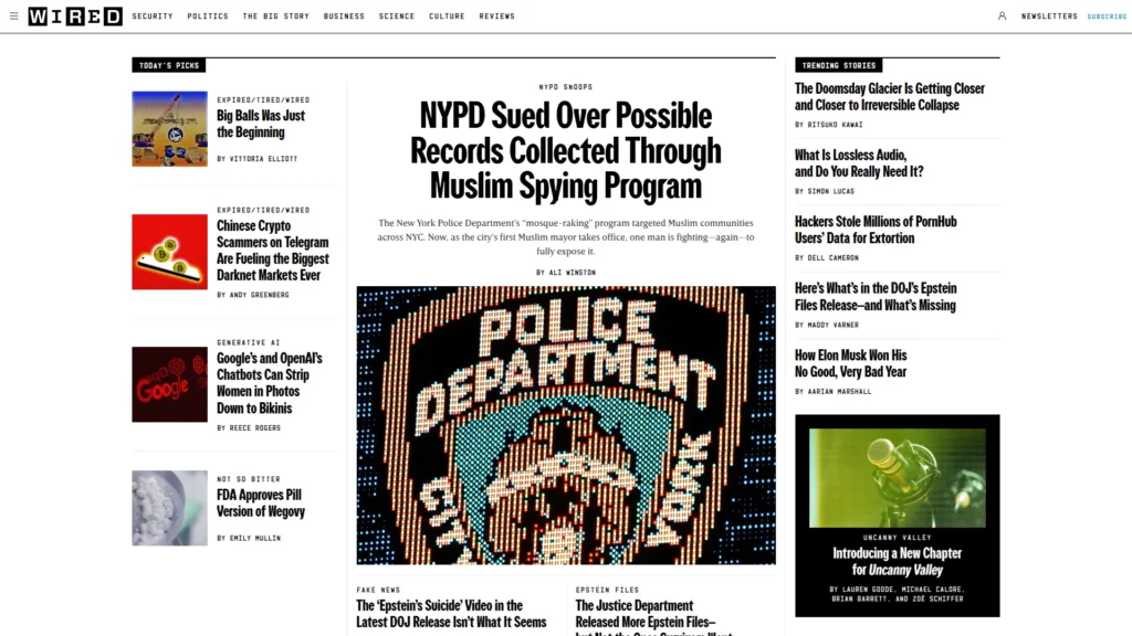
Mobile

Take a look at: Key Web Design Recommendations and Best Practices for Designers
9. The New York Times
The New York Times carries more of its newspaper-style structure on desktop, while mobile streamlines that density into a clearer reading flow. The result feels more focused without losing the authority of the brand.
That translation works because it adapts a historically dense editorial model to the way people actually read on phones. It is a strong reminder that legacy publishing brands should adjust hierarchy and scanning patterns for mobile rather than preserving print-like density.
The below image shows two versions of the The New York Times site:
Desktop
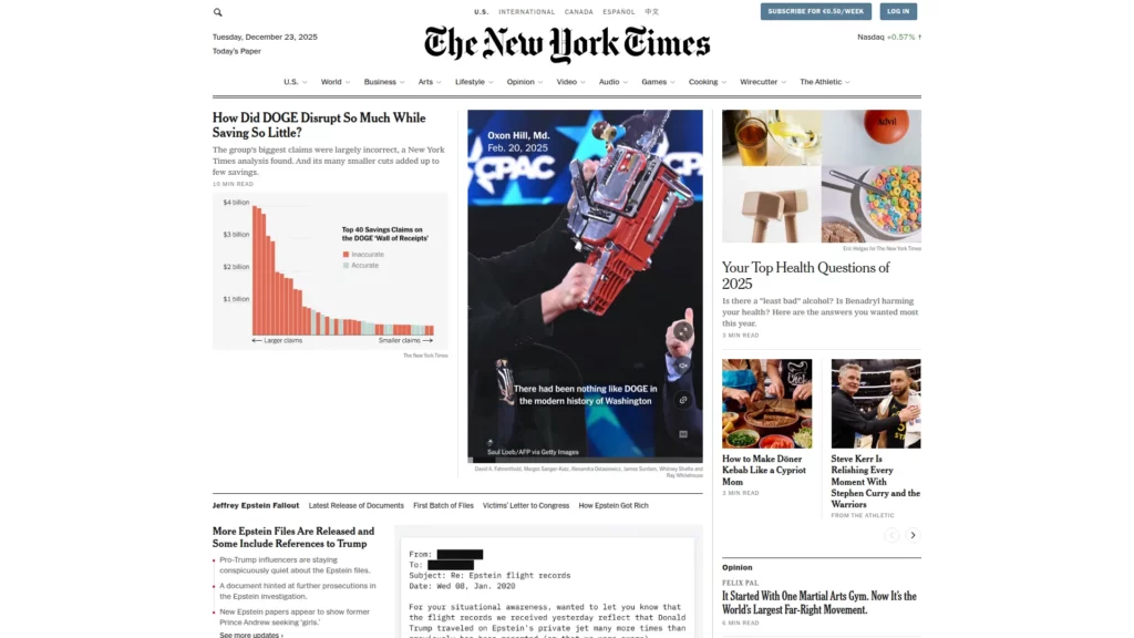
Mobile

Learn more in:
- How To Develop A Mobile-Friendly eCommerce Website
- Best eCommerce Website Design Services for Success
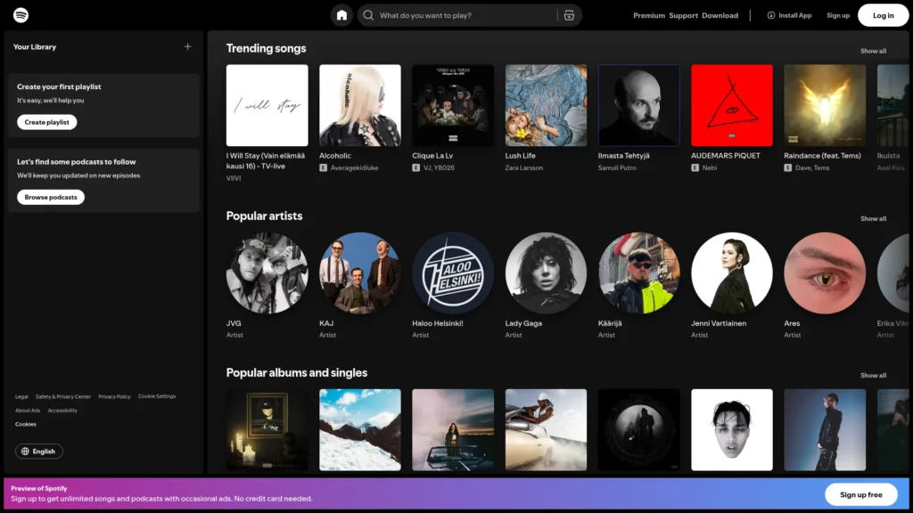
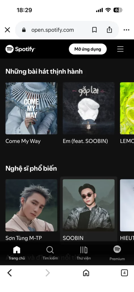
10. Spotify
Spotify exposes more navigation options on desktop, while the mobile version compresses the navigation system and protects the most important playback controls. The smaller layout feels simpler without losing the core listening experience.
This is effective because Spotify reduces clutter instead of stripping away functionality. It is a strong example of how responsive design can simplify a complex product while keeping the main user workflow intact.
The below image shows two versions of the Spotify site:
Desktop
Mobile
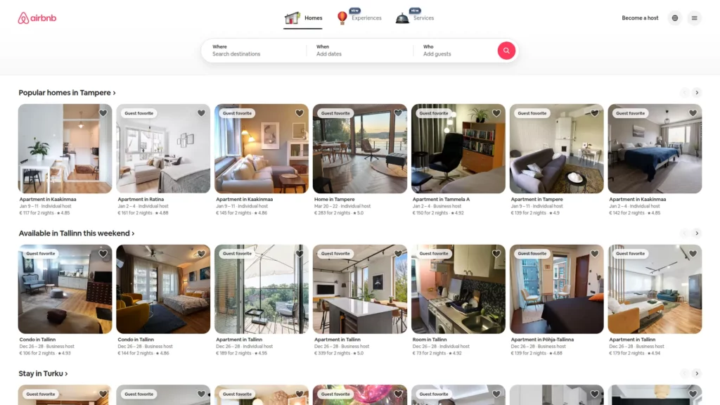
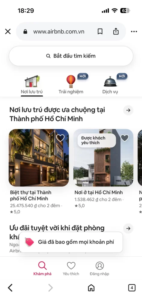
11. Airbnb
Airbnb surfaces broader property detail and galleries on desktop, while mobile prioritizes key differentiators and reveals supporting details progressively. The smaller-screen version feels lighter, but not incomplete.
This works because the site protects booking intent by reducing overload. Airbnb is a strong example of conversion-friendly progressive disclosure, where detailed content stays available without competing with the main decision path.
The below image shows two versions of the Airbnb site:
Desktop
Mobile
You might also like:
12. GitHub
GitHub supports fuller signup and content presentation on desktop and tablet, while mobile simplifies the path to the essential next action. The responsive changes reduce effort without breaking the credibility of the page.
That matters because form completion and technical exploration require different levels of commitment on different devices. GitHub shows how responsive form simplification can reduce friction before mobile users are asked for too much effort.
The below image shows two versions of the GitHub site:
Desktop
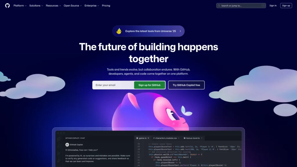
Mobile

13. Shopify
On desktop, Shopify presents broad navigation more openly, while on mobile it reorganizes the hierarchy inside a hamburger menu with clearer grouping. The structure becomes more compact, but the key paths remain discoverable.
That matters because mobile users still need access to business-critical actions. Shopify shows that responsive information architecture should preserve category logic rather than turning the mobile menu into a dumping ground.
The below image shows two versions of the Shopify site:
Desktop
Mobile

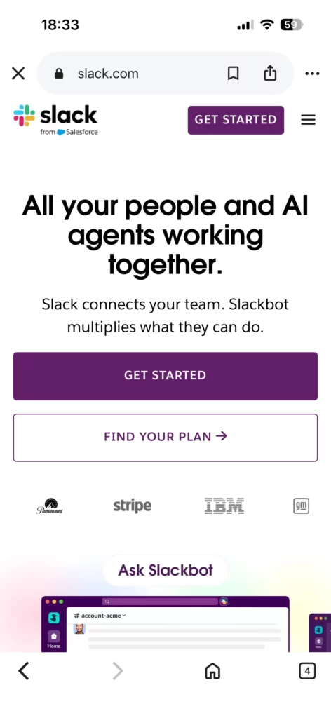
14. Slack
Slack reduces the number of above-the-fold CTAs on mobile and compresses the supporting content. The page becomes more focused as screen space shrinks.
This works because fewer competing choices usually help conversion on smaller screens. Slack demonstrates that single-focus mobile CTA design often performs better when attention and space are both limited.
The below image shows two versions of the Slack site:
Desktop
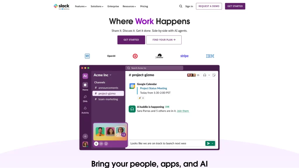
Mobile
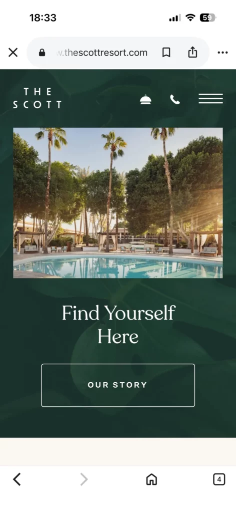
15. The Scott Resort
The Scott Resort keeps video backgrounds and animation as part of the experience, but handles them more carefully on smaller screens and weaker connections. The site preserves atmosphere without forcing the same media treatment everywhere.
This balance works because responsive design is also about performance discipline. The example shows that immersive visuals can support mobile UX when they respond to device capability and loading conditions.
The below image shows two versions of the The Scott Resort site:
Desktop
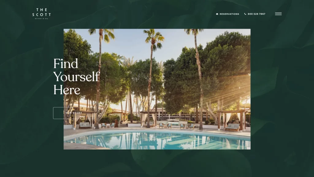
Mobile
16. Ceremony Coffee
Ceremony Coffee moves featured products and promotional sections from wider desktop grids into tighter, easier-to-browse mobile layouts. The responsive system keeps the storefront visual, but it does not force shoppers to navigate cramped cards.
That balance works because the site supports browsing without making the experience feel compressed. It is a useful reminder that product grids should scale down in a way that helps discovery rather than overwhelming mobile users.
The below image shows two versions of the Ceremony Coffee site:
Desktop
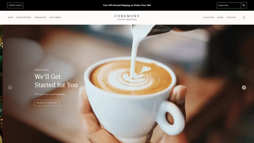
Mobile

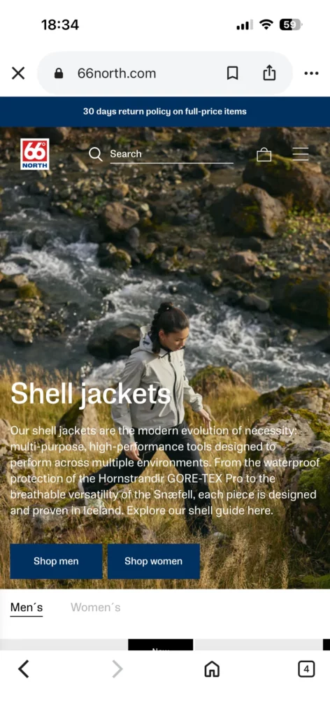
17. 66° North
At 66° North, large visual storytelling elements scale down without losing legibility, and interaction patterns shift from hover-centric behavior to touch-friendly behavior. The mood of the brand stays intact even as the interface becomes more practical.
That makes the site a strong example of responsive visual storytelling. Brands with cinematic imagery can preserve atmosphere on mobile, but they still need to protect readability and control.
The below image shows two versions of the 66° North site:
Desktop
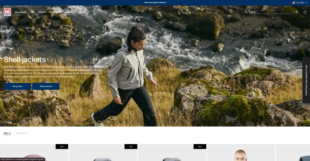
Mobile
18. Kern
Kern emphasizes broader portfolio grids on desktop, while mobile shifts toward a more focused project-by-project presentation with progressive disclosure. The smaller-screen layout changes the browsing mode instead of trying to preserve every desktop comparison pattern.
This works because mobile visitors usually explore differently from desktop users. Kern shows that portfolio websites should rethink how work is revealed on smaller screens rather than forcing a dense showcase into a narrow viewport.
The below image shows two versions of the Kern site:
Desktop
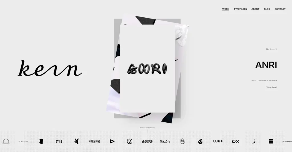
Mobile
19. Maradji
Maradji adapts product sliders, elegant visuals, and off-canvas navigation cleanly to smaller screens while preserving brand identity. The mobile version still feels considered and premium rather than purely functional.
This works because the responsive system protects the emotional feel of the brand instead of flattening it into a generic storefront. It is a useful example of brand-consistent responsive aesthetics.
The below image shows two versions of the Maradji site:
Desktop

Mobile

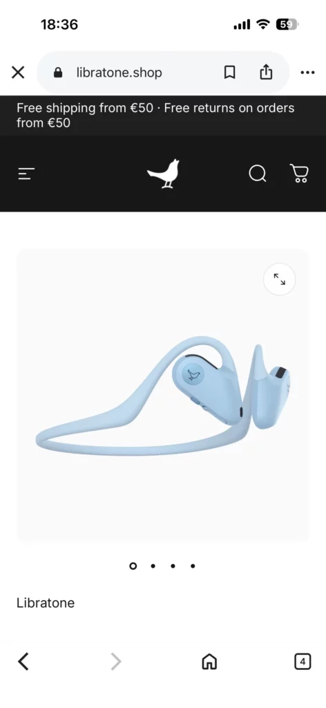
20. Libratone
Libratone keeps product imagery, sliders, and promotional sections prominent, while the mobile layout still protects core shopping actions and readability. The visual side of the product story remains strong across breakpoints.
This works because the site supports product research without letting imagery crowd out purchase intent. It shows how responsive media can strengthen decision-making instead of distracting from it.
The below image shows two versions of the Libratone site:
Desktop
Mobile
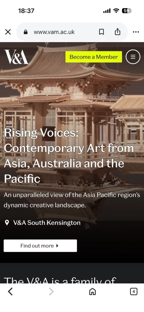
21. V&A Museum
On mobile, V&A Museum makes practical information like opening hours and visitor details more prominent while simplifying the surrounding navigation. The desktop experience remains broader, but the mobile version becomes more utility-driven.
This works well because museum visitors often browse on the go. The design prioritizes time-sensitive information without cutting users off from the wider content experience, which makes it a good example of context-aware mobile navigation.
The below image shows two versions of the V&A Museum site:
Desktop

Mobile
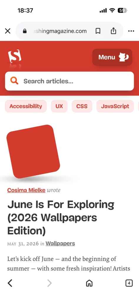
22. Smashing Magazine
Smashing Magazine simplifies navigation labels and supporting interface elements on smaller screens while keeping article pages readable and organized. The mobile experience remains rich, but not cluttered.
This works because the site handles typography and spacing carefully enough to support dense technical content across devices. It shows that educational and content-heavy websites should treat typography as a responsive system, not a fixed desktop setting.
The below image shows two versions of the Smashing Magazine site:
Desktop
Mobile
23. Popular Science
Popular Science keeps complex articles and supporting imagery easy to consume on smaller screens through consistent hierarchy and clean presentation. The content still feels substantial, but the reading path stays manageable.
That matters because responsive design should improve comprehension, not just shorten the page. Popular Science demonstrates how information-dense content can stay accessible when hierarchy is handled well.
The below image shows two versions of the Popular Science site:
Desktop
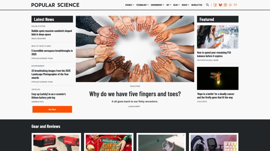
Mobile

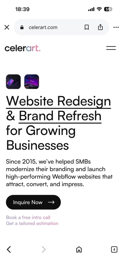
24. celerart.
The desktop version of celerart. presents services and work in more detail, while mobile simplifies the layout and keeps deeper information accessible through a lighter structure. The smaller-screen version feels more selective without losing the core message.
That makes the site persuasive without overwhelming mobile visitors. It is a good example of how responsive service pages can preserve credibility signals while trimming visual density.
The below image shows two versions of the celerart. site:
Desktop
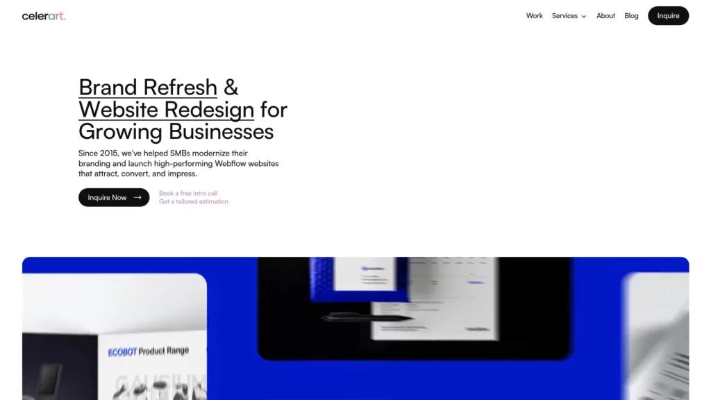
Mobile
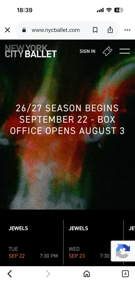
25. New York City Ballet
On larger screens, New York City Ballet keeps video and show content central, while mobile narrows the experience toward essential CTAs and performance details. The smaller-screen version becomes more action-oriented without losing its visual identity.
That approach works because media remains part of the brand story without overpowering the mobile path to exploration and action. It is a strong example of keeping discovery and conversion paths clear in a media-heavy experience.
The below image shows two versions of the New York City Ballet site:
Desktop
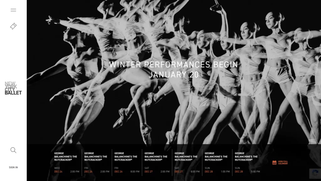
Mobile
Further reading:
Key Takeaways from These Responsive Web Design Examples
Across these responsive web design examples, the clearest pattern is not visual similarity. It is decision quality. Strong responsive websites decide what matters most on each screen, then reorganize the layout around that priority. That is why mobile versions often simplify navigation, sharpen hierarchy, and make one likely user action easier to complete.
Another shared pattern is restraint. The strongest examples do not try to preserve every desktop element on a phone. They remove friction, reduce competing choices, and keep only the parts that support browsing, reading, or conversion in that context. This is what makes responsive web design examples useful in practice: they show how good teams make tradeoffs, not just how interfaces resize.
Common Mistakes These Examples Help You Avoid
One common mistake is designing desktop first and shrinking everything later. That usually produces cramped mobile layouts with weak hierarchy. Examples like SWISS Air and Airbnb show that smaller screens need clearer priorities, not denser versions of the same interface.
Another mistake is relying on rigid grids or device-based assumptions. Dribbble, Wired, and Ceremony Coffee work better because their layouts reflow around content rather than clinging to a fixed desktop composition. The same lesson applies to typography. The New York Times, Smashing Magazine, and Popular Science all show that readability needs intentional adjustment on smaller screens.
Media is another area where responsive design often fails. Cuberto, Magic Leap, and The Scott Resort show that animation and video should adapt to device context instead of behaving identically everywhere. When that does not happen, the page may still look responsive while feeling slow or awkward.
The last recurring issue is mobile friction in high-intent flows. Shopify, GitHub, Dropbox, and Slack all reinforce the same point: if navigation, forms, and CTAs become harder to use on smaller screens, the layout may fit the viewport but the experience still breaks.
How to Apply These Responsive Web Design Best Practices to Your Own Site
The most practical starting point is to audit a few high-value templates instead of trying to review the whole site at once. Begin with the homepage, top landing pages, blog layout, navigation, pricing flow, and any form-driven path such as contact, demo request, checkout, or booking.
Review those templates on mobile first. Check whether the main action is obvious, whether navigation stays usable, whether text remains easy to read, and whether images still support the page instead of dominating it. Then review tablet and desktop states to see whether the layout expands logically instead of merely filling space.
It also helps to test responsive behavior in terms of user journeys, not isolated screens. Try completing a search, filling out a form, comparing products, or reading a long article on an actual phone. That kind of review usually reveals problems that screenshots and emulators miss.
Conclusion
The best responsive web design examples do more than fit a screen. They show how real teams adjust priorities, simplify interaction, protect readability, and preserve the path to action across devices. That is what makes responsive design useful in practice, not just attractive in screenshots.
If you are auditing your own site, start by looking for the same patterns: clearer hierarchy, lighter friction, better media behavior, and more deliberate mobile decisions. And if you need an AI-first software and automation partner to redesign or build a responsive product experience that works across real devices, Designveloper can help turn those requirements into production-ready software.
Also published on

Share post on


Related Articles
Responsive Web Design Principles: 10 Best Practices for Better UX
Responsive Web Design Principles: 10 Best Practices for Better UX Published June 03, 2026
Responsive Web Design Examples: 25 Real Websites
Responsive Web Design Examples: 25 Real Websites Published June 02, 2026
What Is Responsive Web Design (RWD)? How It Works, Why It Matters
What Is Responsive Web Design (RWD)? How It Works, Why It Matters Published June 02, 2026


