


Responsive Web Design Principles: 10 Best Practices for Better UX
Responsive web design principles are the core rules that help websites adapt across screen sizes without sacrificing usability. A strong responsive layout does more than fit the screen. It preserves readability, navigation, interaction, and performance across mobile, tablet, and desktop. This guide covers the most important responsive web design principles, along with the responsive web design best practices that help teams build faster, more usable, and easier-to-maintain websites.
If you need a broader introduction first, read guide on what is responsive web design. If you want to see these ideas in action, explore the collection of responsive web design examples.
KEY TAKEAWAYS:
The points below summarize the most important responsive design principles and implementation priorities covered in this guide.
- Responsive design starts with flexible systems, not fixed desktop layouts.
- Fluid grids and flexible media help layouts adapt across screen sizes.
- Media queries and container queries support both page-level and component-level responsiveness.
- Mobile-first design keeps the core user experience focused from the start.
- Content-based breakpoints work better than device-specific breakpoints over time.
- Touch-friendly interactions improve usability on real mobile devices.
- Fluid typography keeps text readable across viewports.
- Optimized images support both performance and layout stability.
- Progressive disclosure helps mobile interfaces stay clean without hiding important functionality.
- Real-device testing is still necessary before launch.
The Core Principles of Responsive Web Design
Modern responsive design still rests on a few technical fundamentals. The difference is that teams now apply those fundamentals with stronger attention to performance, accessibility, and reusable components.
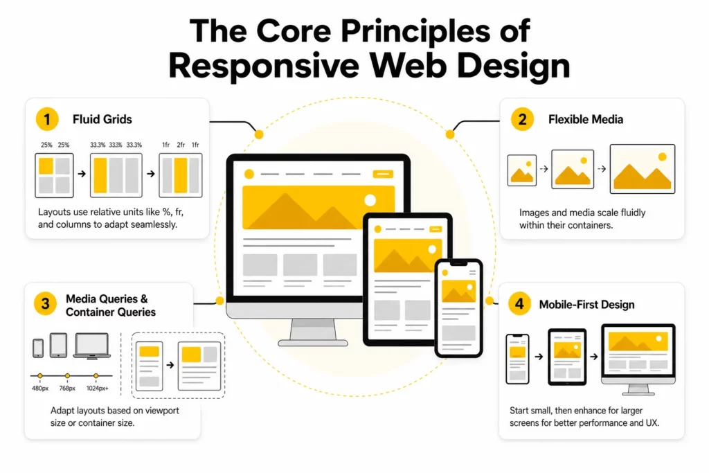
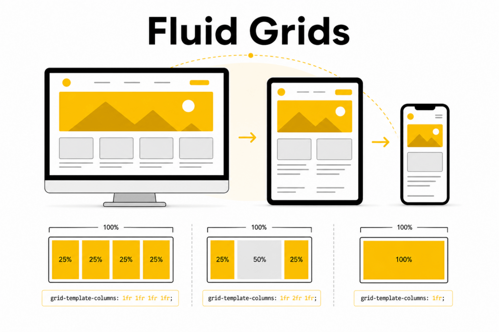
1. Fluid Grids
Older websites often relied on rigid fixed-width layouts such as 960px containers. That approach breaks quickly when screens become narrower, wider, or more varied than expected. Fluid grids solve this by using relative sizing instead of fixed pixel assumptions.
In practice, that means using units like percentages, fr, rem, and minmax() so layout elements can expand or contract with their containers. A two-column section on desktop might become a single column on mobile without forcing horizontal scrolling or awkward spacing.
Today, most teams rely on:
- Flexbox for one-dimensional layouts such as nav bars, button rows, cards in a line, or stacked sections
- CSS Grid for two-dimensional layouts where rows and columns need to respond together
Here is a simple example of a fluid card grid:
.card-grid { display: grid; grid-template-columns: repeat(auto-fit, minmax(220px, 1fr)); gap: 1rem;}The auto-fit and minmax() pattern lets the browser create as many columns as the space allows. As the viewport narrows, cards naturally wrap without the layout collapsing.
2. Flexible Media
A layout cannot be called responsive if images or videos overflow their containers. Media has to scale with the surrounding content, not fight against it.
The baseline rule is still simple:
img,video { max-width: 100%; height: auto;}Flexible media prevents layout breakage on smaller screens while preserving aspect ratio. However, modern responsive media goes beyond that baseline. Teams should also think about:
- image file size
- resolution switching
- art direction
- loading behavior
- layout stability
According to MDN’s responsive images guide, HTML tools such as srcset, sizes, and <picture> help browsers choose the right asset for the user’s device and layout context. That improves both visual quality and performance.
For example:
<picture> <source media="(min-width: 1024px)" srcset="hero-large.webp"> <source media="(min-width: 768px)" srcset="hero-medium.webp"> <img src="hero-small.webp" alt="Responsive website layout across devices" width="1200" height="675" loading="lazy" ></picture>Responsive image delivery reduces waste on smaller screens while keeping images sharp on larger displays.
3. Media Queries and Container Queries
Media queries remain one of the core responsive web design principles because they let developers adjust layout and styling based on viewport conditions such as width, height, orientation, and aspect ratio.
For example:
@media (min-width: 768px) { .feature-list { grid-template-columns: repeat(2, 1fr); }}Modern responsive design has also become more component-driven. A card in a wide main content area may need a different layout than the same card inside a narrow sidebar. Container queries become more useful than viewport-wide rules in that kind of situation.
As MDN explains in its container queries documentation, container queries allow a component to adapt based on the size of its parent container rather than the full viewport. This makes reusable UI modules much easier to design and maintain.
Example:
.article-list { container-type: inline-size;} @container (min-width: 42rem) { .article-card { display: grid; grid-template-columns: 1.2fr 1fr; gap: 1rem; }}Container-level responsiveness is a major shift in modern front-end architecture. Instead of making everything depend on page-level breakpoints, teams can make individual components smarter and more portable.
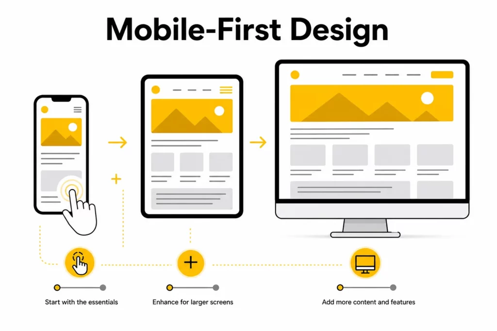
4. Mobile-First Design
Mobile-first design means starting with the smallest practical screen and the most essential user journey first. Then, as more space becomes available, the design is progressively enhanced with richer layouts, supporting content, and optional visual details.
The mobile-first method works better than designing for desktop first and then cutting features down later. The method forces teams to answer a hard but useful question early: what does the user absolutely need to do here?
Mobile-first design usually leads to:
- clearer content hierarchy
- fewer unnecessary elements
- better performance decisions
- more touch-friendly interaction patterns
The mobile-first approach also aligns well with how users actually browse today. Many sites still get a large share of traffic from mobile devices, and even desktop users benefit from focused, uncluttered layouts.
Explore more:
Responsive Web Design Best Practices
The core principles explain what responsive design is built on. The best practices below explain how modern teams apply those principles well.
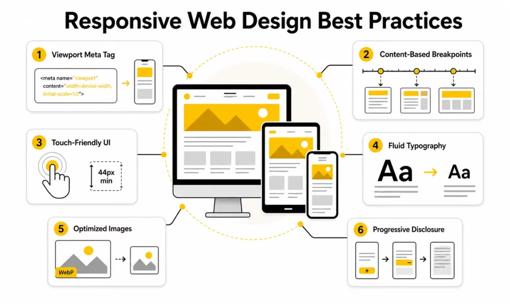
1. Use the Correct Viewport Meta Tag
Before writing responsive CSS, mobile browsers need to be told how to interpret the layout width. Without that signal, some browsers try to render the page using a wider virtual viewport and then scale it down, which creates inconsistent text sizing and awkward zoom behavior.
The standard tag is:
<meta name="viewport" content="width=device-width, initial-scale=1">web.dev’s responsive web design basics recommends using this tag so the layout width matches the device width in device-independent pixels. This is one of the smallest but most important implementation details in responsive design.
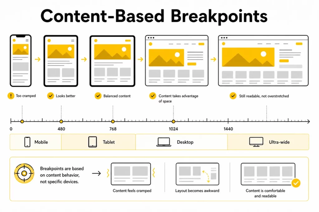
2. Define Breakpoints by Content, Not by Devices
One of the most common mistakes in responsive work is designing for named devices instead of designing for content behavior. A breakpoint like “iPhone 15 Pro” may be obsolete next year. A breakpoint based on where the layout actually starts to break remains useful.
The practical workflow is simple:
- Build the component or page.
- Gradually narrow or widen the viewport.
- Add a breakpoint only when the content becomes hard to read, crowded, or structurally awkward.
A helpful baseline for planning is:
- 360px-480px: mobile portrait
- 481px-767px: larger phones and small landscape states
- 768px-1023px: tablets and small laptops
- 1024px-1279px: standard desktop
- 1280px+: large desktop and ultra-wide displays
These ranges are not strict design targets. They are starting points. The final breakpoint choices should always follow the content.
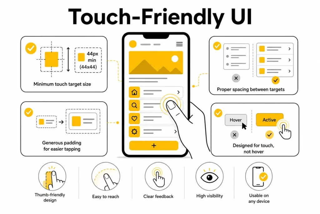
3. Design Touch-Friendly Interactions
Responsive interfaces should work well for touch, not only for precise mouse input. On mobile devices, people tap with fingers and thumbs, which means interactive elements need enough size and spacing to feel reliable in real use.
Touch-friendly design requires interactive elements to be:
- large enough to tap comfortably
- spaced far enough apart to avoid accidental activation
- easy to use without hover states
A practical rule is to keep tap targets at around 48 x 48px or at least 44 x 44px, depending on the design system being followed.
A touch-friendly interface does not require every button to look oversized. In many cases, better padding, clearer spacing, and stronger visual hierarchy improve usability without making the interface feel heavy.
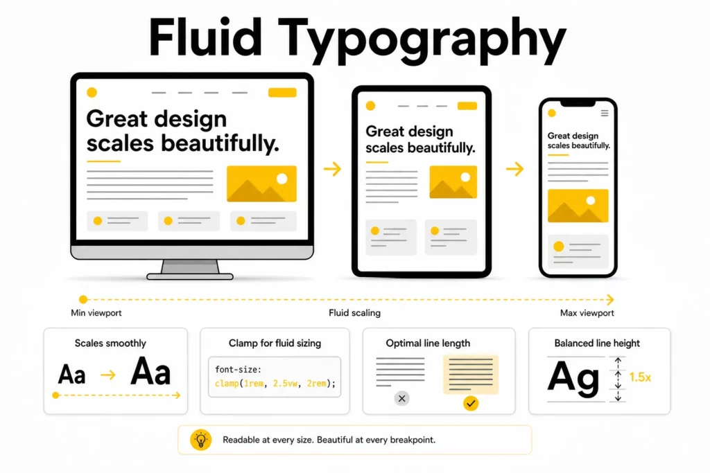
4. Use Fluid Typography With clamp()
Text that looks balanced on a large desktop can become cramped on a phone or oversized on a tablet. Using multiple fixed font sizes and managing them with many media queries creates extra maintenance work and often leads to inconsistent results.
Fluid typography solves this more elegantly.
h1 { font-size: clamp(1.75rem, 4vw + 1rem, 3.25rem);}With clamp(min, preferred, max), the browser scales the text smoothly within a controlled range. This improves readability while reducing the need for repeated overrides.
For long-form content, typography decisions should also include:
- line-height
- line length
- paragraph spacing
- heading contrast
Responsive typography is not only about resizing fonts. It is about preserving reading comfort across contexts.
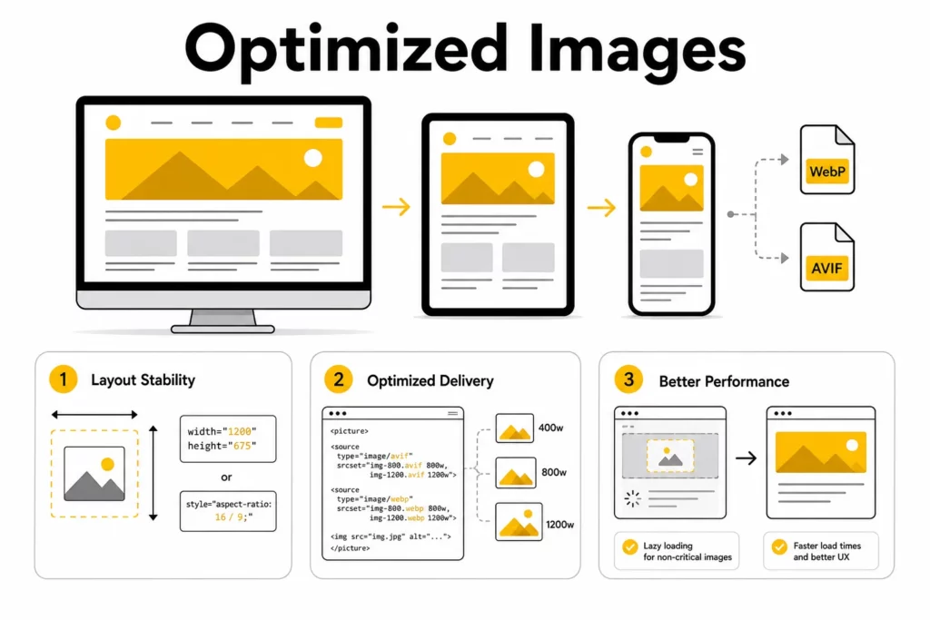
5. Optimize Images for Performance and Layout Stability
Performance is part of responsive design, not a separate concern. A page that technically adapts to screen width but loads slowly or shifts visually during loading still creates a poor experience.
One important area is layout stability. In web.dev’s CLS guidance, Google explains that images without dimensions are a common cause of cumulative layout shift. In practical terms, this means the browser should know how much space to reserve before the image fully loads.
Responsive image workflows should therefore include the following practices:
- add width and height attributes on images when possible
- use CSS aspect-ratio when dimensions need to be managed in layout
- serve WebP or AVIF where supported
- lazy-load non-critical media
- use srcset and <picture> for the right asset at the right size
Responsive design is at its best when visual quality and loading efficiency support each other instead of competing.
6. Use Progressive Disclosure
Small screens do not have room for every detail at once. That does not mean important content should disappear. It means the presentation needs to become smarter.
Progressive disclosure helps keep mobile layouts focused by revealing secondary content only when the user asks for it. Common patterns include:
- accordions
- collapsible filter panels
- hamburger or drawer navigation
- expandable FAQs
- modals for secondary settings
Progressive disclosure keeps the first view clean and actionable. The pattern also respects the user’s time by showing primary tasks first.
Further reading:
Responsive Design at the Component Level
Many older articles treat responsive design as a page-level exercise. In modern product teams, that is too limited. Most interfaces are built from reusable sections and components that need to work in multiple contexts.
Why Component-Driven Responsive Design Matters
A hero section, pricing card, testimonial block, or article teaser may appear on different pages and in different layout widths. If responsiveness depends only on page-wide breakpoints, these modules become harder to reuse and harder to maintain.
Component-driven responsive design solves this by making each module responsible for its own adaptation rules where appropriate.
Component-level responsiveness is especially useful for:
- design systems
- modular CMS builds
- landing page builders
- dashboard interfaces
- content-heavy product pages
How Cards, Sidebars, and Navigation Adapt in Different Containers
A practical example is a content card. In a narrow column, it may work best as a vertical stack with the image above the text. In a wider container, it may become a two-column layout with image and summary side by side.
The same logic applies to:
- sidebar widgets
- article recommendation modules
- navigation groups
- pricing comparisons
- feature grids
Thinking at the component level helps prevent one-off layout hacks and creates a more scalable front-end structure.
When to Use Container Queries Instead of Global Breakpoints
Use global viewport breakpoints when the whole page layout changes. Use container queries when a specific module needs to adapt based on local space.
The distinction between global breakpoints and container queries keeps CSS cleaner. The distinction also reflects how real design systems evolve: some responsiveness belongs to the page shell, and some belongs to the component itself.
Find out more in:
- Web Design Tools for Different Types of Web Design Software
- Steps of the Web Design Process
- Top 10 Web Design Companies in Vietnam
Common Responsive Design Mistakes to Avoid
- Treating responsive design as simple screen shrinking instead of rethinking layout, hierarchy, and interaction.
- Overusing device-specific breakpoints that become outdated as hardware changes.
- Ignoring touch behavior and relying too heavily on hover interactions.
- Letting large unoptimized media damage performance and visual stability.
- Hiding important content rather than restructuring it for smaller screens.
A good next read is: Top Animated Website Templates Providers
Conclusion
The best responsive websites do more than fit different screen widths. They adapt content, interaction, performance, and layout logic to the context in which people actually use them. That is what makes responsive design a real product and usability discipline rather than just a front-end checklist.
Strong responsive web design principles still begin with fluid grids, flexible media, media or container queries, and a mobile-first mindset. But modern responsive web design best practices go further. They also require careful breakpoint strategy, touch-friendly interaction, fluid typography, media optimization, and component-level thinking.
If your team is planning a redesign or trying to improve a mobile experience that still feels fragile, Designveloper can help audit the current UX, map a better responsive system, and turn those decisions into production-ready code.
Also published on

Share post on


Related Articles

11 Best Web Development Languages for Front-End and Back-End
11 Best Web Development Languages for Front-End and Back-End Published June 16, 2026
Responsive Web Design Principles: 10 Best Practices for Better UX
Responsive Web Design Principles: 10 Best Practices for Better UX Published June 03, 2026
Responsive Web Design Examples: 25 Real Websites
Responsive Web Design Examples: 25 Real Websites Published June 02, 2026


