


10+ Basic Principles of Responsive Web Design for 2026
Approximately 86% of the world’s population, which translates to a staggering 6.92 billion people, uses smartphones to access the internet. This fact highlights the importance of responsive web design principles – websites whose user interfaces (UI) adapt to the audience’s device or browser and provide a satisfying user experience (UX).
To achieve adaptability, developers have two options: to create specific website versions for different devices (desktops, laptops, tablets, and smartphones), which is expensive and time demanding. Another option is to embrace the principles of responsive web design.
This article introduces you to responsive web design, compares it with an adaptive and mobile-first design, and explains its main components and best practices.
Related reading:

What is Responsive Web Design?
Responsive web design is focused on creating websites whose UI adapts to various devices and screen sizes, providing optimal viewing and UX. With responsive design, the layout and website elements dynamically adjust and adapt to fit the screen size and resolution of the device audience uses to access the internet.
Maybe the most vivid explanation of responsive design is from Josh Clark, a Brooklyn designer, inspired by Bruce Lee’s famous quote: “You put water into a cup, it becomes the cup.
You put water into a bottle; it becomes the bottle. You put it in a teapot; it becomes the teapot.” Responsive web design is like water – it adapts to the “dish” it’s served in.
The primary goal of responsive web design is to ensure that users can easily access and navigate a website, whether they use a desktop computer, laptop, tablet, or smartphone. Rather than creating separate website versions for each device, responsive design allows for a single website that can intelligently respond and adapt to different viewing environments. A reputable web design company can help you achieve the primary goal of responsive web design – ensuring that users can easily access and navigate your website, regardless of whether they use a desktop computer, laptop, tablet, or smartphone.
By implementing responsive web design as part of effective web maintenance websites deliver a consistent and user-friendly experience across all devices, eliminating the need for users to pinch, zoom, or scroll excessively to access content. It enhances accessibility, improves usability, and accommodates the ever-growing variety of devices used to browse the internet.
Responsive vs. Adaptive Web Design
Responsive and adaptive web design are two different approaches to designing websites for multiple devices. They share a common goal of providing a better UX across different screen sizes, but they use different techniques to achieve that goal.
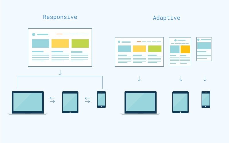
Responsive web design relies on fluid grids, flexible images, and CSS media queries using a single codebase, so the changes made to the website apply across all devices. On the other hand, adaptive web design employs multiple layouts served by a detected device and requires creating and maintaining numerous website versions.
Both approaches have benefits: responsive web design is less time-consuming to create and maintain, but adaptive provides more control over the layout being served.
Responsive vs. Mobile-First Web Design
Although often used interchangeably, responsive and mobile-first designs are different concepts.
Responsive design ensures the website looks and functions well on all devices, including desktops, laptops, tablets, and smartphones. The design starts with a desktop version and then scales to fit smaller screens.
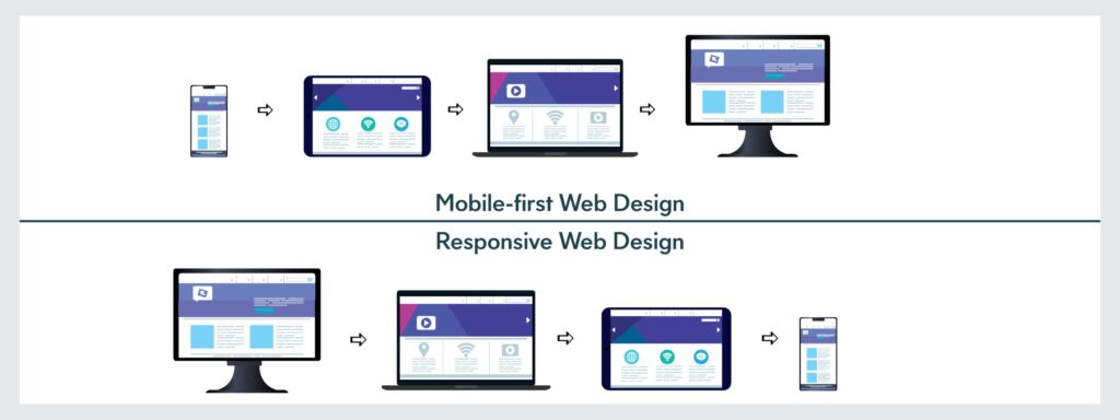
Mobile-first web design, as the name suggests, prioritizes designing for mobile devices first before considering larger screens. The design begins by creating a website version specifically tailored for mobile devices. The focus is optimizing the UX for smaller screens, considering the limited space, touch interactions, and slower connection speeds. After creating the mobile version, the design adapts to larger screens.
Simpler put, responsive web design aims to create a website that adapts to various screen sizes, starting with a desktop version and scaling down. Mobile-first web design prioritizes mobile devices, expanding the design for larger screens. There are many web development courses that explain the difference between responsive and mobile web design and provide fundamental knowledge about both of them.
Further reading:
Responsive Web Design Principles
The following responsive web design best practices, aka principles, will ensure flexibility and provide satisfying UX regardless of the device your website is approached from:
1. Start With Smallest Screens
This principle, also known as the “mobile-first” approach, involves designing the website primarily for mobile devices before considering larger screens. By beginning the responsive web design process with mobile devices, you ensure the website is optimized for smaller screens and limited resources such as bandwidth and processing power.
Starting with the smallest screens prioritizes simplicity, efficiency, and a streamlined UX. You can choose and present essential content and features in a limited space. This will avoid cluttering the UI and get a focused and user-friendly design. Once the mobile version is complete, expand and enhance the design for larger screens.
Coding Example: Use media queries to add features on wider screens. In CSS, define base styles for small screens. Then apply overrides.
/* Base styles for mobile */body { font-size: 16px; padding: 10px;} /* Enhance for tablets and larger */@media (min-width: 768px) { body { font-size: 18px; padding: 20px; } .sidebar { display: block; /* Hidden on mobile by default */ }}This code sets mobile as default. It reveals a sidebar on wider screens.
Note: Don’t fall into a common trap of grouping similar devices’ screen sizes into one category. Some smartphones have larger screens than tablets, while tablets can have larger screens than small notebooks. Instead of designing for mobile devices, tablets, laptops, and desktops, categorize design according to screen size: small, medium, large, and extra large.
Explore more:
2. Enhance Visual Hierarchy
Visual hierarchy is essential to designing responsive websites because screen space varies across different devices. Enhancing it ensures that users can easily navigate and understand the content regardless of their device. It helps create a cohesive and engaging UX, improving usability and overall satisfaction.
Coding Example: Apply CSS to scale headings and space elements. Use relative units.
h1 { font-size: 2.5em; /* Scales with base font */ margin-bottom: 1em;} p { font-size: 1em; line-height: 1.5;} @media (max-width: 480px) { h1 { font-size: 2em; /* Adjust for small screens */ }}This ensures headings dominate. Text remains readable on phones.
3. Create Fluid Grids and Flexible Images
Implementing a fluid grid allows the content to dynamically resize and rearrange to fit different devices. It ensures that the website maintains a consistent structure and readability, regardless of the screen size. Elements within the grid can scale and reposition, providing a seamless and optimized UX.
Flexible images resize proportionally, maintaining their aspect ratio as the screen width changes, without distortion or cropping. To achieve flexibility, designers use CSS techniques.
Coding Example: Define a grid container. Set image styles.
CSS
.container { display: grid; grid-template-columns: repeat(auto-fit, minmax(200px, 1fr)); gap: 10px;} img { max-width: 100%; height: auto;}<div class="container"> <img src="image.jpg" alt="Example"></div>Grid adapts columns. Image scales within cells.
4. Select Appropriate Typography
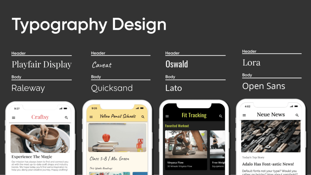
Typography is equally important for readability and website aesthetics. In responsive web design, you must select fonts that work well on different devices, screen sizes, and resolutions. Here is some valuable advice for typography selection:
- Ensure the chosen typefaces and font sizes are legible on various screen sizes, especially smaller devices like smartphones.
- Choose fonts that can scale well without losing their visual quality, keeping crispness and clarity regardless of the device or screen resolution.
- Implement responsive font sizes using relative units like percentages or viewport-based units (e.g., vw, vh) to ensure that the text scales proportionally with the screen size.
- Establish a clear typographic hierarchy to guide users’ attention from the most to the least important content elements.
- Adjust the line length to ensure comfortable reading. Long lines of text can be challenging to read, especially on smaller screens.
- Ensure sufficient contrast between the text and the background to enhance readability, particularly for visually impaired users. Choose color combinations that meet accessibility guidelines and ensure the text is legible under different lighting conditions.
- Avoid using generic placeholder text like “Lorem Ipsum” when designing layouts. It doesn’t provide a realistic representation of how the actual content will look on the website. Work with real content or content that closely resembles the final text to accurately assess the design’s effectiveness and readability.
Coding Example: Use viewport units for sizing. Ensure contrast.
body { font-family: 'Arial', sans-serif; font-size: 1vw; /* Viewport width based */ color: #333; background: #fff; /* High contrast */} @media (max-width: 600px) { body { font-size: 4vw; /* Larger on small screens */ }}Text adjusts dynamically. Contrast aids visibility.
Recommend for you:
Find out more in:
- Web Design Tools for Different Types of Web Design Software
- Steps of the Web Design Process
- Top 10 Web Design Companies in Vietnam
5. Include Content-Centric Breakpoints
When designing a responsive website, making all types of content (different text lengths and multimedia content) look good on every screen is challenging. That is why design should prioritize the content, not the device.
To achieve this, determine breakpoints (the specific “points” where the content and design adjust to provide satisfying UX), focusing on the content that will be displayed. Using content-centric breakpoints will ensure the layout adapts well to different screens and effectively presents all types of content.
Coding Example: Query based on content width. Rearrange elements.
CSS
.article { width: 100%;} @media (min-width: 800px) { /* When content fits two columns */ .article { column-count: 2; }}HTML
<div class="article"> <!-- Long text content --></div>Breaks create columns when space allows.
A good next read is: Top Animated Website Templates Providers
6. Don’t Hide Content
In the past, there was a misconception that certain content should be hidden for mobile devices. However, this approach has changed because people now use mobile devices in various contexts and rely on them as their primary source of internet access.
Therefore, do not hide content for mobile users. Instead, focus on finding ways to present it in a user-friendly manner that makes it accessible and user-friendly across all devices. Displaying content prioritizing UX for all screen sizes ensures users can access all the information they need, regardless of their device.
Coding Example: Use display properties to stack elements.
CSS
.section { display: flex; flex-direction: column; /* Stack on small screens */} @media (min-width: 1024px) { .section { flex-direction: row; /* Side by side on large */ }}HTML
<div class="section"> <div>Content A</div> <div>Content B</div></div>All content visible. Layout shifts.
7. Prioritize Accessibility
A responsive website should provide equal access and usability for all users, including those with disabilities or impairments. Ensure your web design includes keyboard accessibility, screen reader compatibility, color contrast, well-structured content, and accessible forms.

By implementing accessibility best practices, you ensure everyone can access, navigate, and engage with your website’s content, promoting a positive and inclusive UX
Coding Example: Use ARIA roles. Set focus styles.
HTML
<button aria-label="Submit form">Submit</button>CSS
button:focus { outline: 2px solid blue; /* Visible focus */} [role="region"] { background: #f0f0f0; /* Contrast */}Elements gain labels. Focus highlights aid navigation.
8. Test Responsiveness
Testing responsiveness ensures the website adapts and performs well across various devices and screen sizes. To check you did a good job, use responsive testing tools or conduct manual testing using different devices to access your website.
By thoroughly testing responsiveness, you can identify and address any issues or limitations that may impact the usability and performance of your website. It helps ensure that users have a seamless and enjoyable UX regardless of the device they use to access your website.
Coding Example: No direct code, but integrate media queries and test with browser dev tools. Example query for debug.
@media (max-width: 320px) { .debug { background: red; /* Flag small screen issues */ }}Highlights problems during tests.
See also:
9. Optimize for Performance
Performance drives user retention. Slow sites lose visitors. Responsive design demands fast load times across devices. Compress assets. Use efficient code. Prioritize critical rendering paths. This approach cuts bounce rates. It boosts engagement.
Minify CSS and JavaScript. Remove unused code. Enable browser caching. These steps reduce file sizes. Servers respond quicker. Users experience seamless interactions.
Coding Example: Implement lazy loading for images. Minify CSS.
<img src="image.jpg" loading="lazy" alt="Optimized">Apply tools like webpack for minification. This defers offscreen loads.
10. Implement Touch-Friendly Interactions
Touch inputs dominate mobiles. Design elements must suit fingers. Enlarge targets. Add spacing. Prevent accidental taps. This enhances usability. Users navigate without frustration.
Set minimum sizes for buttons. Handle touch events. Avoid hover-only interactions. These practices align with device realities.
Coding Example: Set minimum sizes. Handle events.
CSS
.button { min-width: 48px; min-height: 48px; padding: 10px;}JavaScript
document.querySelector('.button').addEventListener('touchstart', function() { // Handle touch});Buttons suit touch. Events respond.
Resources to Learn Responsive Web Design
Understanding the principles of responsive web design is just the beginning of the journey. To truly master these principles, you need to put them into practice. In this section, titled “3 Resources to Learn Responsive Web Design”, we’ll introduce you to five valuable resources that can help you apply and refine your understanding of responsive web design principles. These resources range from comprehensive guides and tutorials to interactive coding challenges, all designed to enhance your skills and confidence in creating responsive web designs. So, let’s explore these resources and take a step closer to mastering how to make a website responsive.
MDN Web Docs
The first resource on our list is the MDN Web Docs. This platform provides a comprehensive guide on responsive web design principles. It covers the basics of responsive design, including CSS features used to implement responsive designs.
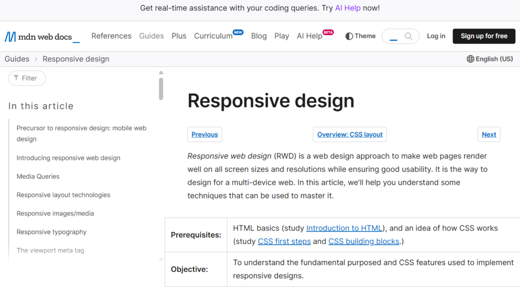
MDN Web Docs explains how to apply different CSS to a document depending on device features like screen width, orientation, and resolution. It also explores the technologies available for serving different video and images depending on such features.
This resource is particularly useful for beginners as it starts with the fundamentals of responsive web design. It helps you understand the purpose of responsive design and how to implement it using CSS.
Moreover, MDN Web Docs also provides a historical context, explaining how web design has evolved from mobile web design to responsive web design. This understanding of the evolution of web design can provide valuable insights when learning how to make a website responsive.
Coursera
Coursera is another excellent resource for learning responsive web design principles. It offers a variety of courses that cover the basics of responsive design, including CSS features used to implement responsive designs.
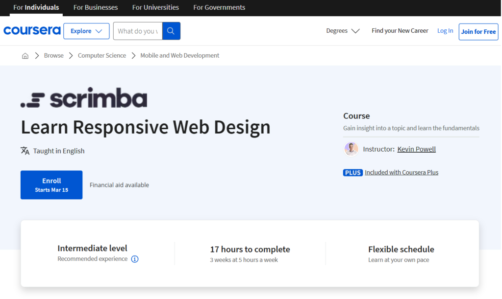
One of the courses, “Responsive Web Design”, is part of the Responsive Website Development and Design Specialization. This course provides a deep understanding of CSS and responsive design while keeping you fully engaged along the way. You’ll learn to build four different layouts: a blog, a landing page, a banner, and a company website. Each layout will take your skills to a new level.
The course includes interactive coding challenges as you progress. It’s as if you and the instructor are pair-programming together. This kind of fast-paced interactivity simply isn’t possible with any other platform than Coursera.
Another course, “Learn Responsive Web Design”, takes you to a professional level in responsive web design. You’ll learn to apply concepts from interaction design and human computer interaction in order to design and build an interactive, professional looking website. You will learn how to make your web page designs adapt to different screen sizes using responsive grid layouts.
LinkedIn Learning
Mastering responsive web design principles is a journey that often starts with LinkedIn Learning. This platform offers a comprehensive course on responsive web design. It’s a treasure trove of knowledge, packed with practical examples and real-world applications.
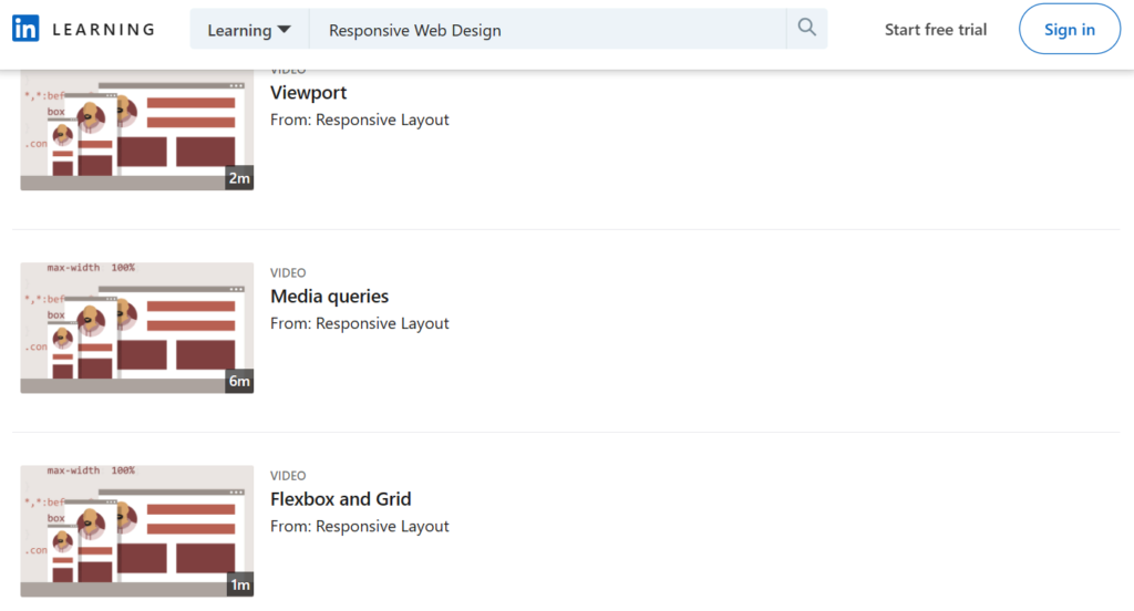
The course delves into the core principles of responsive design. It teaches how to create fluid grids and flexible images. It also explains how to use media queries to handle different devices and screen sizes. By the end of the course, learners have a solid understanding of responsive web design principles.
LinkedIn Learning’s course stands out for its hands-on approach. It encourages learners to apply their knowledge through various projects. This active learning strategy helps cement the principles in the learner’s mind.
Remember, mastering responsive web design principles is not an overnight process. It requires practice and patience. But with resources like LinkedIn Learning, the journey becomes more manageable and rewarding.
Conclusion
A responsive website is imperative in today’s rapidly evolving technology world, where new devices are constantly emerging. By investing in responsive web design, you not only ensure an enjoyable browsing experience for users across various screen sizes but also future-proof your website.
This article has provided valuable insights into the best practices for implementing responsive design, including resources for more learning. However, if you’re not a designer or developer, it’s advisable to seek professional assistance to elevate your website flexibility. At Designveloper, we hope you can do it better every day.
Also published on

Share post on


Related Articles
How a Storyblok Agency Simplifies Headless CMS Setup
How a Storyblok Agency Simplifies Headless CMS Setup Published May 05, 2026
Web Design Vs. Web Development: What’s the Difference?
Web Design Vs. Web Development: What’s the Difference? Published April 23, 2026
Web Development Cost: How Much to Build a Website?
Web Development Cost: How Much to Build a Website? Published April 23, 2026Read more topics

AI Development
AI Development
AI/Machine Learning
AI/Machine Learning

Automation Technologies & Solutions
Automation Technologies & Solutions

Back-End Development
Back-End Development

Best Companies
Best Companies

Blockchain Technology and Applications
Blockchain Technology and Applications

Business Analyst Role & Skills
Business Analyst Role & Skills

Chatbot Development
Chatbot Development

Cloud Technology Revolution
Cloud Technology Revolution

CMS Platforms Development
CMS Platforms Development


