










15 Modern Website Design Examples And The Principles Behind Them

Modern website design makes a site easy to understand, navigate, and use across devices while expressing a clear brand identity. The strongest examples do not share one visual style. They match their layout, content, and interactions to what visitors need to do.
That is why a government service, a developer platform, and a dinnerware shop can all feel modern in different ways. These 15 modern website design examples show choices worth adapting, followed by lasting principles and a practical way to improve an existing site without rebuilding everything.
15 Modern Website Design Examples To Inspire Your Next Project
Use these examples as solutions to visitor problems, not as templates to copy. For a useful baseline, our guide to web design principles explains how purpose, visual order, and navigation work together. The observations below concern publicly accessible pages reviewed in November 2026. Live layouts and promotions can change, and The Outline is explicitly a historical example.
Stripe: Clear Product Messaging For Technical Buyers
Stripe’s website has to explain financial infrastructure to businesses with different payment needs. Its main message names the business outcome before the page introduces individual products. Visitors can then explore payments, billing, and other tools through clear product categories.
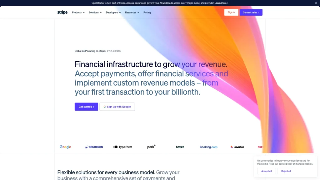
This order matters because a technical buyer may know the problem but not the product name. A B2B company can adapt the approach by stating the job its software performs, then showing a small set of routes for specific use cases. Detailed feature explanations belong on the pages where buyers compare solutions.
GOV.UK: Task-First Design And Accessible Public Services
GOV.UK serves people looking for specific public services, often under time pressure. Its homepage leads with search and recognizable subjects such as benefits, passports, and driving. Plain labels do more work than decorative visuals.
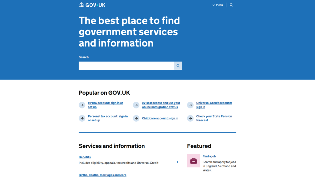
The lesson is not that every business should copy a government layout. It is that navigation should use the words visitors recognize. A service company with several customer groups could organize its menu around common tasks and test whether people find the right form without being taught internal department names. That is a stronger test of design than visual novelty.
Airbnb: Search-Led Discovery And Trust
Airbnb’s homepage turns a broad travel idea into a search. Visitors can specify where they want to go, when they plan to travel, and who is coming. Separate routes for homes, hotels, experiences, and services clarify what can be discovered.
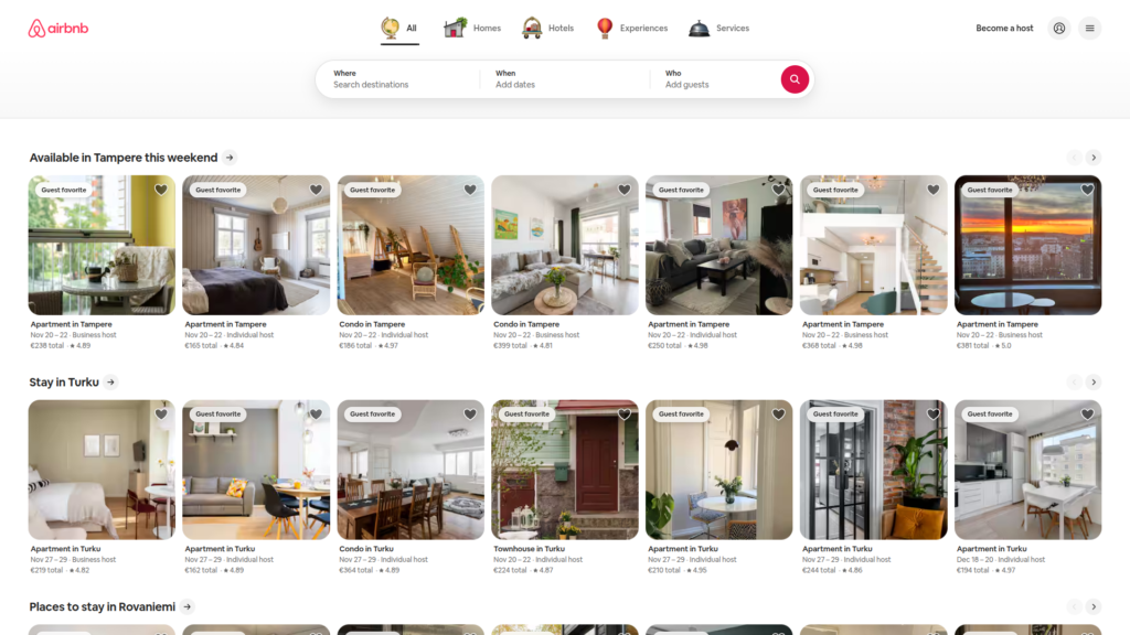
The design choice is to ask for the few details needed to begin rather than demand a complete plan. A booking website can use the same principle: make the first search simple, then reveal filters and listing details when they become useful. Trust still depends on truthful listing information and clear booking terms, not on attractive photography alone.
Apple: Product Storytelling And Visual Hierarchy
Apple’s homepage gives major products their own large visual sections. Short headlines, product imagery, and distinct links for learning more or buying help visitors decide how far to explore. Each section has a clear subject instead of competing with every other offer at once.
Businesses with a small product range can learn from that restraint. Choose the strongest product benefit for each section and make the next action clear. A complex service may need more explanation than an Apple product panel, so copy the information order rather than the amount of text.
Wise: Clear Financial Flows And Trust
Wise helps visitors understand international money transfers before committing. Its transfer interface connects the amount sent with the amount received, while related information shows fees and estimated arrival details. This makes a financial process more concrete than a general promise of low costs.
A business handling important transactions can adapt this pattern by displaying the inputs and consequences together. Show a customer what changes when they alter an amount or option. The figures must come from the actual transaction logic; a polished calculator that hides assumptions can weaken trust instead of building it.
Notion: Explaining A Flexible SaaS Product
Notion’s website faces a difficult messaging problem: teams can use the product for many kinds of work. Rather than begin with every feature, its homepage organizes the experience around actions such as capturing knowledge, finding answers, and automating tasks. Product visuals then make those actions easier to picture.
This approach fits software that is highly configurable. Start with a few common jobs and show how the interface supports them. When visitors recognize their own work, they have a reason to explore the wider feature set. A long feature list without that bridge leaves them to invent the use case themselves.
Linear: A Cohesive Brand And Product Interface
Linear introduces its product development system with actual interface content. Visitors can see issues, projects, activity, and team workflows rather than only abstract descriptions. Its consistent treatment of type, spacing, and interface panels helps these dense screens remain recognizable.
The useful idea is to make the marketing page resemble the product experience. A SaaS company could show one realistic workflow from its interface and explain what the user is doing. That offers more evidence than a generic dashboard mockup. Visual consistency also helps prospects connect what they see before signup with what they will use later.
Google Arts & Culture: Immersive Editorial Storytelling
Google Arts & Culture makes a large collection approachable through featured stories, artworks, online exhibits, and playful discovery routes. People can start with an object or subject that catches their attention, then follow it into deeper material.
This is valuable for organizations whose content is richer than a normal catalog. A museum, publisher, or education provider can lead with an interesting entry point and offer related paths without forcing every visitor through the same narrative. The essential safeguard is orientation: immersive presentation should not make search, labels, or the route back harder to use.
Headspace: Illustration And A Calm Visual Language
Headspace offers meditation, sleep resources, and mental health support. Its friendly illustration system gives these topics a recognizable visual identity. The homepage also organizes choices around visitor needs, such as sleep and stress, rather than expecting everyone to know which product to select.
A business can adapt the underlying relationship between tone and task. If visitors arrive uncertain or worried, reassuring visuals may help, but they should support clear language and obvious actions. A playful illustration is not a replacement for careful explanations, especially when the service concerns health or other sensitive decisions.
Miro: Product Screens That Show The Experience
Miro presents a visual workspace used for tasks such as diagramming, workshops, and planning. Its site names these uses and connects them to the canvas-based product. This is important because the value of a collaborative workspace is easier to grasp when visitors can picture the work taking place.
Software businesses can follow that example with honest interface demonstrations. Show a realistic starting point, an action, and the result within the product. For complex tools, one focused screen can explain more than a collection of unrelated screenshots. Use captions or nearby text to make the outcome clear to visitors who cannot inspect every visual detail.
Ridge: Product Discovery Through Shoppable Categories
Ridge gives shoppers direct routes to wallets, rings, travel products, and other categories. Its current homepage opens with promotional panels and then presents product categories and shoppable items in grids. Whether the first grid is above the fold depends on screen size and the current campaign; it is not a fixed homepage feature.
The transferable choice is quick access to real merchandise. An online store can place recognizable categories and products near the start of the shopping path, with enough detail to compare them. Seasonal promotions should not bury ordinary browsing. Test what a first-time visitor sees on a phone, not only on a large desktop monitor.
Supabase: Technical Detail For Developer Audiences
Supabase names core building blocks such as a Postgres database, authentication, storage, and realtime features. It also shows code and interface examples. That level of detail is useful because its visitors often need to assess technical fit before starting a project.
The broader lesson is to match proof to the buyer. A developer-facing website should make documentation, technical constraints, and a path to trying the product easy to find. A business-owner audience may need a simpler first layer. Modern design is not always minimal text; it gives knowledgeable visitors the detail required for a sound decision.
Locomotive: Experimental Motion And Agency Branding
Locomotive’s agency website uses an expressive visual identity and a prominent selection of client projects. For a design agency, that presentation is part of the evidence of its creative range. Visitors can explore the work instead of relying only on claims about originality.
Motion and unusual transitions can make sense when the experience itself demonstrates a service. They are a weaker fit for pages where visitors need a quick answer or an urgent action. Businesses taking inspiration from experimental sites should preserve readable content and clear controls. They should also test reduced-motion settings and performance before keeping an effect.
The Outline: Editorial Typography And Content Hierarchy
The Outline is a historical editorial example, not an active publication. Its archive remains accessible, while its newsroom was shut down in April 2020. The archive uses strong section labels and distinctive headline treatment to separate topics such as culture and the future.
Its continuing lesson is that typography can establish an editorial identity while helping readers choose a story. A content-heavy business can use consistent headline levels and category labels to make a large archive easier to scan. Treat the site’s design as a dated reference, not as evidence of current publishing practice or a model to reproduce without accessibility checks.
Palmer: A Distinctive Visual Identity For An E-Commerce Brand
Palmer’s dinnerware website presents colorful tableware as objects to explore. Its collection pages connect product photography with filters for characteristics such as color, type, and size. Visitors can browse by appearance without losing the route to specific products.
The practical lesson is to let a distinctive brand style improve discovery. A homeware retailer might use expressive product photos at the start, then offer a familiar catalog view for people who know what they need. The experience should still provide reliable names, dimensions, availability, and a usable mobile path. An unusual gallery is valuable only if shoppers can reach an informed choice.
Modern Website Design Principles That Go Beyond Visual Trends
Modern website design works when brand identity supports the task instead of competing with it. The same site should make sense to someone scanning a first page, using a keyboard, or returning on a small screen. These website design principles remain useful even when fashionable colors and effects change.
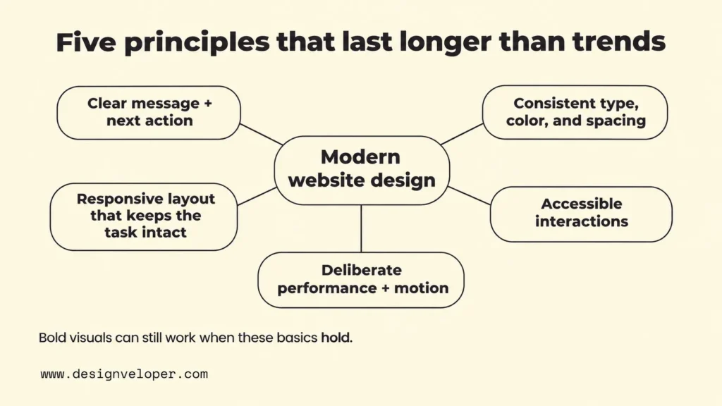
- Lead with a clear message and next action. State what the business offers and who it helps before adding secondary claims. Use headings and visual size to show which information matters first. If visitors have several distinct tasks, give each a recognizable route.
- Keep typography, color, and spacing consistent. Use a small set of text styles and spacing rules across pages. Consistency makes patterns easier to learn. Color should identify meaning or actions, not merely decorate empty space.
- Make responsive website design serve the same task everywhere. Flexible layouts should reflow as space changes without hiding essential information. Mobile menus, forms, and buttons must remain usable. Our responsive web design principles guide explains how to select breakpoints from content problems rather than device names.
- Build accessibility into interactions. Give controls meaningful names, support keyboard use, make focus visible, and provide sufficient contrast. WCAG 2.2 offers testable criteria. A fashionable interface that people cannot operate is not a successful design.
- Make performance and motion deliberate. Compress and size images appropriately, avoid shifts while a page loads, and use animation only when it explains a state or supports the story. Google’s Web Vitals guidance covers loading, interaction responsiveness, and visual stability. Test motion controls and reduced-motion preferences as well.
A site’s aesthetic can still be bold, quiet, colorful, or minimal. The choice depends on its audience and purpose. For changing styles rather than durable rules, see our separate overview of web design trends. Treat any new effect as a proposal to test, not a reason to replace a working user flow.
How To Modernize A Website Without A Full Redesign
You can modernize many websites by improving the pages and tasks that cause the most friction, then checking the results. A full rebuild is more likely to be necessary when the underlying platform cannot support essential changes, or when the information structure no longer matches the business.
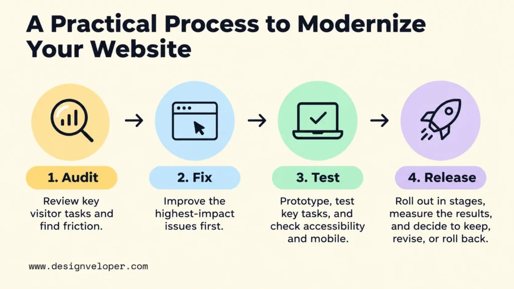
- Audit real visitor tasks. Choose one or two important journeys, such as finding a service, requesting a quote, or buying a product. Review analytics, user feedback, and the pages involved. Record where visitors get stuck and the current result for each journey. This creates a baseline rather than a vague goal to look newer.
- Fix the highest-impact friction first. Rewrite an unclear headline before commissioning new imagery. Simplify a menu if visitors cannot find key pages. On mobile, check whether controls remain visible and easy to use. Inspect slow images and layout shifts before adding motion. Rank fixes by the importance of the task and the evidence of a problem.
- Prototype and test the change. Try a revised page or reusable component before applying it across the site. Test a real task at narrow and wide widths, with keyboard navigation and text zoom. MDN’s responsive design guidance explains the flexible layouts behind these checks. Our web design process guide also provides a fuller path from requirements to review.
- Release in stages and compare the result. Recheck the main task and baseline from the audit, such as completed quote requests. Before launch, assign an owner and a review date or traffic sample. Agree what result will lead to keeping, revising, or rolling back the change. For example, review quote requests after one full reporting cycle. If they fall below the agreed threshold, inspect the form before applying the design elsewhere. Also recheck performance and accessibility after deployment.
For example, a media website with inconsistent article layouts might need shared grids, clearer heading styles, and reusable page templates before it needs a new platform. That is an illustrative scenario, not a reported client result. Standardizing those parts can make future pages easier to maintain, but the team should first confirm that the existing content system can support the change.
If several design fixes depend on front-end development, scope them together before starting. In our web development services, we include website design and redesign as well as implementation. For a useful first discussion, bring one priority visitor journey, examples of its current problems, and the result you want to measure. That makes it easier to decide whether a targeted update or a larger rebuild is justified.
FAQs About Modern Website Design
How Much Does A Modern Website Design Cost?
The cost depends on what needs to change. Updating typography and a few page templates is a different project from replacing a booking flow or building a custom online store. Design scope, content work, integrations, testing, and maintenance all affect the estimate. Our web development cost guide explains those cost drivers. Request estimates against a written scope and acceptance criteria rather than assuming a single market price fits every website.
What Fonts Make A Website Look Modern?
No single font makes a site modern. A clear sans-serif can suit a software product, while a carefully chosen serif can give a publication or premium brand more character. Readability depends on the complete setting: size, weight, spacing, line length, and contrast. Start with a readable body font, select a display font only if it serves the brand, and test both on small screens with real content.
Should My Website Use Dark Mode?
Use dark mode when it suits the audience and content, not simply because it looks current. It can work well for tools that people use in different lighting conditions, but it needs careful contrast, image treatment, and focus states. A theme switch adds design and testing work. If you offer one, remember the visitor’s choice and test both themes. A well-designed light interface is still modern.
Is Minimalist Website Design Still Popular?
Yes, minimalist design remains a useful approach, but it is not a universal rule. Removing distractions can help a product page or form. Removing necessary explanations can hurt a technical service or complex purchase. The better test is whether every element has a job. Keep the details visitors need to decide, then simplify the way those details are presented.
Also published on

Share post on










Related Articles


15 Modern Website Design Examples And The Principles Behind Them
15 Modern Website Design Examples And The Principles Behind Them Published November 18, 2026
Helvetica Neue Font: Licensing, Styles, and Mobile UI Decisions
Helvetica Neue Font: Licensing, Styles, and Mobile UI Decisions Published September 30, 2026
10 Best Prototyping Tools for UI, UX, and Product Design Teams
10 Best Prototyping Tools for UI, UX, and Product Design Teams Published September 29, 2026