











10 Luxurious Websites: Design Ideas, UX, And Brand Lessons To Apply

KEY TAKEAWAYS:
- Start with brand fit, not a preset luxury look. Apply web design principles to connect visual style with hierarchy and the visitor’s purpose.
- Judge each design by its visitor journey. A shopper, hotel guest, interior-design client, and yacht buyer need different routes to trust and action.
- Balance visual impact with access. Motion, large images, and unusual navigation should not hide product details, booking steps, or contact options.
- Adapt the principle, not the surface style. Test mobile layouts, readability, keyboard access, and the next step before borrowing a visual pattern.
Screenshot galleries make it easy to admire an elegant page and harder to explain why a design choice works. The ten luxurious websites collected here span fashion, jewelry, interiors, hospitality, automotive, and yachting, so each reference gives a different context to inspect. Each entry starts with a visible choice in the supplied image instead of treating visual polish as proof of a good experience. It also names a likely visitor task and a question to verify on the live site before adapting the pattern. That turns visual inspiration into a more useful starting point for a design brief.
What Makes A Website Feel Luxurious?
A luxury website is a brand-owned digital experience for high-value products, services, or hospitality. Its visual language should fit the brand and help visitors complete a meaningful task, such as exploring a collection, evaluating a portfolio, or checking a stay.
Luxury is not one palette or layout. A restrained editorial page and an expressive campaign-led page can both fit when each supports the brand promise. The broader field of modern website design offers many visual directions; the examples here focus on high-consideration journeys.
This is a curated inspiration set, not a ranking or a performance test. The observations describe the supplied reference images, not a current audit of every live site or market. Treat interaction notes as questions to verify on the current experience, since campaigns, layouts, and features can change.
Related reading:
- What Is Web Design? Principles, Process, And Practical Examples
- 20 Web Design Tools for Different Types of Web Design Software
- Web Design Vs. Web Development: What’s the Difference?
How To Evaluate Luxury Website Design
Evaluate the design by following a real visitor task, not by counting visual effects. A useful review connects brand identity to hierarchy, product or service information, and a clear next action. The same broad ideas appear in web design recommendations, but each brand needs criteria that fit its own audience and sales path.
Brand Identity And Visual Hierarchy
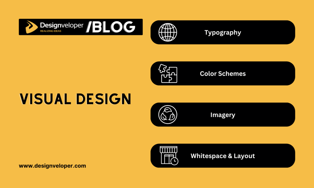
Typography, color, photography, spacing, and motion should reflect the brand rather than follow a luxury formula. A heritage watchmaker may need a different visual language from a contemporary fashion label or an intimate hotel.
Visual hierarchy should make the important choice easy to spot. A campaign may lead into a collection, destination imagery may lead to room details, and an interior portfolio may lead to the studio’s services.
- Brand fit: Do the words, images, type, and pace feel consistent with the brand’s promise?
- Legibility: Can people read product names, prices, service details, and calls to action?
- Content focus: Does each large image or animation support a story or task, rather than compete with it?
- Distinctiveness: Could this page belong to any brand, or do its details make the identity recognizable?
- Information order: Are product facts, service details, and the next step easy to find?
User Experience Across The Full Journey
A polished visual layer is not enough if visitors cannot move from discovery to evaluation, trust, and action. Review one task from the first page through buying, booking, or making an inquiry. This is where user experience design becomes visible in the flow, not only in the page’s appearance.
Choose a task that matches the business. A shopper may compare materials and sizes. A hotel guest may check dates, rooms, and booking terms. An interior-design client may review relevant work before contacting the studio.
- Discovery: Can visitors find a category, destination, project type, or service?
- Evaluation: Are the product, room, service, or project details easy to compare?
- Trust: Are policies, availability, contact details, and next steps clear?
- Action: Can visitors buy, book, locate a store, or request information without losing their place?
Repeat the task on a phone and with a keyboard. Check menu use, readable text, visible focus, reduced-motion options, and form errors. Responsive web design helps layouts adapt across screens, but teams still need to test the complete task on real devices.
For practical examples, check out:
- Responsive Web Design Examples: 25 Real Websites
- Why Web Design Is Important for Business?
- Top 7 Essential UI Design Principles for Newbies
Luxury Fashion And Jewelry Websites
Fashion and jewelry sites often balance campaign storytelling with product discovery. Their design choices matter when they help visitors move from a brand story to a product, collection, store, or service. For purchase journeys, ecommerce UI/UX design offers related guidance, but luxury examples still need brand-specific choices.
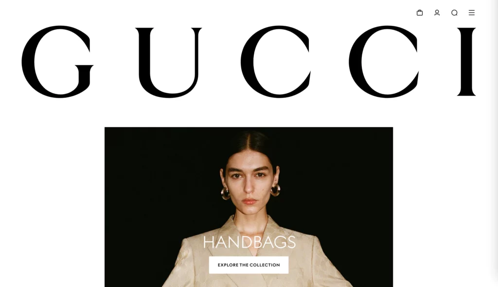
Gucci: Use Motion To Introduce A Brand Story
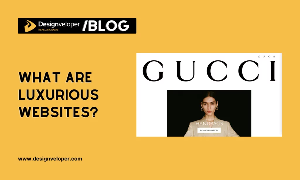
The supplied Gucci image foregrounds a large wordmark with product and campaign imagery. The scale of the brand name gives visitors an immediate identity cue, while the product imagery signals what they can explore next.
A campaign-led opening helps only when visitors can move from the story to a collection or item. A still reference image cannot confirm how scrolling, motion, or navigation works on the current site.
What to adapt: Pair one clear brand statement with a visible route to products. If the live design uses motion, test reduced-motion behavior and keep collection navigation available without it.
Jimmy Choo: Connect Campaigns To Product Categories
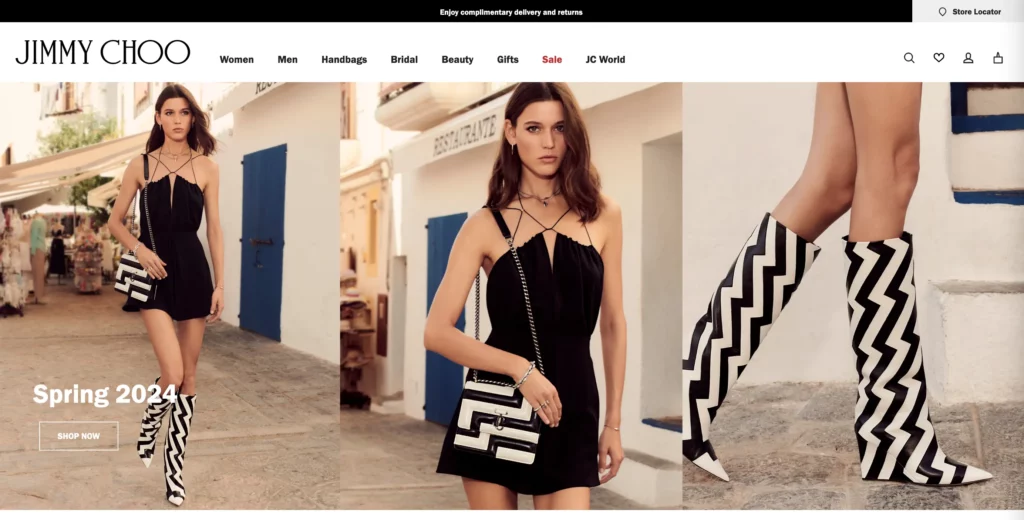
The supplied Jimmy Choo image places category navigation beside campaign imagery for new arrivals and bridal products. That layout presents both a direct product route and an editorial route into a collection.
The two paths serve different shopping behaviors, but campaign content should not hide category access. If the live page uses a carousel, check whether visitors can control it and whether the category route stays visible on small screens.
What to adapt: Connect each campaign to a clear collection or product category. Keep stable navigation available so a visitor does not have to wait for a slide to find the item they want.
Tiffany & Co.: Treat Signature Color As A Brand Asset
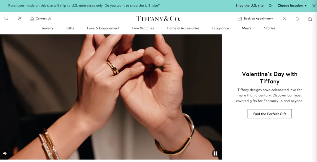
The supplied Tiffany & Co. image pairs the familiar blue brand cue with jewelry photography and wordmark styling. The useful design lesson is consistency: a recognizable cue can connect campaign and product pages.
That does not make blue, black, or gold a universal luxury signal. Color must still support contrast, readable labels, clear buttons, and accurate product details. Visitors should not need to identify a control by color alone.
What to adapt: Choose a small set of brand cues that can repeat across pages, then check contrast and product information separately.
Rolex: Let Product Inspection Support High-Consideration Choices
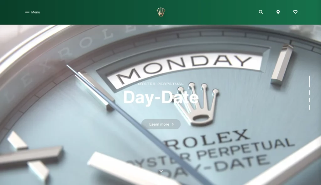
The supplied Rolex image emphasizes close watch imagery and model context. That presentation gives a visitor a reason to inspect details before choosing which collection or model to explore.
Images alone cannot answer questions about size, materials, availability, or service. Keep specifications and comparison details close to the visual, and do not assume an image proves that a video or 360-degree control works.
What to adapt: Use close product views to answer a real buying question, then provide text details that visitors can scan and compare without relying on the image.
Fendi: Separate Store Visits From Digital Updates
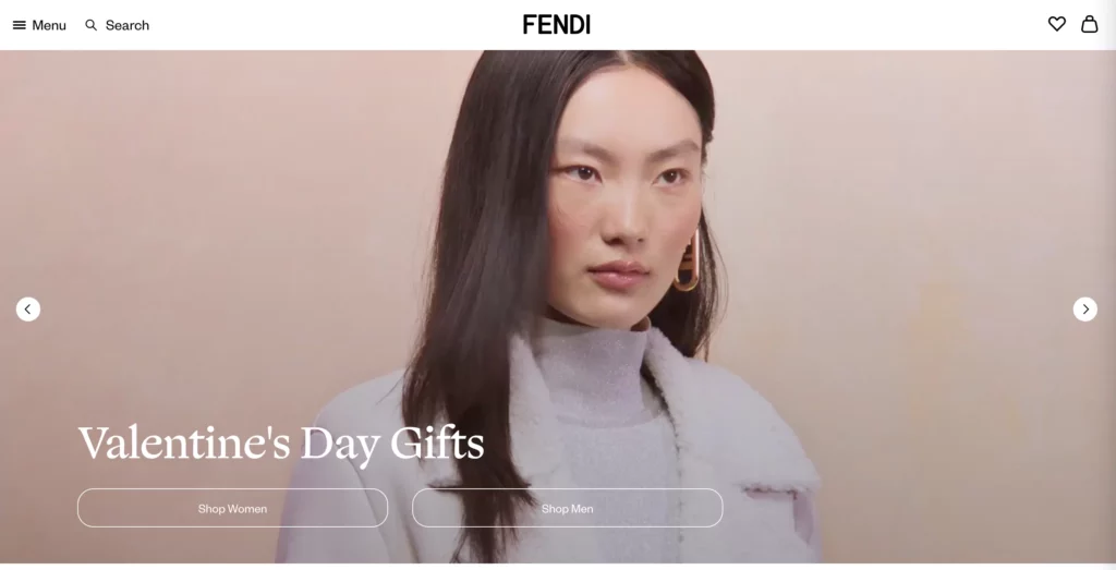
The supplied Fendi image presents fashion imagery beside two distinct actions: locating a store and signing up for email. Those actions serve visitors who want an in-person visit and visitors who want brand updates.
Each action needs a clear label and an honest next step. A store locator should make location entry simple; an email form should state what updates a person will receive. Neither action should block product browsing.
What to adapt: Separate online and in-person routes when a brand serves both. Make each path easy to choose and explain what happens after a click.
Swarovski: Give Detailed Product Imagery A Clear Role
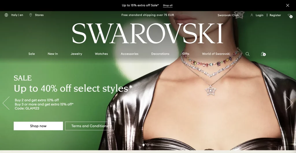
The supplied Swarovski image emphasizes crystal detail and a recognizable brand mark. Close product photography can help visitors notice cut, shape, or finish before opening a product page.
The image cannot establish how well a gallery performs or whether a promotion appears in every market. Product pages should still provide the facts and selection details that imagery cannot show.
What to adapt: Use detailed photography to support inspection, then keep product facts and any membership prompt separate, optional, and easy to understand.
Luxury Interiors And Hospitality Websites
Interior and hospitality sites help visitors assess an experience they cannot fully judge from a specification. The page needs to show the work or destination, explain the offer, and make an inquiry or booking path clear.
Nicole Fuller Interiors: Make The Portfolio Lead To A Service Inquiry
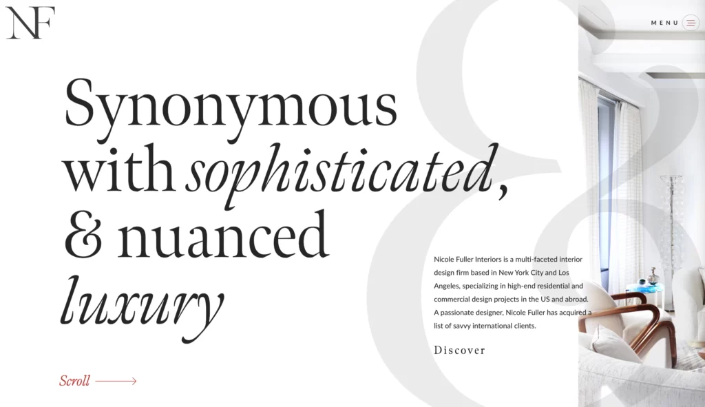
The supplied Nicole Fuller Interiors image presents selected interior projects as a visual portfolio. A curated set can help prospective clients judge whether the studio’s style is relevant to their own space.
Photographs need context to support a real choice. Project type, room, service scope, or location can help visitors compare relevant work before they contact the studio.
What to adapt: Pair portfolio images with enough project context and a direct inquiry route. If the live portfolio scrolls horizontally, provide visible controls and a keyboard-friendly alternative.
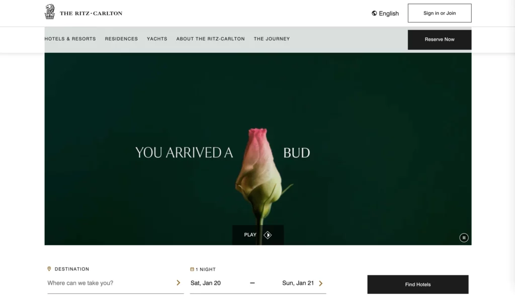
The Ritz-Carlton: Join Destination Storytelling To Booking
The supplied Ritz-Carlton image pairs destination imagery with a booking route. The visual helps visitors picture a stay, while the booking entry signals a next practical step.
Visitors still need dates, room information, availability, and booking terms before they can make a choice. Keep those details close to the booking flow rather than making people search through a long visual story.
What to adapt: Let destination content create context, then keep availability and booking details easy to reach on both desktop and mobile.
Automotive And Yachting Websites
Automotive and yacht websites present high-value choices with many possible paths. Rich media can set a tone, but visitors also need ways to compare options, understand services, and contact the right team.
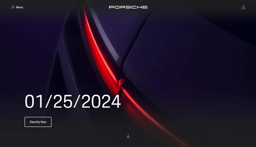
Porsche: Turn Configuration Into A Guided Decision
The supplied Porsche image shows vehicle imagery, model context, and a route toward customization. That visual can move a visitor from browsing a model to considering a more specific configuration.
A configuration flow should make each choice and its effect easy to review. Keep specifications nearby and show a useful summary before visitors share or save their choices.
What to adapt: For configurable products, show progress, preserve selections, and explain important option differences before asking for an inquiry.
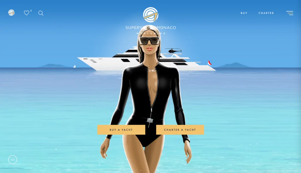
SuperYachtsMonaco: Make Immersive Media Serve A High-Value Inquiry
The supplied SuperYachtsMonaco image combines yacht imagery with a stylized 3D character. This gives the reference a distinctive visual tone, but the still image does not confirm how any live animation behaves.
Buying, selling, building, and chartering attract different visitors. Each route should lead to relevant inventory or service details, rather than making every visitor pass through the same visual sequence.
What to adapt: Use one memorable visual cue, then keep service and inquiry routes visible. If motion is part of the live experience, offer a reduced-motion path and test load time.
Turn Inspiration Into A Luxury Website Brief
Use an example as a prompt for a design decision, not as a template to copy. A short brief can connect the brand’s position to a real user task and help the team test whether visual choices support it.
Use the brand’s main task to shape the brief. A hotel may focus on destination discovery and booking; a design studio may focus on portfolio review and inquiries. Shopping teams can also apply an ecommerce UI/UX design lens to product discovery and checkout.
- Name the brand signal. Write down the qualities visitors should recognize, then identify proof in the products, service, materials, or story.
- Choose one main journey. Define the visitor, starting point, information needed, and next action, such as compare, book, buy, or inquire.
- Set the content order. Put the most useful information near the decision. Keep campaign material, product facts, service details, and policies distinct.
- Choose visuals for a reason. Assign each image, animation, or interaction a job. Remove elements that compete with the primary task.
- Test the experience. Check mobile layout, readable type, keyboard use, image loading, form errors, and reduced-motion behavior before release.
- Review real task outcomes. Ask target users to complete the journey and note where they pause, get confused, or leave. Use those findings to adjust the design.
A web design process can turn these observations into a workable plan. Define the visitor, primary task, content hierarchy, success measure, and constraints before expanding the visual system. A UX design process can help teams test that journey with users before adding new interactions.
Use the brief as a test plan: name what visitors should be able to do and what evidence will show that the design supports the task. If the page looks polished but visitors cannot complete that journey, revise the hierarchy before adding more visual effects.
Also published on

Share post on







Related Articles


13 Informational Website Examples: UX Patterns For Your Site
13 Informational Website Examples: UX Patterns For Your Site Published October 05, 2026
How to Use Website Templates: 10 Things You Need to Notice
How to Use Website Templates: 10 Things You Need to Notice Published April 25, 2025
10 Luxurious Websites: Design Ideas, UX, And Brand Lessons To Apply
10 Luxurious Websites: Design Ideas, UX, And Brand Lessons To Apply Published February 18, 2025