










13 Informational Website Examples: UX Patterns For Your Site

KEY TAKEAWAYS:
- Start with the reader’s task. A reference lookup, a course search, and a health question need different paths through information.
- Make the next step visible. Descriptive labels and topic paths help readers continue across pages; use responsive web design to keep those paths usable on smaller screens.
- Show why content deserves trust. Put authorship, sources, review context, and clear limits near the information they support.
People rarely visit an informational website to admire its layout; they arrive with a question, a task, or a decision to make. If the page makes the next step hard to find—or the source hard to trust—good information can still feel inaccessible. These 13 informational website examples are grouped by reader task rather than ranked. For each, the analysis points to a visible navigation, content, or learning pattern, explains the user benefit, and shows what to adapt for a different audience, content library, and device mix.
What Is an Informational Website?
An informational website organizes pages around a subject or reader need so visitors can learn, verify, and use information. Unlike a blog that may prioritize publishing cadence, it often relies on stable topic categories, evergreen pages, search, and navigation. It can contain articles, reference pages, lessons, news, or tools; its defining job is to help users find, understand, and evaluate information. That makes the choices in web design and UX design inseparable from the content structure.
Explore more:
- All You Need to Know About Web Navigation Examples
- 10 Luxurious Websites: Design Ideas, UX, And Brand Lessons To Apply
- Responsive Web Design Examples: 25 Real Websites
Choose an Example by Reader Task
- Look up or verify a fact: study encyclopedia and reference patterns.
- Understand a developing story: look at news hubs, explainers, and related coverage.
- Learn a skill or subject: examine lesson paths, progress cues, and practice feedback.
- Explore a specialist topic: review how health, finance, and technology sites make expertise and limits visible.
- Understand an idea visually: study how a story or lesson combines images, video, and explanatory text.
Quick Comparison of 13 Informational Websites
This comparison is a starting point, not an overall ranking. Use the reader task and pattern columns to shortlist examples; then check whether the trust cues and trade-offs fit your own subject and audience.
| Website | Best for | UX pattern to study | Trust cue to inspect | Common watch-out |
|---|---|---|---|---|
| Wikipedia | Reference lookups | Contents, in-page links, and related topics | Citations and revision history | Dense pages can overwhelm new readers |
| Britannica | Curated knowledge | Consistent entry structure and guided exploration | Editorial context and citations | A tightly curated path may limit open exploration |
| The New York Times | Long-form news and analysis | Headline, summary, subheads, and media hierarchy | Byline, date, and clear format labels | A paywall can interrupt a reading path |
| BBC News | Scanning current news | Modular story cards and topic hubs | Story context and published editorial standards | A busy homepage can compete with the main task |
| The Guardian | Explainers and continuing coverage | Related stories that extend a topic | Bylines and linked reporting context | Prompts and recommendations can distract from reading |
| Khan Academy | Self-paced learning | Skills, lessons, and practice in a learning path | Clear lesson goals and supporting explanations | A large catalog still needs simple wayfinding |
| Coursera | Course and credential discovery | Filters and comparison-friendly listings | Provider, credential, and course details | Too many choices can create decision fatigue |
| Udemy | Finding a focused course | Search, sorting, and repeatable course pages | Instructor, curriculum, and review context | Catalog size needs useful selection criteria |
| WebMD | Navigating common health questions | Topic clusters and logical next questions | Author/reviewer, source, and medical limits | Education must not be mistaken for diagnosis |
| Investopedia | Understanding financial terms | Repeatable definitions and examples | Author and review context | Too many cross-links interrupt a definition |
| The Verge | Technology news and explainers | Visual hierarchy and recognizable formats | Bylines and clear news/review labels | Visual weight should not reduce readability |
| National Geographic | Visual and immersive storytelling | Narrative pacing around images and media | Captions, credits, and source context | Heavy media needs accessible, fast alternatives |
| TED-Ed | Short lessons that explain an idea | Video paired with lesson materials | Learning objective and supporting resources | Video needs captions and a text-based path |
A Simple Way to Adapt a Pattern
Use a pattern to remove friction in a real reader journey, not because another site uses it. A short review before designing can keep an attractive reference from becoming a poor fit:
- Name the task. Write what the visitor needs to find, compare, learn, or verify.
- Choose the content shape. Match the task to a glossary, article, topic hub, course, or step-by-step explainer. A web design process can help the team define that structure before polishing screens.
- Prototype one path. Sketch the entry page, the next step, and the return path so stakeholders can review the hierarchy before implementation.
- Check access and trust. Test keyboard use, mobile layouts, readable type, load behavior, authorship, source links, and review dates. Apply design principles without treating them as a substitute for user testing.
- Test with a real question. Ask someone to complete the task without coaching, note where they hesitate, then improve that page before expanding the pattern across the site.
This sequence keeps inspiration practical: borrow the interaction that serves your reader, then adjust its density, language, and evidence to fit your own content.
Encyclopedia and General Knowledge
Reference sites serve readers who may need one fact or a route into a much larger subject. Clear hierarchy, source context, and links between concepts help them move between those levels.
1. Wikipedia
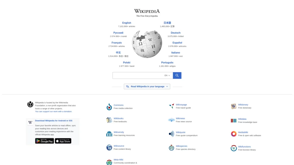
For reference lookups, Wikipedia connects an article contents list, descriptive headings, in-page links, citations, and revision history. Readers can scan for one answer or follow the subject into supporting detail without treating the page as one uninterrupted essay.
For your site: Put common questions first, label sections precisely, and link concepts when the next step is clear. Long contents lists can overwhelm new readers. Citations and edit history aid verification, but they do not prove every claim; show review ownership and source quality where the topic demands it.
2. Britannica
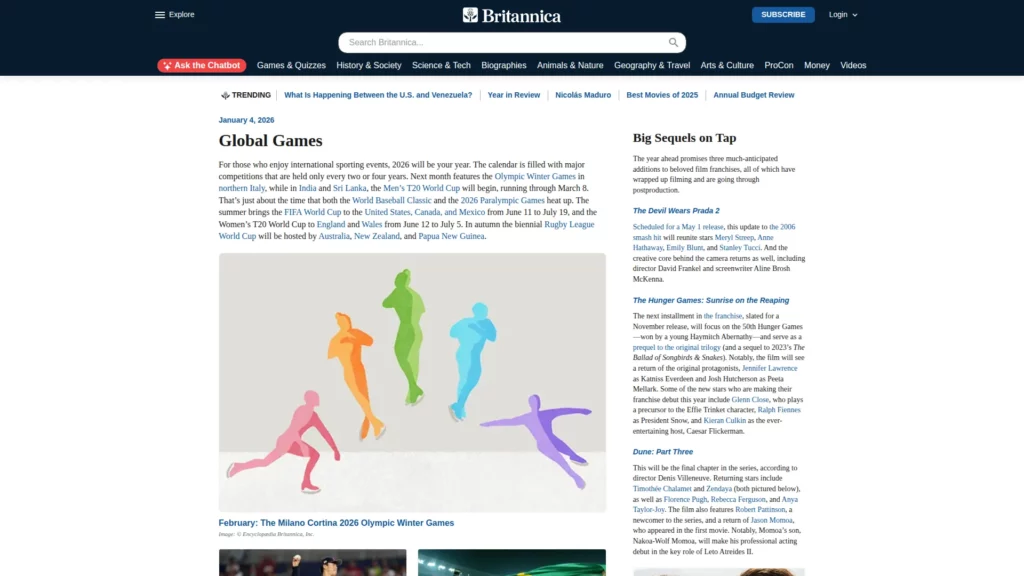
Britannica offers a contrasting reference pattern: curated entries with consistent hierarchy and routes into related topics. That structure suits readers who want an edited path through a subject instead of an open-ended network of pages.
What to borrow: Keep article templates consistent, explain unfamiliar topics plainly, and make related material easy to find. If experts review content, name who owns the review and what it covers. Curation should not hide alternative viewpoints when they matter.
News and Journalism
News readers often need to scan what is new, understand the context, and decide what to read next. These publishers show different ways to support that journey while keeping story formats and source context recognizable.
3. The New York Times
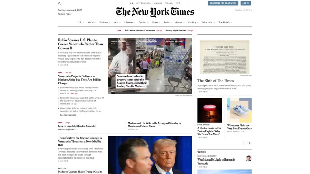
The New York Times is a useful reference for long-form hierarchy. A headline, summary, subheads, and media help readers understand a story before committing to a longer read. Labels for news, opinion, and analysis also set expectations.
On your own articles: Add a short orientation, break long material into meaningful sections, and surface byline, date, and source context. If registration or a paywall limits access, explain that before readers invest time in the story.
4. BBC News
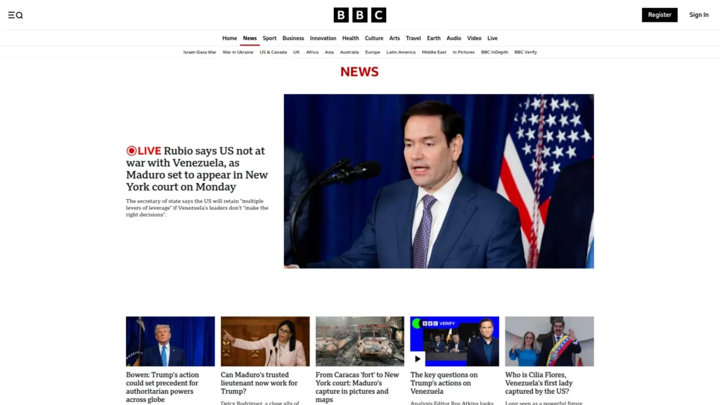
BBC News uses modular story cards and topic hubs to support scanning while distinguishing updates, background, and wider coverage. It also publishes its editorial guidelines for readers to inspect.
A practical version: Use repeatable cards for topic, headline, date, and format. Keep the most important current item prominent without letting a crowded homepage compete with the reader’s task. Link editorial standards from relevant content in plain language.
5. The Guardian
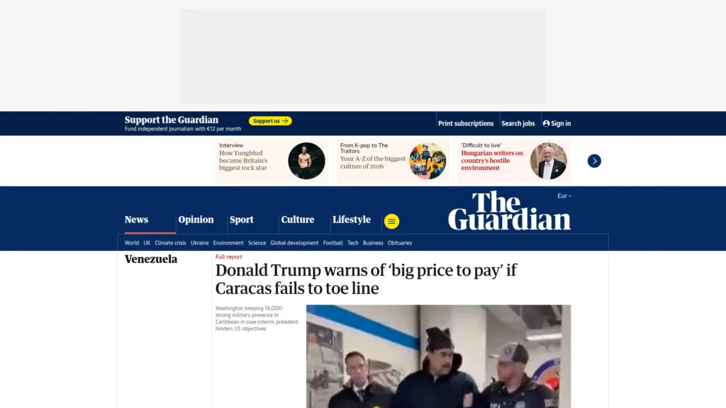
The Guardian shows how explainers, topic pages, and related stories can connect a current event to background or analysis. This path helps when one article cannot answer every question raised by a developing subject.
To use this well: Recommend material related to the page just read, and explain why it belongs. Keep the story visually dominant and distinguish editorial content from fundraising or promotional prompts; recommendations should extend the journey, not compete with it.
For a deeper dive, read:
- 9 Web Design Principles Must Be Obeyed
- 10 Best Prototyping Tools for UI, UX, and Product Design Teams
- How To Create A Website Mockup: A Guide To Integrating Mockups
Education and E-Learning
Learning platforms need to do more than list material. Their structure should show what a lesson covers, what comes next, and how a learner can check understanding without losing their place.
6. Khan Academy
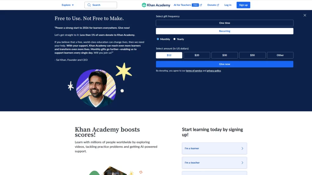
Khan Academy organizes skills, lessons, and practice into self-paced paths. A sequence gives learners a next step, while exercises connect explanation to active use instead of leaving lessons as unrelated catalog items.
A useful adaptation: Group lessons by outcome, state what learners should be able to do, and show progress without implying mastery from one click. Pair video with captions and readable explanations; let people find prerequisites or skip familiar material.
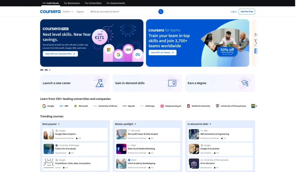
7. Coursera
Coursera’s structured listings and filters help people compare subjects, levels, duration, providers, and credentials before opening a course. Keeping decision details near search results can reduce unnecessary back-and-forth.
For a smaller catalog: Filter on real learner decisions, label the provider and credential, and surface prerequisites and access conditions. When choices are numerous, offer a useful starting path and distinguish promoted options from neutral recommendations.
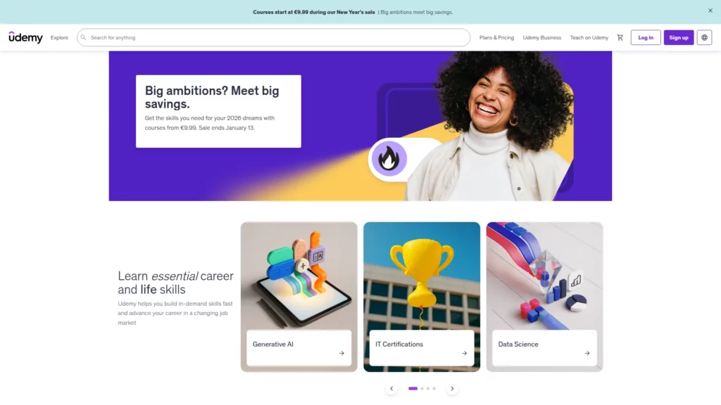
8. Udemy
Udemy uses search, sorting, and repeatable course pages to help people narrow a large catalog. A consistent layout makes curriculum, instructor, level, and learner feedback easier to compare.
To recreate the benefit: Keep comparison fields stable and explain what ratings do—and do not—show. Make filters usable on smaller screens. When options are similar, give readers selection criteria instead of an endless list.
Niche Authority
Specialist sites answer questions where context and confidence matter. Their design should make it easy to identify the topic, understand the limits of the information, and find a suitable next step.
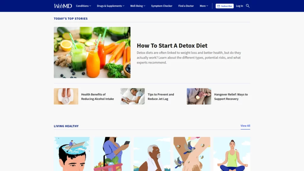
9. WebMD
WebMD groups health topics and related questions so readers can move from one subject to adjacent explanations instead of browsing a flat archive.
For high-stakes topics: Place author or reviewer, review date, sources, and intended use beside the guidance. Distinguish general education from personal medical advice and identify an appropriate route to professional care. Never let promotions obscure safety information.
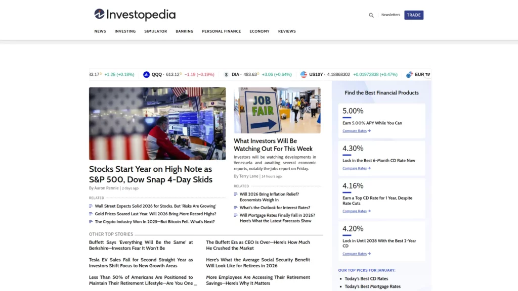
10. Investopedia
Investopedia makes financial definitions easier to navigate with repeatable article structures, examples, and related terms. Readers can begin with a concept’s meaning and continue into its context.
A reusable version: Define the term first, then use an example to show how it applies. Link adjacent concepts selectively. For financial topics, distinguish general education from advice tailored to a person’s goals or circumstances.
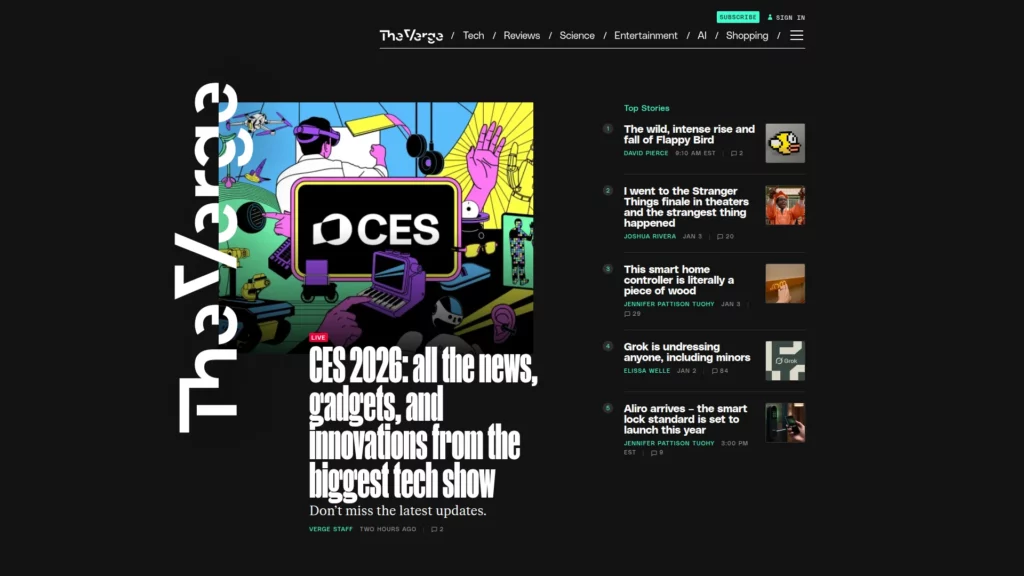
11. The Verge
The Verge combines technology reporting, explainers, and reviews in recognizable formats. Clear labels help readers tell reporting, interpretation, and product reviews apart before reading.
The transferable lesson: Use distinct labels and a clear visual hierarchy; keep the byline, date, and sources visible. Imagery should add context without displacing headlines, navigation, or readable body text.
Visual and Immersive Storytelling
Images, animation, and video can explain spatial, scientific, or abstract ideas—but only when the media contributes information. Readers still need a clear narrative, accessible alternatives, and control over how much media they load or play.
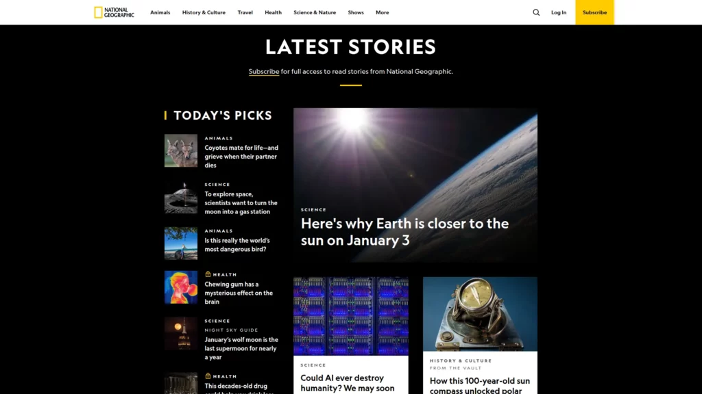
12. National Geographic
National Geographic uses images, captions, and pacing to establish context. The surrounding text explains what a visual shows and why it matters instead of asking the photograph to carry the story alone.
To make media useful: Explain visuals, add captions and credits, and provide text alternatives. Use motion to clarify a relationship or sequence, then test load behavior and reduced-motion preferences. See how website animations can serve a clear purpose.
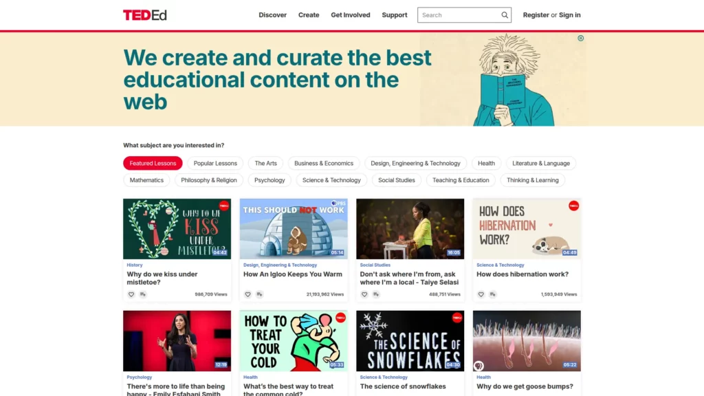
13. TED-Ed
TED-Ed pairs animated explanations with lesson materials, giving viewers a route from watching to checking or discussing an idea. Each media element works best when it supports one learning objective.
For a text-first equivalent: Pair video with a concise explanation, captions or transcript, and sources. If you use animated website templates, keep motion subordinate to the lesson and make sure the material still works when animation is disabled.
FAQs
What is the best platform to build an informational website?
Choose a content management system that supports structured content, reusable templates, search, editorial permissions, and accessible publishing. A small site may need a simple editor and a few page types; a large library usually needs taxonomy, role-based review, and a repeatable content workflow. Compare platforms against those needs before choosing, and test the workflow with a real page rather than a feature checklist alone. A website template can speed up a small launch, but it should not dictate the content model.
How do informational websites make money?
Common models include advertising, sponsorships, memberships, subscriptions, affiliate links, and paid courses or resources. Choose a model that fits the audience and label paid placements clearly. Keep promotions separate from editorial review, and make sure monetization does not block access to information the site promises to provide.
What is the difference between a blog and an informational website?
A blog often organizes content around posts and publishing cadence, while an informational website organizes it around a subject, task, or knowledge structure. The formats can overlap: a blog may be part of an informational website, and a reference site may publish time-sensitive updates. The useful distinction is how readers are expected to find and use the information.
Conclusion
The strongest informational website is not necessarily the one with the most media or the largest library. It is the one that makes a reader’s next useful step clear and gives them enough context to judge the information. Treat these examples as patterns to test—not designs to copy wholesale—and prioritize findability, readable structure, accessible media, and visible trust cues.
For an information-heavy product with structured content, search, user roles, or interactive workflows, Designveloper’s web application development team can help turn those requirements into a maintainable experience.
Also published on

Share post on










Related Articles


13 Informational Website Examples: UX Patterns For Your Site
13 Informational Website Examples: UX Patterns For Your Site Published October 05, 2026
How to Use Website Templates: 10 Things You Need to Notice
How to Use Website Templates: 10 Things You Need to Notice Published April 25, 2025
10 Luxurious Websites: Design Ideas, UX, And Brand Lessons To Apply
10 Luxurious Websites: Design Ideas, UX, And Brand Lessons To Apply Published February 18, 2025