













What Is a Wireframe for an App? Examples & How to Create One

KEY TAKEAWAYS:
- Use an app wireframe to agree on screen structure, content priority, and navigation before visual styling or implementation.
- Visual fidelity and interactivity are separate choices: a detailed screen can still be static, while a simple screen can be clickable.
- Map the user task from entry to completion, including relevant empty, loading, error, or confirmation states.
- Test the flow with realistic tasks and observe wrong turns or hesitation instead of asking only whether stakeholders like the layout.
- Choose a tool based on the work: quick low-fidelity sketching, shared interface files, or behavior that needs a prototype.
Before a team discusses colors, icons, and motion, it needs a shared view of which screens an app requires and how people move between them. That early map is easy to confuse with a polished mockup or a clickable prototype, even though each artifact answers a different question. This guide clarifies those boundaries, shows what to put on an app wireframe, and walks through a practical booking flow from first sketch to user test. It also compares current tools so beginners can choose a suitable starting point without treating a free plan as a universal fit.
What Is a Wireframe for an App?
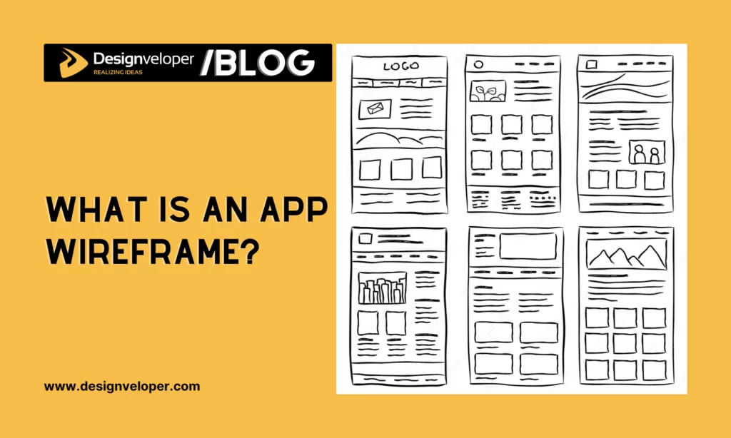
An app wireframe is a simplified, screen-by-screen plan of a mobile app’s content, hierarchy, navigation, and task-related controls. It helps a team decide what belongs on each screen and how screens connect before spending time on detailed visual design or code. A basic wireframe is usually static: it communicates structure, not the finished app’s behavior or backend.
A wireframe is useful when a team needs to review screen order, labels, and the main action a user should take. For a grocery app, an early screen map might place search, categories, product results, and the route to a cart before the team chooses brand colors or product photography. Some teams link screens to demonstrate a flow, but once the review depends on simulated taps or responses, the artifact is functioning as an interactive prototype.
| Artifact | Main question it answers | Typical level of detail or behavior |
|---|---|---|
| Wireframe | What information and actions belong on each screen? | Simple blocks, labels, and screen relationships; often static. |
| Mockup | What might the interface look like? | More visual detail such as color, type, imagery, and spacing; usually static. |
| Prototype | How does a person move through or interact with the design? | Screens may be linked and simulate actions or states; fidelity can vary. |
The terms can overlap in real projects: one file may contain rough wireframes and clickable links. The important distinction is the purpose of the review. Wireframes focus on structure, mockups on appearance, and prototypes on behavior. If the team is deciding whether it needs a clickable concept or a build-ready product, this comparison of a prototype, proof of concept, and MVP explains the different validation jobs.
Visual fidelity and interactivity are separate.
Low, medium, and high fidelity describe how much visual detail a screen contains. They do not tell you whether the screen is interactive. A high-fidelity mockup can be static, and a rough paper sketch can be used in a facilitated test where a researcher changes pages as a person taps.
Start with low fidelity when the team is still deciding screen order, content priority, or navigation labels. Add visual detail only when the question depends on it. Add links or simulated states when the team needs to observe a user completing a task. This keeps a wireframe focused instead of making every early screen look finished.
If the review does depend on visual hierarchy, these essential UI design principles can help frame that discussion.
For a deeper dive:
- Product Design Process: 6 Steps From Research To Launch
- UI vs UX Design: Definition and Why This Comparison Should Not Exist?
- How To Create A Website Mockup: A Guide To Integrating Mockups
Why App Wireframes Matter
An app wireframe gives product, design, and engineering teammates a concrete object to discuss before implementation. It does not guarantee a successful product or remove the need for research; it makes early decisions easier to inspect and change.
- Expose missing steps: A screen flow can reveal when a task has no clear start, next action, or completion state.
- Agree on priority: A team can decide which information or action deserves the most space before refining colors and visuals.
- Find unclear language: Reviewers can question labels, instructions, and navigation while changes are still inexpensive to make.
- Focus feedback: A rough layout encourages discussion about what the user needs to do, rather than premature debate about polish.
These benefits depend on a clear question. If the team does not know which task or assumption it is reviewing, a wireframe can become a collection of screens without a useful decision attached to it.
What to Include in an App Wireframe
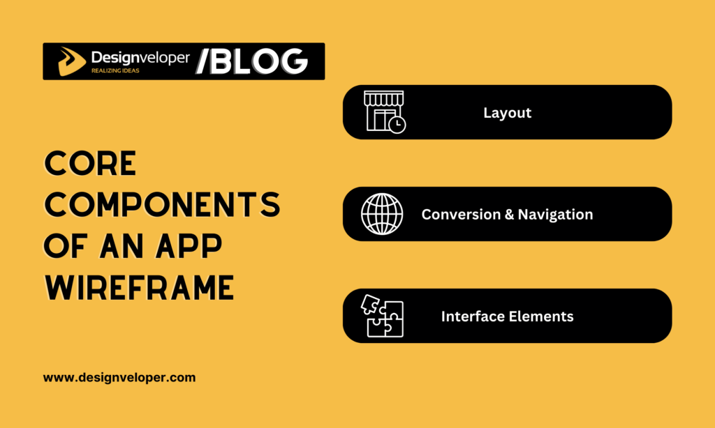
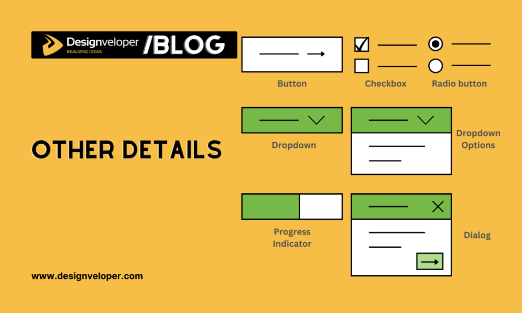
Include enough detail to show the user’s task and the screen’s role, but leave styling choices open until the team needs to test them. A useful app wireframe usually makes these parts visible:
- Screen purpose and hierarchy: A title or heading, the main content, and the information users need first.
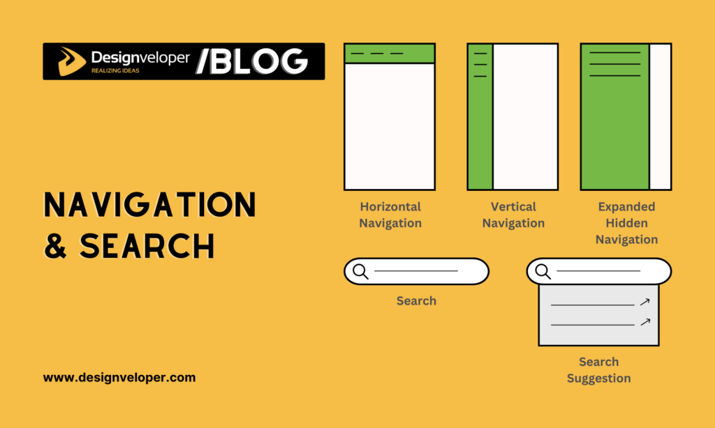
- Navigation: The route into the screen, the way to continue, and a way to go back or change direction.
- Primary action: The main task control, such as Search, Save, Continue, or Book. Add secondary actions only when they affect the task.
- Content and controls: Short labels for fields, selectors, buttons, cards, and other elements that shape the task.
- Relevant states: Empty, loading, error, disabled, or confirmation states when a user could encounter them in the flow.
Use labels and plain rectangles when exact copy or visual design is not under review. If hierarchy is hard to explain, sketch what should draw attention first and decide which elements need stronger visual weight later.
The example below illustrates how a screen map groups information and actions. It is a teaching visual, not a complete specification: teams still need to define the content and states required by their own app task.
How to Create an App Wireframe in Five Steps
Move from a user task to a small screen flow, then test whether people can follow it. The example throughout this process is a hypothetical appointment-booking app, so treat it as a practice scenario rather than a research finding or a real product case study.
Step 1: Identify the User and the Task
Start with one user group and one task the app should support. Gather relevant evidence from interviews, support questions, product data, or existing requirements. Record what the user is trying to do, what they need to know, and any constraint that could change the flow.
For the booking example, the task is: “Find an available appointment with a selected service and confirm the time.” This is more useful than “make booking easy.” It gives the team a concrete path to map and test.
Step 2: Map the Screen Flow Before Drawing Details
List the screens needed to finish the task and connect them in order. A first appointment flow might be: Choose service → Search availability → Select a time → Enter contact details → Review and confirm. Add only a branch that changes the task, such as “no times available” leading back to another date.
Write down the starting point and the successful end state. Note likely interruptions too: an empty search, a slow result, a missing required field, or a user who changes the selected time. A quick flow sketch should make it clear where each choice takes the person next.
Keep the path simple enough to review. A map with every possible branch can overwhelm a beginner. Start with the common route, then add edge states that could change the decision or block task completion.
Step 3: Choose a Tool That Fits the Review
Choose a tool after deciding whether the team needs static layouts, cloud collaboration, or interaction simulation. The table lists current products and plan details visible on official vendor pages on September 29, 2026. Prices are in USD; billing basis and seat definitions differ, so check the linked vendor terms before budgeting.
| Tool | Useful for | Platform and review | Plan signal checked Sep 29, 2026 | Limit to consider |
|---|---|---|---|---|
| Figma | Shared interface files, wireframes, and clickable flows | Browser and desktop workflow; cloud sharing | Starter is free with limited product access; Professional Full seat is $16/month in the monthly view. Official pricing | Price varies by seat type and billing choice. |
| Balsamiq | Quick, deliberately low-fidelity wireframes | Cloud workspace with editors and reviewers | 14-day trial; Starter is $16/editor/month billed annually. Official pricing | The sketch-like style is not meant to test polished visuals. |
| Penpot | Open-source UI work, collaboration, and self-hosting | Browser-based; cloud or self-hosted | Professional is $0/user/month; Unlimited is $7/editor/month, capped at $175/month. Official pricing | Self-hosting makes the team responsible for setup and operations. |
| Sketch | Mac-based interface design and screen prototypes | Mac authoring; web and iOS review options | Standard is $12/editor/month billed yearly; a 30-day trial is listed. Official pricing | Full authoring requires a supported Mac. |
| MockFlow | Browser-based wireframes and early team alignment | Browser workspace; Basic shares publicly | Basic is free forever: 1 editor and 5 reviewers. Official plans | Check privacy and export limits before team use. |
| Justinmind | Web/mobile wireframes and interactive simulations | Windows and macOS; web/mobile prototype output | Free plan includes 1 project; Standard is listed at $19/editor/month. Official pricing | Confirm the billing term and project limit for the plan. |
This is a short comparison, not a ranking or hands-on benchmark. Figma, Penpot, and Sketch support broader interface work. Balsamiq suits low-fidelity review, while MockFlow offers an early wireframing workspace. Justinmind can carry a flow into interactive simulation.
Step 4: Sketch Screens in Order of Importance
Draw the screen frame, title, main content region, and primary action before adding smaller details. Keep the layout aligned with the task: in the booking example, service and availability should be easier to find than secondary account or help options.
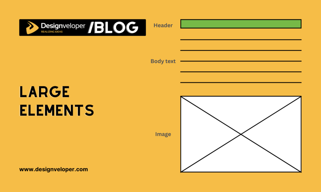
Place the Largest Content Blocks First
Use rectangles for content groups and short labels for their purpose. Check that the user can see what the screen is about and what to do next. Avoid filling every space just because the canvas is empty.
Use size and position to communicate hierarchy, not to imply final colors or branding. The screen should make the task’s main information easy to scan before the team reviews decoration.
Add Controls and States That Affect the Task
Add only the fields, buttons, selectors, and feedback that the user needs for the flow. In the booking example, show how a person selects a date and time, enters contact details, and sees a confirmation.
- Show an empty state when a search has no results.
- Show a loading or disabled state if the user must wait before continuing.
- Show a clear error or correction when required information is missing.
- Show confirmation when the task is complete, with a way to review or change the choice if needed.
Do not add every possible state to the first sketch. Include the states that change the next action or could prevent a user from completing the task.
Step 5: Test the Flow and Refine It
Ask representative users to complete a realistic task, such as booking a chosen service at a specific time. Give the task without explaining where to tap. Observe whether they choose the expected route, understand labels, find the main action, and recover from an empty or error state.
A static wireframe can test whether people understand the screen structure and content. To test tapping or screen transitions, link the relevant frames or facilitate the session by changing paper screens when a person acts. Do not treat a discussion with stakeholders as a substitute for observing target users.
Record the point where the user hesitates, takes a wrong turn, or misses an action. Revise the screen order, label, or control that caused the problem, then repeat the task. A small test should lead to a specific change or a decision to keep the current design, not a vague conclusion that the wireframe “looks good.”
When Should You Move from a Wireframe to a Prototype?
Move beyond a static wireframe when the question depends on how an interface responds to a person. Use the artifact that matches the decision:
- Stay with a wireframe when reviewing screen order, content hierarchy, labels, or navigation.
- Use a mockup when the decision depends on visual appearance, brand, typography, or spacing.
- Build a prototype when testing screen transitions, form responses, gestures, timing, or conditional paths.
These stages do not have to be rigid. A team can link a rough wireframe early, then add only enough visual or interactive detail to test the next unresolved question. The right stopping point is when reviewers have enough evidence to decide what to change or build next.
Frequently Asked Questions
Does an app wireframe need to show every screen?
No. Start with the screens required to complete the task under review. Add a screen or state when it changes the user’s next action, blocks progress, or helps the team test an important assumption.
Should I add color and real images to a wireframe?
Only when color or imagery is part of the question being tested. For structure and flow, simple blocks and labels are usually enough; save visual detail for a mockup or for a test that depends on appearance.
Can I test an app wireframe without coding?
Yes. Review static screens for content and layout, or link screens in a design tool to test a simple flow. A facilitator can also switch paper screens as users make choices. None of these methods requires production code.
Begin with one app task, map the screens needed to complete it, and keep the first wireframe simple. Check that the flow makes sense before refining its appearance; when the next question is about interaction, link the screens or build a prototype. Include only the states that affect a real user action, then test and revise the path before implementation.
Also published on

Share post on








Related Articles


Top Mobile App Design Tools: 12 Picks For Different Workflows
Top Mobile App Design Tools: 12 Picks For Different Workflows Published September 30, 2026
Android Vs iPhone Users In 2026: Market Share And Survey Insights
Android Vs iPhone Users In 2026: Market Share And Survey Insights Published September 30, 2026
Helvetica Neue Font: Licensing, Styles, and Mobile UI Decisions
Helvetica Neue Font: Licensing, Styles, and Mobile UI Decisions Published September 30, 2026