


Communicating Brand Values Through UX: Teaching Teams To Speak One Language
Brands don’t collapse because of one bad decision; they erode in the micro-moments. A label says one thing, a product page suggests another, and a poorly phrased error message finishes the job. Users feel this inconsistency instantly — a quiet sense of friction that whispers, “they don’t really know who they are.”
In fashion especially, UX reveals brand values faster than any campaign. Sustainability, inclusivity, transparency, ease — these aren’t slogans. They’re expressed in the way a filter works, how returns are framed, how long a page takes to load, and how confidently a user moves from cart to confirmation. This is why consistency matters even more when working with fashion ecommerce website development — the industry where UX and identity merge on every screen.
To prevent fragmentation across UX, product, marketing, and support, teams need one shared language. Not thicker brand guidelines. Not longer decks. A practical, operational system that transforms values into design, copy, and interaction patterns that show up everywhere.

Why UX is the clearest expression of brand values
UX isn’t decoration — it’s operationalized identity. Multiple studies confirm that behavior, not branding, determines trust:
- 88% of users are less likely to return after a poor UX (NN Group).
- 64% of consumers say inconsistent experiences reduce trust across channels (Gartner, 2023).
- 70% of fashion shoppers abandon a purchase when clarity around sizing or returns is low (Shopify E-commerce Market Index).
- 42% of users expect brand tone to remain consistent across product, emails, and support (Deloitte CX Study).
If marketing promises “effortless elegance,” but navigation feels like a maze, the brand message collapses.
If sustainability is core, but no supply-chain info exists until checkout, users notice the gap.
If inclusivity is a value, but a site ignores accessibility standards, the contradiction is obvious.
UX either proves your values or exposes them as superficial.
1. Start With a Values Map — Not a Moodboard
Most brands keep abstract nouns in a deck: clarity, sustainability, confidence, inclusivity.
They don’t translate them into UX decisions. That’s where teams drift.
A values map operationalizes every value into UX outcomes and actual interface decisions.
Example structure
Value → UX Implication → Practical Expression
Reliability
- Predictable flows, transparent system status
- Progress indicators, forgiving forms, clearly labeled actions
Inclusivity
- Accessible contrast ratios, diverse models, simple microcopy
- Sizing logic that includes non-linear body types
Sustainability
- Upfront fabric and supply-chain transparency
- Carbon impact disclosures, consolidated shipping options
- Repair, resale or circular services built into the flow
This map becomes a living artifact. It should influence:
- sprint rituals
- QA checklists
- microcopy review
- design critiques
- onboarding
If a designer wants to “hide complexity” behind ambiguous icons, the map does the questioning: clean for whom? and at what cost to clarity?
2. Encode Values Into the Design Language

Design systems often focus on tokens, spacing, and components — essential but incomplete.
Without encoded values, teams slowly drift into convenience-driven decisions.
Define interaction patterns that reflect ethics and intent
Confirmation patterns
- Is success acknowledged quietly (confidence), warmly (approachability), or energetically (celebratory)?
Error patterns
- Do we blame the user or the system?
- Do we give recovery steps or vague warnings?
Loading states
According to Baymard Institute, 39% of users distrust long silent loading states, even if the wait is short.
Transparency builds trust; emptiness builds doubt.
Navigation
If clarity is a value, deep nesting and ambiguous labels become red flags.
The design system becomes more than “how UI looks.”
It becomes the grammar through which the brand speaks.
3. Make Copy and Design Inseparable

In strong organizations, writers don’t “decorate” flows at the end — they shape them early.
Microcopy is where voice, clarity, and values live.
Principles for value-driven product writing
- Use verbs that make users feel capable
- Respect cognitive load (short, scannable phrasing)
- Avoid jargon unless the audience expects it
- Keep tone steady even in stressful moments (returns, payment failures)
This matters most in edge cases.
Shopify reports that return-friction clarity reduces repeat purchase drop-off by up to 25%.
In fashion, sizing, delays, and unexpected fees are the top three friction points — all solved with clear writing, not UI alone.
A copy playbook should sit beside the design system. Not slogans — rules.
4. Use Team Rituals To Maintain Alignment
Culture maintains consistency better than documentation.
Introduce lightweight, repeatable rituals that rebuild shared instinct.
UX Value Critique (30 minutes weekly)
Pick one brand value. Pull up a live flow.
Ask only one question: Where do we drift?
Keep it specific, fast, and honest.
Pre-release “Value Pass”
A single owner reviews the experience strictly for value alignment — not usability, not performance.
Copy Camps
Short working sessions where design, product, and support rewrite tricky UI moments together.
This surfaces assumptions and reveals misalignments fast.
Support Shadowing
One hour per month in support tools.
Reading real customer phrasing sharpens empathy more than any workshop.
These rituals build a team that self-corrects instinctively.
5. Teach Through Examples, Not Lectures
Values are abstract until made visible. Create an internal “UX evidence library”:
- Great and weak flows from fashion competitors
- Examples tagged by value (confidence, clarity, patience, transparency)
- Recordings of user tests where language either reduced or amplified friction
Fashion teams especially benefit from side-by-side comparisons of:
- sizing flows
- checkout logic
- supply-chain transparency
- sustainability dialogs
- loyalty programs
Seeing contradictions is more powerful than explaining them.
6. Measure Values, Not Just Speed
Traditional KPIs (conversion, speed, funnel completion) matter — but they don’t reflect values.
Layer in value-sensitive metrics:
Time to Clarity
How long until a user understands price, delivery, returns?
Policy Comprehension
Test rewritten policies like you test hero banners.
Support Escalations per Flow
Track when UX or copy fails empathy.
Trust Indicators
McKinsey reports that fashion shoppers reward transparency with 2–3x higher loyalty odds.
Optimize responsibly — with guardrails defined by the values map.
7. A Practical Training Playbook
Make the system simple enough to use daily.
Value Briefs
Two pages per project with examples, anti-patterns, success signals.
“Value Fingerprints” in the Design System
Short notes explaining how a component expresses a value.
Scenario Sprints
Quarterly micro-sprint around a tough scenario (e.g., delayed orders).
Decision Logs
One paragraph in plain English explaining how the selected option supports values.
This builds judgment — the highest-value team skill.
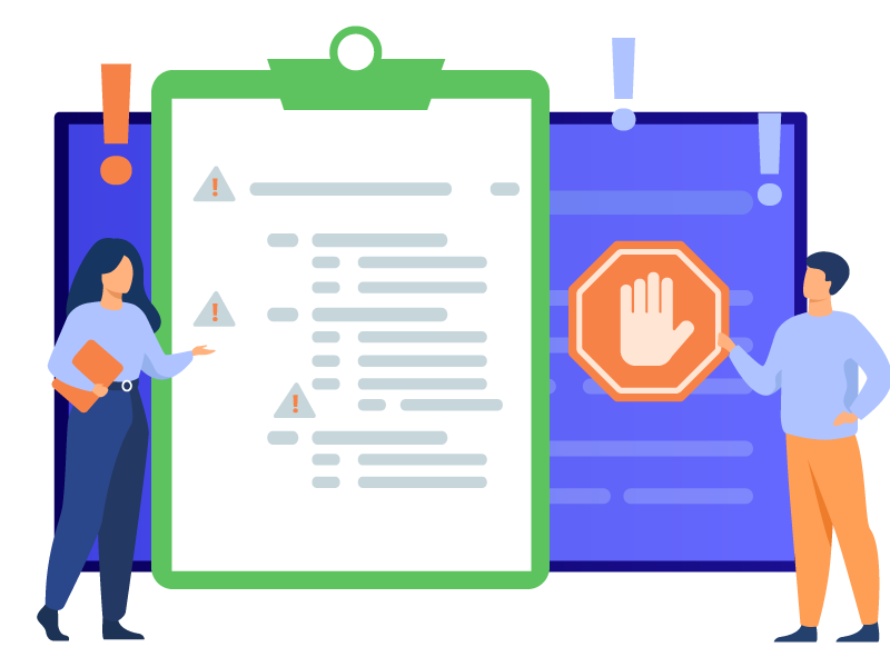
8. Catch Red Flags Early
Common signs of brand drift:
- Fragmented voice across channels
- Clever UI that sacrifices clarity
- Value inflation in marketing (“radical transparency”) unsupported by UX
- Silent edge cases (errors, account recovery, verification)
Don’t panic — annotate, fix, document.
9. Onboarding That Creates Fluency
New team members need more than a brand deck.
Give them:
- The values map
- Three annotated flows (good + bad examples)
- A writing exercise on empty states
- A voice audit discussion
- 60 minutes shadowing support
Two weeks in, they should critique work through the values lens. That’s the benchmark.
What’s Worth Remembering
Brand values aren’t slogans.
They’re UX decisions, expressed in microcopy, flow logic, interactions, and everyday tradeoffs.
When teams learn to speak one UX language, through shared examples, encoded design systems, rituals, and value-based metrics — users feel it not because the brand tells, but because it shows.
And in fashion e-commerce, where identity and experience are inseparable, this alignment becomes a competitive advantage no campaign can replicate.
Also published on

Share post on