
















Ecommerce UI/UX Design: Best Practices For Better Conversions

Good ecommerce UI/UX design can support conversions by removing avoidable effort from product discovery, product evaluation, and checkout. In practice, that means making information and actions clear, reducing unnecessary steps, and testing changes against real shopper behavior.
This guide focuses on the parts of the shopping journey that design can influence: discovery, product pages, checkout, mobile use, accessibility, performance, and measurement. It also separates UX friction from price, inventory, shipping, and fulfillment problems that interface changes cannot solve. For broader store-wide priorities, see our ecommerce best practices guide.
Ecommerce UI And UX: Key Differences And Connection
UI is the visual and interactive layer of an ecommerce store, while UX is the complete path a shopper follows to complete a task. UI includes layout, typography, buttons, product cards, form controls, and interaction states. UX includes navigation, product discovery, comparison, checkout, error recovery, and the logic that connects those moments.
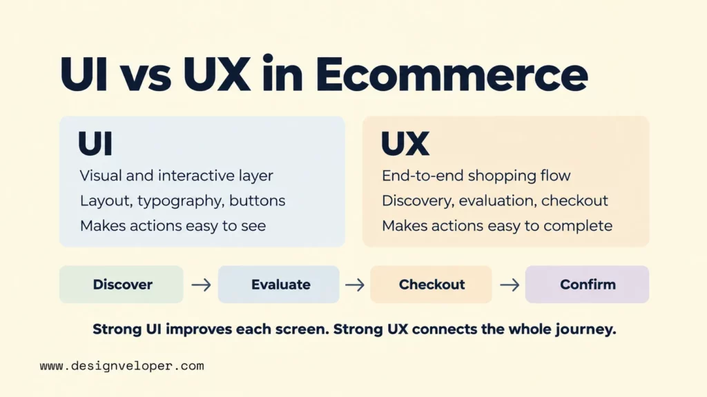
The difference matters because a page can look professional and still create a poor shopping experience. A large “Add to cart” button is useful UI. It does not solve a UX problem if shoppers cannot understand size options or see delivery costs before buying. Good ecommerce UI design makes actions visible. Good UX makes those actions sensible in the shopper’s journey.
UI and UX therefore have to work as one system. Layout guides attention to important product information. Navigation and search help the shopper reach a relevant item. Product details reduce uncertainty. Checkout converts purchase intent into an order. Feedback confirms whether actions succeeded and explains what to do when something fails.
This connection is especially important in ecommerce because conversion depends on more than visual appeal. A shopper may leave because of price, stock, or delivery constraints that design cannot fix. Design can still prevent avoidable confusion by showing those conditions clearly, at the right time, with a useful next step.
Core Principles Of Ecommerce UI/UX Design
Effective ecommerce UI/UX starts with clarity: show shoppers what matters now, keep patterns consistent, and make the next action easy to recognize. Visual hierarchy should make page purpose, product identity, price, variants, and primary actions easy to scan before secondary content competes for attention.
Consistency reduces the amount a shopper has to relearn. Product cards should use a stable information order. Buttons with the same purpose should look and behave alike. Navigation labels should match the language customers use rather than internal business terms. These choices make the store more predictable as shoppers move between categories, products, cart, and checkout.
Readable content is part of the interface, not an afterthought. Product names, specifications, returns, delivery information, and form labels should answer real purchase questions in plain language. Dense marketing copy should not push essential details below decorative content. If a shopper needs a fact to decide, make that fact easy to find.
Design also has to fit the catalog and business model. A store with 30 similar products may need simple categories and a few filters. A marketplace with thousands of items needs stronger search, faceted filters, comparison support, and consistent product data. The right interface depends on the decisions shoppers must make, not on a universal template.
Every interaction should provide feedback. A selected filter should look selected. An unavailable variant should be clearly unavailable. An added item should produce a visible cart update. A form error should identify the problem and explain how to correct it. Useful feedback prevents shoppers from repeating actions or wondering whether the store responded.
UX Patterns For Product Discovery
Product discovery should reduce the distance between a shopper’s intent and a manageable set of relevant products. Categories, breadcrumbs, search, filters, sorting, and comparison tools each solve a different part of that job. Large catalogs usually need several of them to work together.
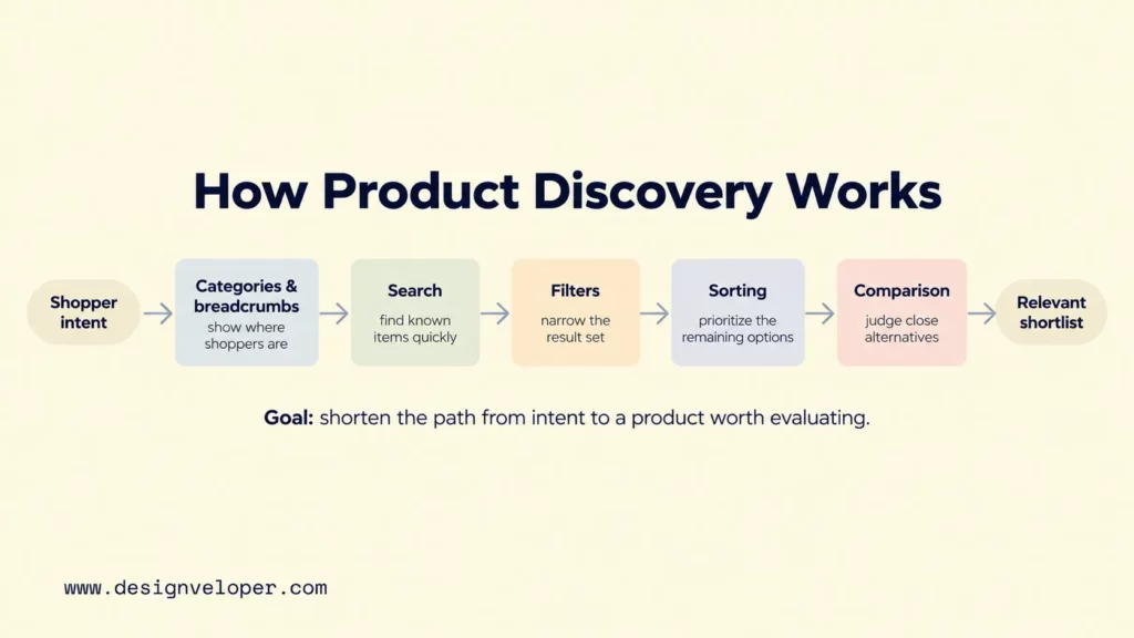
| Pattern | Reader job | Useful design check |
|---|---|---|
| Categories and breadcrumbs | Understand location and move through the catalog | Use labels that match how shoppers describe products |
| Internal search | Find a known product or need quickly | Support common names, identifiers, and useful query variations |
| Filters | Narrow a large result set | Offer attributes that change the purchase decision |
| Sorting | Prioritize the remaining options | Provide sort choices that fit the category and shopper goal |
| Comparison | Evaluate close alternatives | Show the attributes that meaningfully distinguish the products |
Baymard’s product-list research shows why these patterns matter. Its usability studies examine how people scan, evaluate, filter, and sort products. The research also shows that weak product-list and filtering design can make relevant products hard to find. Baymard’s product-list UX research provides the supporting findings and implementation guidance.
Filters should represent decision criteria, not just whatever product fields exist in the database. For a laptop catalog, useful filters could include price, screen size, memory, storage, processor family, and availability. Sorting then helps shoppers prioritize the reduced set, while search supports people who already know what they want.
Comparison becomes more valuable when products are complex or closely matched. Shoppers need enough information on list pages to reject poor fits before opening every product. Price, key variants, availability, ratings, and category-specific attributes can support that decision. Our guide to the essential elements of ecommerce websites covers these store components in a broader implementation context.
Consider a large furniture catalog. A shopper looking for a sofa may first choose a category, then filter by width, material, color, price, and delivery availability. The interface should preserve those choices and show which filters are active. The product list should expose enough information to compare likely options without forcing repeated visits to individual product pages.
Example: Buying a sofa
- Filter products: Width: under 200 cm · Delivery: available this week → 12 matching sofas. Annotation: Show active filters and the updated result count; let shoppers remove either filter.
- Select a variant: Sofa A · Fabric: navy (available) · Sand (unavailable) → Price and delivery date update for navy. Annotation: Make the selected option and unavailable option distinct before “Add to cart.”
- Recover at checkout: Postcode: 123 → “Enter a valid postcode to see delivery options.” The address and cart remain intact. Annotation: Put the error beside the field, preserve entered data, and return focus to the field.
Do not improve discovery by simply adding more controls. A filter that shoppers do not understand adds work rather than reducing it. Test labels, ordering, defaults, and mobile behavior. The goal is not the largest filter set. It is a shorter, clearer path from intent to a product the shopper can seriously evaluate.
UI/UX Patterns For Product Pages And Checkout
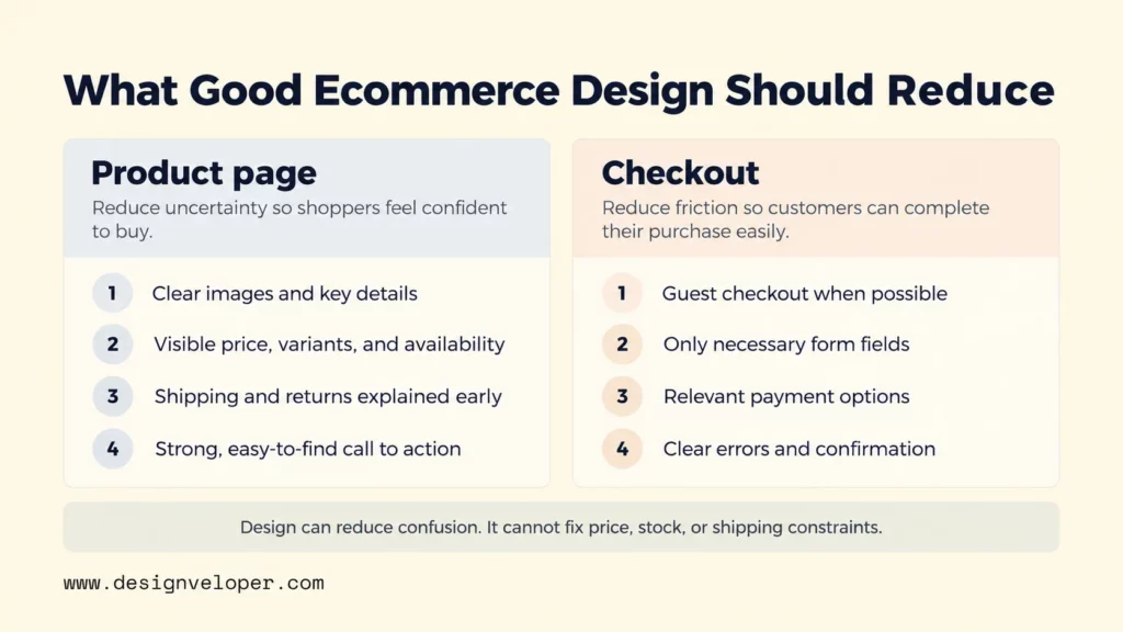
Product pages should help shoppers answer three questions quickly: what is this product, does it fit my needs, and what happens if I buy it? Clear images, useful media, specifications, price, variants, availability, reviews, and a recognizable call to action should work together to reduce uncertainty.
For visual references, our product page design examples show how different stores arrange product information and interactions. Use them as inspiration, then validate the pattern against your own catalog and shoppers.
Important information should appear close to the decision it affects. If selecting a variant changes price or availability, update those details immediately. If shipping time depends on location, explain when and how it will be calculated. And if returns have important conditions, make them discoverable before the shopper commits. Shopify’s current product page optimization guidance also emphasizes clear calls to action, product imagery, descriptions, reviews, mobile usability, and trust signals.
Checkout deserves special attention because the shopper has already shown purchase intent. Baymard reports an average documented cart abandonment rate of 70.22% across 50 studies. Its 2026 reasons-for-abandonment data also lists high extra costs, forced account creation, and long or complicated checkout among the stated reasons shoppers abandon. These figures do not mean design causes every abandoned cart, but they identify common sources of avoidable friction.
A practical checkout should ask only for information needed to complete the transaction. Offer guest checkout when an account is not essential. Support relevant payment choices. Use clear labels and inline error recovery. Preserve entered information after a validation error when possible. After payment, provide an unambiguous confirmation with the order status and next steps.
Cost transparency is also part of checkout UX. Baymard’s 2026 data lists extra costs as the most common stated avoidable reason for abandonment in its survey. Show shipping costs, taxes, fees, delivery timing, and return conditions as early as the business can calculate them. Hiding unavoidable costs until the last step does not make the offer cheaper; it makes the experience less predictable. See Baymard’s cart-abandonment statistics for the study scope and figures.
Keep UX problems separate from commercial or operational problems. A clear interface cannot fix an out-of-stock product, expensive shipping, slow fulfillment, or an uncompetitive price. It can communicate those constraints early enough for the shopper to make an informed choice. That distinction helps teams avoid redesigning the page when the real problem sits elsewhere in the business.
Mobile, Accessibility, And Performance Essentials
Mobile ecommerce UI/UX should be designed for touch, small screens, and interrupted attention rather than treated as a compressed desktop layout. Keep text readable, controls easy to tap, important actions visible, and forms short. Test the full path from navigation to payment on real devices, not only in a resized desktop browser.
Responsive layout decisions should preserve task priority as space changes. A desktop product page may show the gallery, product details, and delivery information side by side. On a phone, that content needs a deliberate order. Our responsive web design principles explain how flexible systems can preserve readability, navigation, interaction, and performance across screen sizes.
Accessibility should be built into the same shopping flow. The W3C Web Accessibility Initiative explains that informative images need text alternatives, form controls need labels, and functionality should be available from a keyboard. Sufficient contrast and visible keyboard focus also help people perceive and operate controls. These requirements affect whether shoppers can browse products and complete forms at all. The W3C accessibility principles explain the underlying guidance.
Performance belongs in UX because delays and unstable layouts interrupt the shopping task. Product pages often carry large images, third-party scripts, review widgets, analytics, personalization tools, and web fonts. Optimize what is delivered, not just what appears on the screen. Compress and correctly size images, remove low-value scripts, load noncritical resources carefully, and keep font use disciplined.
Core Web Vitals offer useful performance diagnostics. Google’s web.dev documentation defines Largest Contentful Paint for loading, Interaction to Next Paint for interactivity, and Cumulative Layout Shift for visual stability. The recommended thresholds are LCP within 2.5 seconds, INP at 200 milliseconds or less, and CLS at 0.1 or less at the 75th percentile of page loads. These metrics do not replace usability testing, but they can reveal technical friction that shoppers feel. Web.dev’s Web Vitals documentation explains the current definitions.
Performance work should focus first on high-value shopping pages. A slow editorial page is inconvenient; a slow product or checkout page can block an active purchase. Review product media, tag managers, chat tools, recommendation engines, fonts, and payment integrations with that business context in mind.
How To Test And Improve Ecommerce UI/UX
Improve ecommerce UI/UX with a cycle of evidence, design, testing, and measurement. Start with the problem you can observe, not the redesign you already want. Combine user research and support feedback with analytics so qualitative evidence explains why shoppers struggle and quantitative evidence shows where the problem is large enough to prioritize.
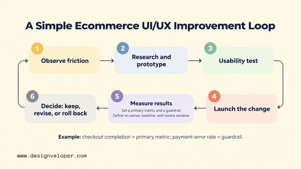
Prototype important flow changes before committing to full implementation. A prototype can test navigation, filtering, variant selection, cart behavior, or checkout sequence without rebuilding the whole store. Usability testing then checks whether representative users understand the flow and can complete realistic tasks. Our UX design process guide explains how research, prototyping, testing, and iteration fit together.
Use analytics to track the shopping journey at the points where intent changes. Search usage shows whether shoppers depend on internal search. Product engagement shows whether they inspect the information provided. Add-to-cart rate measures movement from evaluation to purchase intent. Checkout completion and cart abandonment show what happens after that intent becomes stronger.
Do not treat a single metric as proof of good UX. A lower add-to-cart rate could be bad, or it could mean product pages now answer questions earlier and prevent unsuitable purchases. A checkout completion change may come from design, payment availability, traffic mix, stock, or promotions. Pair funnel data with session feedback and controlled testing before assigning a cause.
For each test, define one primary metric, one guardrail metric, an owner, a baseline, and a review window before launch. A checkout simplification test might use checkout completion as the primary metric and payment-error rate as the guardrail. Use a controlled experiment when traffic allows. Otherwise, compare a stable traffic segment with a pre-change baseline and record other changes that could affect the result. At the end of the review window, the owner should decide whether to keep, revise, or roll back the change.
For the sofa journey shown above, test the three interface changes as one defined flow against the current experience. Use completed orders per eligible shopper who applies a sofa filter as the primary metric, and checkout field-error rate as the guardrail. Record both baselines before launch, keep product availability, prices, and promotions comparable, and review results after two full weeks or a pre-agreed sample size, whichever takes longer. Keep the change only if the primary metric improves by the threshold set before the test and the field-error rate does not worsen beyond its agreed limit. Roll it back if the guardrail fails; if neither condition is clear, continue the test rather than claiming a conversion gain.
Test one meaningful design or flow change at a time when you need to understand its effect. That might mean revising filter logic, moving delivery information, simplifying a form, or changing a mobile interaction. Limiting the change makes the result easier to interpret than a full redesign that changes dozens of variables at once.
Our work on the Aha ecommerce project illustrates another constraint: UX changes live inside technical and content systems. The public project page describes performance requirements, customizable ecommerce management, CMS-ready web components, and dynamic conditions for content management. For teams planning improvements, test more than whether a new flow is usable. Check whether editors can manage it and whether the platform can deliver it fast enough. We do not treat that project page as evidence of Aha’s UX research process or visual design system.
FAQs About Ecommerce UI/UX Design
What Should An Ecommerce Website Improve First?
Improve the highest-impact friction that evidence shows is blocking shoppers. Use analytics, usability findings, and support feedback to locate that friction. Start with discovery if users cannot find relevant products, product pages if they lack decision information, or checkout if purchase intent is being lost there. Check mobile behavior, accessibility, and performance across the same flow before spending time on decorative changes.
How Does Mobile UX Affect Ecommerce Conversions?
Mobile UX affects conversions by changing how easily shoppers can browse, compare, type, tap, and pay on a small screen. Responsive layout, readable content, touch-friendly controls, short forms, fast loading, and mobile payment support reduce avoidable effort. Measure the effect on your own mobile funnel because traffic mix, products, and purchase complexity differ by store.
Which Ecommerce UI/UX Metrics Should Teams Track?
Track metrics that match the shopping stage you are improving, such as search success, product engagement, add-to-cart rate, checkout start, checkout completion, cart abandonment, task success, and Core Web Vitals. Define each analytics event before testing and keep that definition stable. For example, decide whether “checkout start” begins with a cart CTA click or the first checkout page view. Compare the primary metric with its baseline and at least one guardrail so an apparent gain does not hide a new problem.
Also published on

Share post on










Related Articles



Ecommerce UI/UX Design: Best Practices For Better Conversions
Ecommerce UI/UX Design: Best Practices For Better Conversions Published September 28, 2026
10 Ecommerce Best Practices For Better UX, SEO, And Sales
10 Ecommerce Best Practices For Better UX, SEO, And Sales Published September 21, 2026
B2C Ecommerce Model: Types, Examples, and How to Choose One
B2C Ecommerce Model: Types, Examples, and How to Choose One Published September 18, 2026