


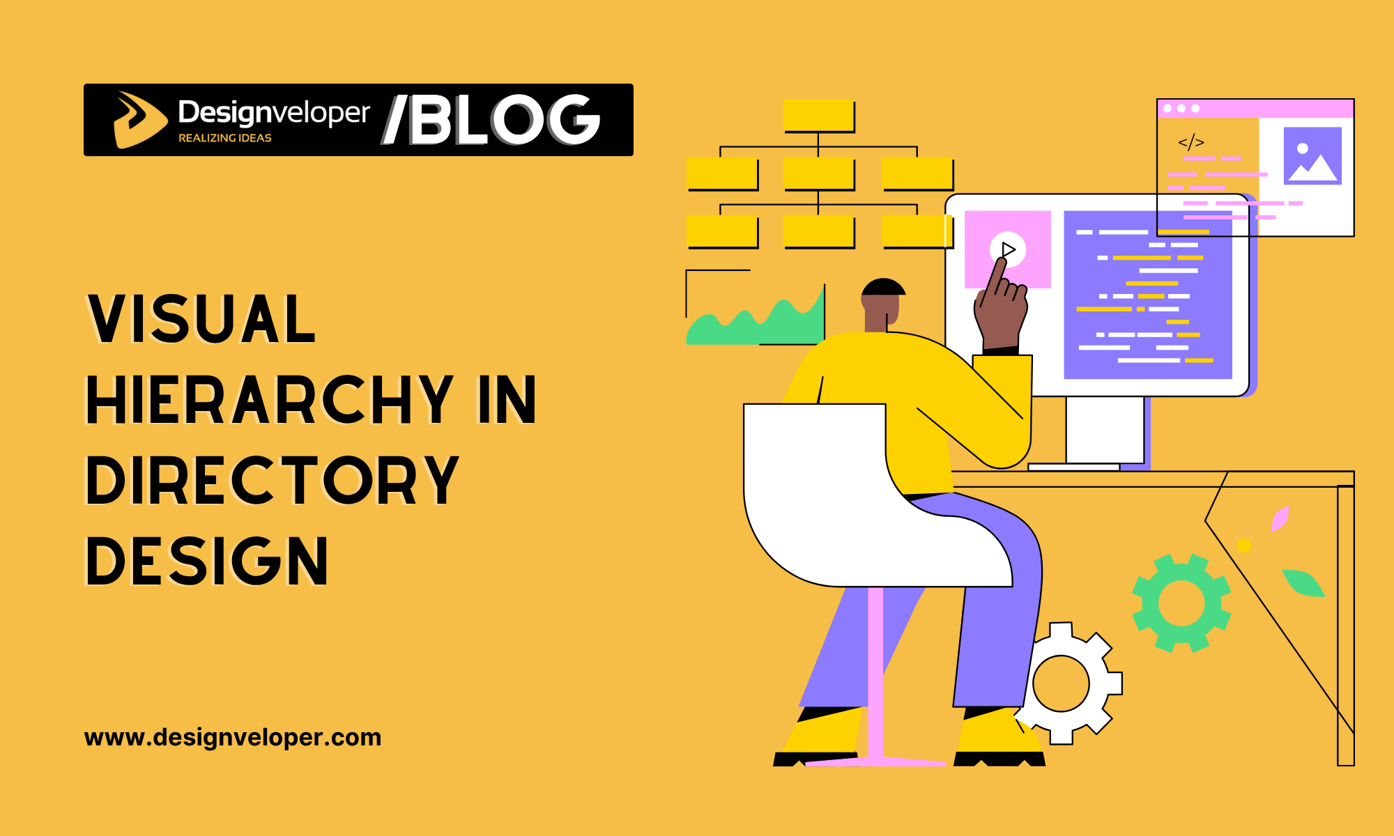
Visual Hierarchy in Directory Design: Guiding Users to the Right Professionals
June 06, 2025
The first impression users form when landing on a directory site can determine whether they stay or leave. In a digital landscape oversaturated with options, visual hierarchy is the silent guide that steers their attention, subtly influencing how they interpret, explore, and ultimately engage with the information presented. A well-structured directory not only looks clean—it feels intuitive. It encourages confidence and clarity, even in the midst of complex service categories or dense professional listings. With just a few seconds to capture a visitor’s focus, effective visual prioritization becomes a form of UX shorthand, pointing users toward the value they seek without making them work for it.
When visual elements align—typography commanding attention in just the right places, contrast calling out actionable items, spacing giving the eye room to breathe—the user’s journey becomes seamless. Instead of clicking away in frustration, visitors feel gently pulled toward their intended destination. This article explores how design strategies like color contrast, text hierarchy, and spatial rhythm work in harmony to elevate directory usability. Drawing on examples like RelayFi’s Advisor Directory, we’ll show how smart design can connect users to top-tier professionals with minimal friction.
The Role of Typography in Establishing Clarity
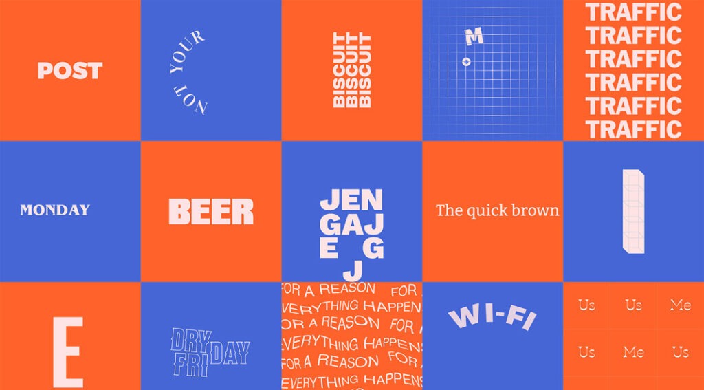
Typography is one of the most immediate ways to signal importance, organize information, and guide behavior. A bold headline can announce a professional’s name; a secondary font weight can quietly support it with credentials or specialties. When type styles are inconsistent or haphazardly arranged, users are left to decode the interface on their own—a frustrating and inefficient experience.
Type Hierarchy as a Map
Clear visual layering—using distinct font sizes, weights, and colors—creates a roadmap that helps users understand where to look and what actions to take. Users instinctively scan titles first, then subheadings, and finally body content. For directories, this means emphasizing names, job titles, and call-to-action elements like contact buttons that direct users toward their next step. Effective layering reduces decision fatigue, helping users locate relevant profiles faster and with greater confidence.
Decorative or overly stylized fonts may look appealing in branding but can hinder user readability, especially when used in essential navigation elements or detailed listings. Prioritizing legible, accessible typefaces across the site ensures users of all ages and visual abilities can interact comfortably with the directory. This becomes particularly important for professional services directories, where trust and accuracy are key—clean typography communicates professionalism and reliability without distraction. The best designs balance aesthetics and usability, ensuring that even a visually engaging directory remains easy to navigate and act upon.
Color Contrast and Visual Flow
Color isn’t just about branding—it plays a crucial role in setting the tempo of a page. The right palette can establish mood, direct the eye, and make call-to-action areas pop. Poor color choices, on the other hand, bury important elements and disrupt usability.
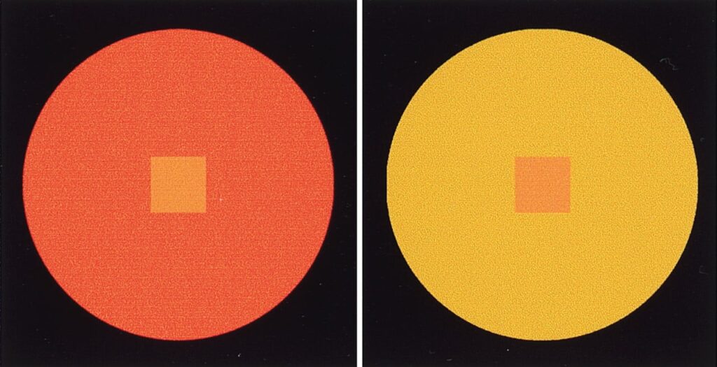
Contrast as a Guiding Force
High-contrast color pairings—such as dark text on a light background—help key information stand out. This is particularly important when users are skimming to find specific service providers or evaluating expertise.
Design systems that use a consistent color scheme across headings, buttons, and interactive states foster trust and predictability. Users shouldn’t have to guess what’s clickable or miss an important feature because it blends into the background.
Strategic Spacing and Grouping
Whitespace, often overlooked, is a designer’s best ally. It defines relationships between elements, suggests content flow, and creates a breathable, organized layout. In directory design, spacing influences whether users feel overwhelmed or empowered.
Grouping Related Information
Professionals’ profiles should visually cluster relevant data—name, credentials, services, and contact methods—into digestible blocks. This minimizes cognitive effort and promotes fast comprehension.
Alternating between dense content zones and open space allows users to pace their exploration. Strategic use of margins and padding breaks up monotony and reduces visual fatigue.
Interaction Design and Behavioral Cues
Beyond static layout, directories also need interactive elements that respond intuitively to user behavior. Microinteractions—hover effects, pressed states, subtle animations—create a feedback loop that keeps users engaged and oriented.

Clickable Clarity
Buttons that resemble buttons, links that behave like links—these conventions may seem obvious, but they’re often ignored. Properly styled interactive elements help users know what actions they can take.
Icons, badges, and filters give visual shorthand to features and categories. When integrated cleanly, they act like trail markers, helping users refine their search and stay oriented as they navigate between profiles.
Case Study: RelayFi’s Advisor Directory
RelayFi’s Advisor Directory provides a powerful example of how a cohesive visual hierarchy can transform user navigation. At a glance, the eye is drawn to names and professional titles through bold font use. Ratings and specializations are tucked beneath in lighter weights, while contact buttons remain visually prominent yet unobtrusive.
The site makes expert use of whitespace, allowing each listing to stand on its own without visual clutter. Colors are used with restraint—blues and grays dominate, with occasional highlights in vibrant hues to draw attention to urgent features or top-rated professionals. Most importantly, every interactive element behaves predictably. Whether filtering by state or profession, users can explore without confusion or interruption.
In a space where users arrive with a goal—to discover top accountants in your state or find niche advisors—this clarity is invaluable. Rather than scanning endlessly, users are subtly nudged toward the right options, saving time and elevating satisfaction.
Designing for Trust and Efficiency
Ultimately, visual hierarchy isn’t just about aesthetics—it’s about building trust. When users sense coherence in a directory’s layout, they trust the content more. When buttons respond predictably and typography highlights what matters, users feel respected, not manipulated.
A well-designed directory should feel like a conversation, not a maze. It should say, “Here’s what you’re looking for,” instead of shouting, “Look at everything!” That subtle distinction is the difference between a helpful tool and a frustrating experience.
Designers who apply principles of visual hierarchy with empathy and precision aren’t just improving aesthetics—they’re improving lives. They’re enabling smoother decisions, better matches, and more confident users who feel empowered rather than lost.
Small Changes, Big Impact
Good directory design doesn’t require flashy effects or massive overhauls. It requires intention. Every type choice, color pair, and padding value contributes to the user’s cognitive load—or relief from it. Designers who understand this can craft directories that guide, not distract.
Visual hierarchy is the unsung hero of digital directories. It quietly shapes experience, builds clarity, and opens pathways. Whether someone’s searching for a specialist or hoping to discover top accountants in your state, a clear visual path can make all the difference. And in today’s competitive attention economy, that difference is everything.
Also published on

Share post on


Read more topics


You may also like
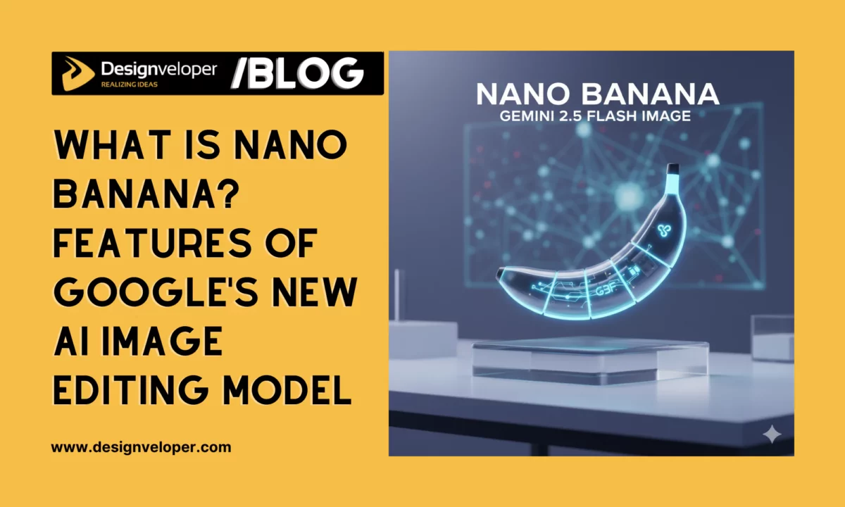
What is Nano Banana? Features of Google’s New AI Image Editing Model
What is Nano Banana? Features of Google’s New AI Image Editing Model Published September 30, 2025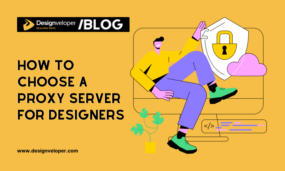
How to Choose a Proxy Server for Designers
How to Choose a Proxy Server for Designers Published June 26, 2025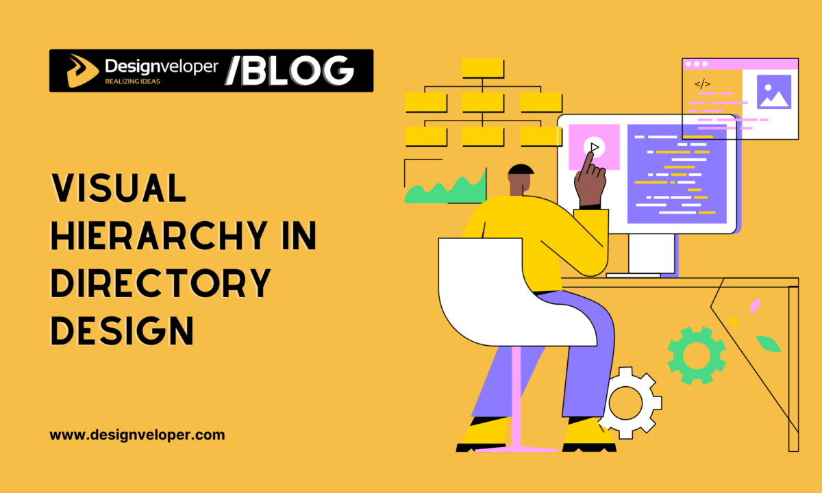
Visual Hierarchy in Directory Design: Guiding Users to the Right Professionals
Visual Hierarchy in Directory Design: Guiding Users to the Right Professionals Published June 06, 2025


