


How to Future-Proof Your Website’s Front-End Without Constant Redesigns
It’s easy to get excited about fancy website designs, but constantly redesigning your site every year isn’t practical. It takes time, money, and energy. Instead of rebuilding from scratch every time trends change, you can create a front end that lasts longer and works better. “Future-proofing” means designing your site in a way that makes updates easier, not harder. It’s about smart planning, not guessing what the internet will look like five years from now. Let’s walk through simple but powerful ways to keep your website strong, flexible, and ready for whatever comes next.
10 Powerful Ways to Future-Proof Your Website’s Front-End
1. Pick a Framework That Will Last
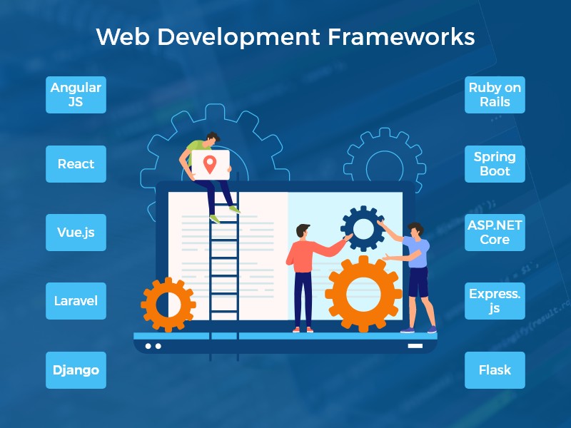
A framework is like the skeleton of your website. It holds everything together. Some frameworks are popular for a few months, then disappear. Others stick around because they’re reliable and supported by lots of developers. If your team knows how to use a certain framework well, and it’s got good support online, that’s a smart choice. Don’t just pick the newest or flashiest one. A website built on something stable is easier to keep updated. Choosing a framework with long-term support and a strong community can help ensure your site is truly Future-Proof, saving you time and resources down the line.
2. Write Clean, Easy-to-Read Code
Think of code like instructions for your website. If those instructions are messy or confusing, it’s really hard to change anything later. Clean code means using clear names, keeping things organized, and avoiding shortcuts that make sense only to the original coder. When your code is well-written, anyone (including future you) can understand it and make changes without breaking the whole site. This saves tons of time. It also makes it easier to fix bugs or add new features down the road without needing to redesign the whole thing.
3. Use a Design System, Not Just Pretty Colors
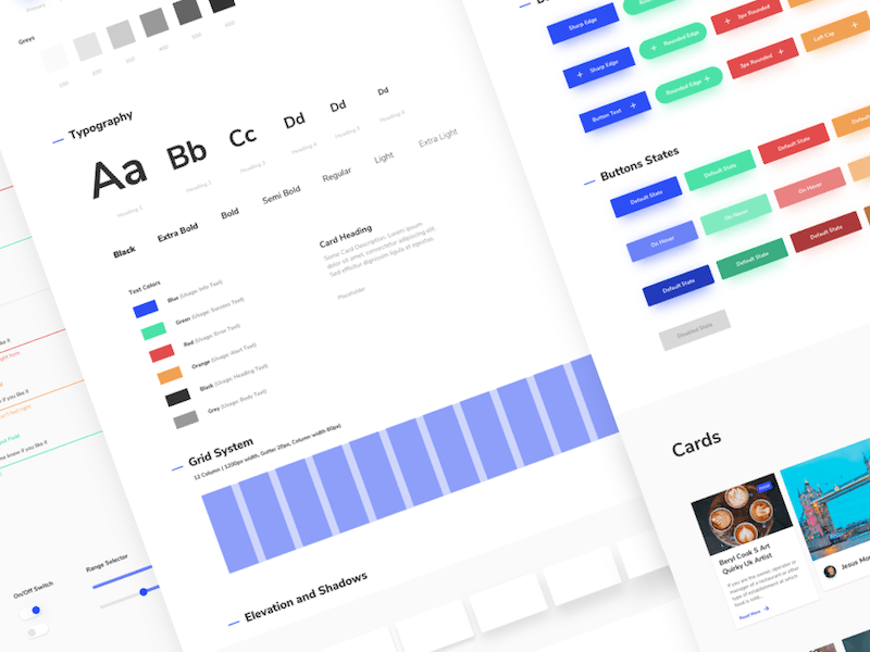
A design system is more than a color palette or font choice. It’s a collection of reusable pieces: buttons, headings and cards that you can mix and match throughout your site. Having one makes everything look and feel consistent. It also means when you want to change something later, like button styles or spacing, you can do it in one place instead of a hundred. Tools like Figma or Storybook can help you build one. With a solid system in place, your site can grow without looking messy or feeling like different people built each part.
4. Make It Work on All Screen Sizes
Most people visit websites on phones now, not just computers. That means your website needs to look and work great on all kinds of screen sizes. Use flexible layouts that stretch or shrink depending on the device. Avoid designs that only look good on a desktop screen. Phones, tablets, and even foldable devices are all part of how people browse the web. If your site works well everywhere, you won’t need to redesign it every time a new screen size becomes popular. That’s how you build something that lasts.
5. Build with Accessibility in Mind

Accessibility means making sure everyone can use your site, including people with disabilities. Use clear headings, write helpful image descriptions, and make sure buttons can be used with a keyboard. Starting with accessibility means your site is already strong and well-structured. If you skip it, you might have to redo big parts later, which costs time and money. Plus, accessible websites are easier to read and use for everyone, not just people with specific needs. Building with this in mind from the start helps your site stay useful and compliant over time.
6. Be Careful with Third-Party Plugins
Plugins are like extra tools you add to your website. They can help you do cool things without building everything yourself. But the more plugins you add, the more things can go wrong. If a plugin stops getting updated or becomes incompatible, it might break your site. Or it might slow things down. Before adding one, ask: “Do we really need this?” And if you do use plugins, stick with the ones that are popular, updated often, and have good reviews. Less is more, especially when you’re trying to build something that won’t need constant fixing.
7. Keep It Fast and Simple

No one likes a slow website. People leave if things take too long to load. That’s why performance is part of future-proofing. Compress your images, limit animations, and avoid loading too many things at once. A fast site works better on every device and with slower internet connections, too. Google even ranks faster websites higher. So when you’re designing your front end, don’t just think about how it looks; think about how quickly people can use it. The simpler and faster it is, the fewer problems you’ll have later on.
8. Don’t Ignore Website Maintenance
Even if your site looks great now, it still needs attention over time. That means updating your code libraries, checking for bugs, and making sure nothing is broken. It also means paying attention to cyber security. Hackers often look for weaknesses in old or outdated websites. If your site uses JavaScript libraries or plugins, you need to keep them current or risk security problems. Future-proofing isn’t just about design…it’s also about keeping your site safe and working behind the scenes. Regular maintenance keeps small problems from turning into big ones.
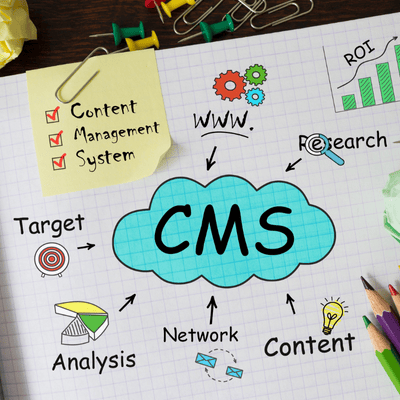
9. Separate Content from Code

Try to keep your content (like blog posts or product info) separate from your design and code. That way, you can change text or images without messing up the site’s layout. Using a content management system (CMS), or a “headless CMS,” lets writers and marketers update the site without needing help from developers. This saves time and avoids mistakes. It also means if you ever decide to change your website’s design, you don’t have to re-enter all your content. Keeping things separate makes everything easier to manage and update later.
10. Focus on What People Actually Need
It’s fun to experiment with creative ideas, but your website isn’t just for showing off. It’s for helping real people do real things. Whether it’s shopping, reading, signing up, or contacting you, the design should support those goals. Keep things clear, clean, and simple. The more complicated the site is, the more likely it’ll need to be redesigned later. Future-proofing is really about good decision-making. Build something useful, make it easy to change, and stay focused on your users. Do that, and your website will stay strong, even when trends change.
Also published on

Share post on


Related Articles
How to Future-Proof Your Website’s Front-End Without Constant Redesigns
How to Future-Proof Your Website’s Front-End Without Constant Redesigns Published May 23, 2025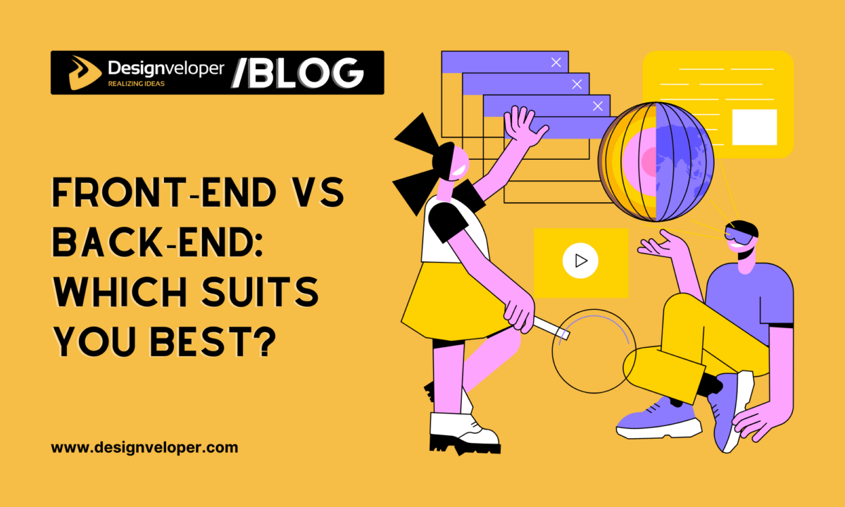
Front-End vs Back-End: Which Suits You Best?
Front-End vs Back-End: Which Suits You Best? Published May 07, 2025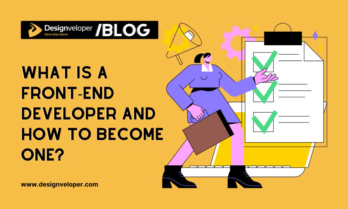
What Is a Front End Developer and How to Become One?
What Is a Front End Developer and How to Become One? Published March 30, 2025


